


Wizard
Wizard is a multi-step flow built on the same model as StateView — the steps
are named branches — plus everything that makes it a wizard rather than a view switcher: an order, a
progress indicator, a Back/Next bar that knows where it is, and a gate on leaving a step.


Screenshots
Section titled “Screenshots”MAUI (iOS)
| Next gated by validation | Valid — Next enabled | The next step |
|---|---|---|
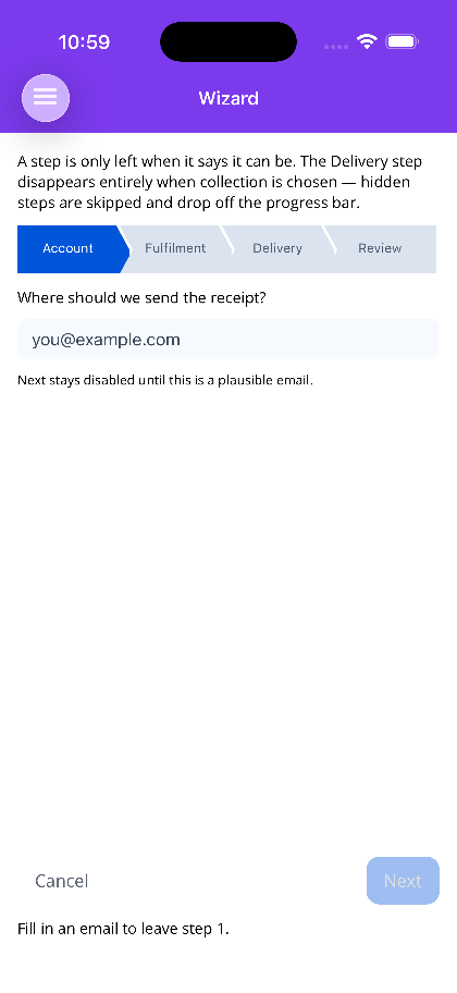 |
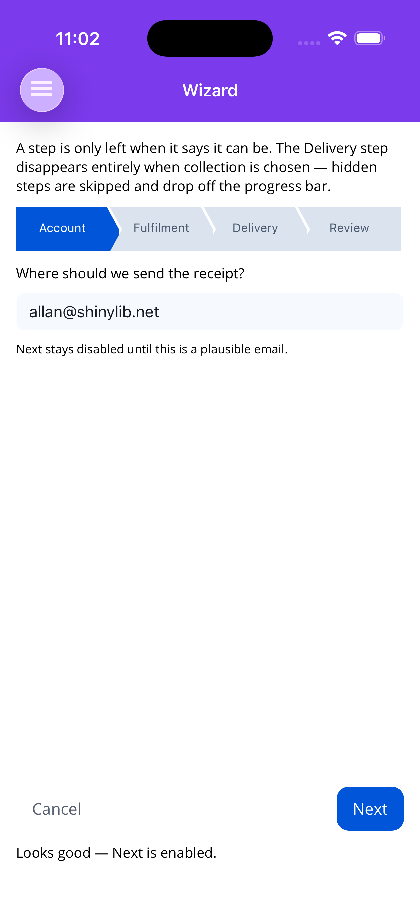 |
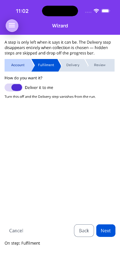 |
Blazor
| Next gated by validation | Valid — Next enabled | The next step | Indicator styles |
|---|---|---|---|
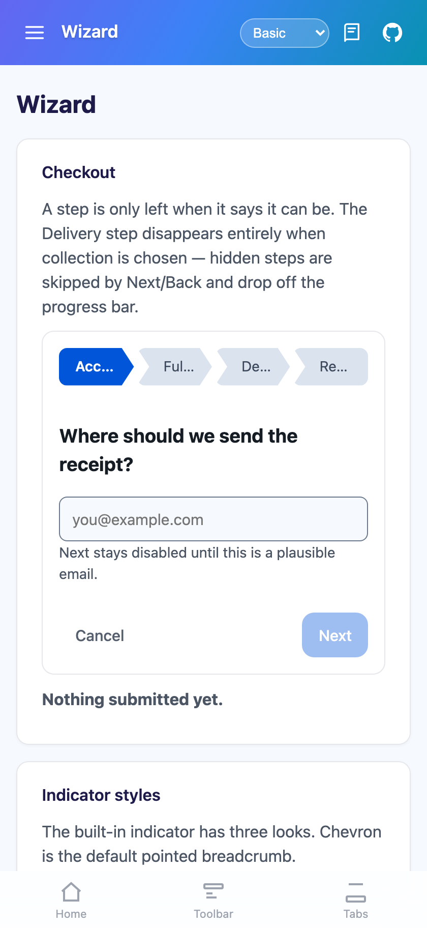 |
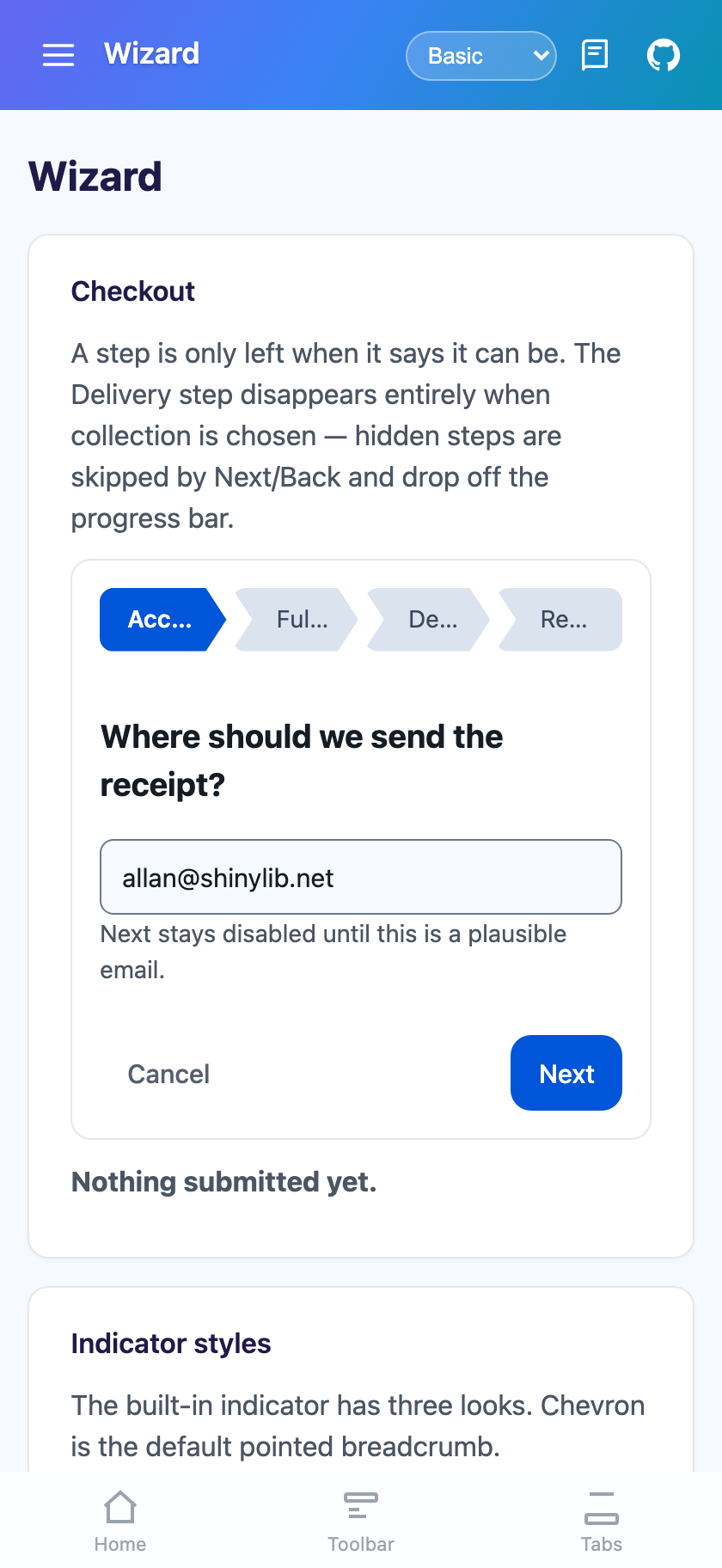 |
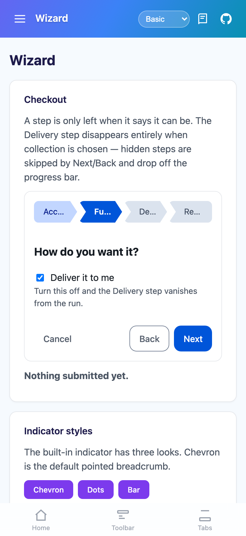 |
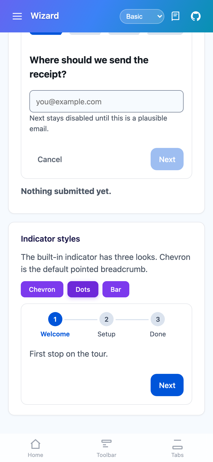 |
Features
Section titled “Features”- Pointed progress bar by default — one chevron per step carrying its title, coloured from the theme.
DotsandBarare built in too, andProgressreplaces the indicator with your own view - Layered validation —
IsValid,IsOptional, aValidateCommand(MAUI) that runs before validity is read, an asyncValidate(Blazor), and a cancellableStepChangingfor anything else - Conditional steps —
IsVisible="False"takes a step out of the run entirely: skipped by Next/Back, dropped from the indicator, excluded fromStepCount - Built-in navigation commands on the wizard, so a button inside a step navigates without the view-model re-implementing it
- Two-way position —
CurrentStepandCurrentStepIndex, plus read-onlyStepNumber,StepCount,IsFirstStep,IsLastStepandProgressFraction - Review without skipping ahead — a clickable indicator limited to steps already completed
- Finish that can fail —
Finishingis cancellable, so a rejected submit leaves the user on the last step with their input intact - Step transitions inherited from
StateView(Slideby default, direction-aware)
Quick Start
Section titled “Quick Start”Steps is the ContentProperty, so the steps are written as direct children.
<shiny:Wizard xmlns:shiny="http://shiny.net/maui/controls"              x:Name="Checkout"              CurrentStep="{Binding CurrentStep}"              ShowCancel="True"              AllowStepSelection="True"              FinishedCommand="{Binding SubmitCommand}"              CancelledCommand="{Binding AbandonCommand}">
    <shiny:WizardStep Name="Account" Title="Account" IsValid="{Binding EmailIsValid}">        <shiny:TextEntry Text="{Binding Email}" Placeholder="you@example.com" Keyboard="Email" />    </shiny:WizardStep>
    <shiny:WizardStep Name="Fulfilment" Title="Fulfilment">        <Switch IsToggled="{Binding WantsDelivery}" />    </shiny:WizardStep>
    <!-- Turn delivery off and this step leaves the run entirely -->    <shiny:WizardStep Name="Delivery" Title="Delivery"                      IsVisible="{Binding WantsDelivery}"                      IsOptional="True">        <shiny:TextEntry Text="{Binding Address}" />    </shiny:WizardStep>
    <shiny:WizardStep Name="Review" Title="Review" NextText="Place order">        <Label Text="{Binding Email, StringFormat='Receipt to {0}'}" />    </shiny:WizardStep></shiny:Wizard>
Blazor
Section titled “Blazor”<Wizard @bind-CurrentStep="step" ShowCancel="true" AllowStepSelection="true" Finished="OnFinished" Cancelled="OnCancelled"> <Steps> <WizardStep Name="Account" Title="Account" IsValid="@emailIsValid"> <TextEntry @bind-Text="email" /> </WizardStep>
<WizardStep Name="Fulfilment" Title="Fulfilment"> <input type="checkbox" @bind="wantsDelivery" /> Deliver it to me </WizardStep>
<WizardStep Name="Delivery" Title="Delivery" IsVisible="@wantsDelivery" IsOptional="true"> <TextEntry @bind-Text="address" /> </WizardStep>
<WizardStep Name="Review" Title="Review" NextText="Place order" Validate="ConfirmAsync"> <p>Receipt to <strong>@email</strong></p> </WizardStep> </Steps></Wizard>Validation
Section titled “Validation”Pick the cheapest thing that expresses the rule. Each layer runs in this order when Next is taken:
CanGoNext— the wizard-level consumer gate, ANDed with everything belowValidateCommand(MAUI) /Validate(Blazor) — runs before validity is readIsValid— the step’s own flag, bypassed entirely whenIsOptionalis setStepChanging— cancellable, and carriesFrom,ToandDirection
A bound flag
Section titled “A bound flag”The simplest case. Bind IsValid to a view-model property; Next disables itself and refuses to move while
it is false.
<shiny:WizardStep Name="Account" IsValid="{Binding EmailIsValid}">A command that validates and sets the flag
Section titled “A command that validates and sets the flag”ValidateCommand runs before IsValid is read, which is what lets one command do both jobs — no event
wiring:
[RelayCommand]void ValidateAccount() => this.EmailIsValid = this.Email?.Contains('@') == true;<shiny:WizardStep Name="Account" IsValid="{Binding EmailIsValid}" ValidateCommand="{Binding ValidateAccountCommand}" />An async gate (Blazor)
Section titled “An async gate (Blazor)”Validate is a Func<Task<bool>>, so a server round-trip is a first-class validator rather than something
bolted onto an event:
<WizardStep Name="Review" Validate="ConfirmAsync">…</WizardStep>
@code {    async Task<bool> ConfirmAsync()    {        var response = await http.PostAsJsonAsync("/api/orders/validate", order);        return response.IsSuccessStatusCode;    }}
A cancellable event
Section titled “A cancellable event”For anything the above cannot express — a confirmation prompt, a cross-step rule, a redirect:
wizard.StepChanging += (_, e) =>{ if (e.Direction == WizardDirection.Forward && e.From?.Name == "Payment" && !this.CardAccepted) e.Cancel = true;};Conditional steps
Section titled “Conditional steps”IsVisible="False" takes a step out of the run, not merely off screen: it is skipped by Next and Back,
dropped from the progress indicator, excluded from StepCount, and unreachable by name. Bind it and the
wizard reshapes itself as the user’s answers change.
<shiny:WizardStep Name="Delivery" Title="Delivery" IsVisible="{Binding WantsDelivery}">If the step being hidden is the one on screen, the wizard moves to the nearest still-visible step rather than blanking.
IsEnabled="False" is the softer version — the step stays drawn (dimmed) on the indicator but cannot be
navigated to. Use it for a step that is coming but not ready yet.
Progress indicators
Section titled “Progress indicators”ProgressStyle picks the built-in look and ProgressPosition places it (Top by default, or Bottom /
None).
| Style | Looks like |
|---|---|
Chevron (default) |
Pointed breadcrumb segments, one per visible step, carrying the step title |
Dots |
Numbered markers joined by a connector, with a tick on completed steps |
Bar |
A filled track under a “Step 2 of 5 — Delivery” caption |
None |
Nothing |
Completed, current and upcoming take PrimaryContainer, Primary and SurfaceContainerHighest from the
active theme, so the indicator follows a theme swap like everything else. On MAUI the chevron is drawn on a
GraphicsView — a chevron is a notched polygon, and a canvas renders identically on every head including
AppKit and GTK4. On Blazor the same shape is a CSS clip-path.
ShowStepTitles="False" drops to a compact numbered strip, which is what you want on a narrow phone with
more than four steps.
Your own indicator
Section titled “Your own indicator”Set Progress and the built-in one is not drawn at all. The wizard still owns navigation, so bind the
read-only position properties:
<shiny:Wizard.Progress> <Label Text="{Binding Source={x:Reference Checkout}, Path=StepNumber, StringFormat='Step {0}'}" /></shiny:Wizard.Progress><Wizard @ref="wizard"> <Steps>…</Steps> <Progress> <MyBrandedSteps Current="@wizard?.StepNumber" Total="@wizard?.StepCount" /> </Progress></Wizard>Navigating from your own markup
Section titled “Navigating from your own markup”The wizard owns its navigation, so a step’s own buttons do not need the view-model to re-implement it.
| Action | MAUI | Blazor |
|---|---|---|
| Forward, or finish on the last step | GoNextCommand / GoNext() |
GoNextAsync() |
| Back a step | GoBackCommand / GoBack() |
GoBackAsync() |
| Finish from anywhere | FinishCommand / Finish() |
FinishAsync() |
| Abandon | CancelCommand / Cancel() |
CancelAsync() |
| Jump (step name or visible index) | GoToStepCommand / GoTo(...) |
GoToAsync(...) |
| Clear completion, back to the start | Reset() |
ResetAsync() |
On MAUI, reach them from inside a step with x:Reference:
<Button Text="Start over" Command="{Binding Source={x:Reference Checkout}, Path=GoToStepCommand}" CommandParameter="Account" />On Blazor, take an @ref to the wizard and call the methods.
Turn ShowNavigationBar="False" off entirely when every step carries its own buttons, or set
NavigationBar (MAUI) / <NavigationBar> (Blazor) to replace the bar while keeping the wizard’s logic.
Step selection
Section titled “Step selection”AllowStepSelection makes the progress indicator clickable. LinearNavigation — on by default — limits
that to steps already completed plus the current one, so the user can go back and review without skipping
ahead into a step whose prerequisites have not been met. Programmatic GoTo is never restricted by it.
Finishing
Section titled “Finishing”Taking Next on the last step finishes. Finishing is raised first and is cancellable, which is the hook
for a submit that can be rejected:
wizard.Finishing += async (_, e) =>{ if (!await this.SubmitAsync()) e.Cancel = true; // stay on the last step, input intact};Finished (and FinishedCommand on MAUI) follows only when it was not cancelled.
Wizard properties
Section titled “Wizard properties”| Property | MAUI | Blazor | Default | Description |
|---|---|---|---|---|
Steps |
IList<WizardStep> (content property) |
RenderFragment |
— | The steps |
CurrentStep |
two-way | @bind-CurrentStep |
null |
Name of the step on screen |
CurrentStepIndex |
two-way | two-way | -1 |
Index among visible steps |
CanGoBack / CanGoNext |
✅ | ✅ | true |
Consumer gates, ANDed with the wizard’s own checks |
CanCancel |
✅ | ✅ | true |
|
AllowStepSelection |
✅ | ✅ | false |
Clickable progress indicator |
LinearNavigation |
✅ | ✅ | true |
Restrict clicks to completed steps |
Progress |
View |
RenderFragment |
null |
Replaces the built-in indicator |
ProgressStyle |
✅ | ✅ | Chevron |
Chevron / Dots / Bar / None |
ProgressPosition |
✅ | ✅ | Top |
Top / Bottom / None |
ProgressHeight |
✅ | — | 44 |
Height reserved for the drawn indicator |
ShowStepTitles |
✅ | ✅ | true |
|
NavigationBar |
View |
RenderFragment |
null |
Replaces the built-in Back/Next bar |
ShowNavigationBar |
✅ | ✅ | true |
|
ShowCancel |
✅ | ✅ | false |
|
ShowBackOnFirstStep |
✅ | ✅ | false |
Keep Back on screen (disabled) so the bar does not reflow |
BackText / NextText / FinishText / CancelText |
✅ | ✅ | Back / Next / Finish / Cancel | |
Transition / TransitionDuration |
✅ | ✅ | Slide / 220 |
Same values as StateView |
StepCount / StepNumber / IsFirstStep / IsLastStep / ProgressFraction |
read-only bindable | read-only | — | Position |
CurrentStepItem |
read-only | read-only | — | The WizardStep on screen |
Events — StepChanging (cancellable), StepChanged, Finishing (cancellable), Finished,
Cancelled. MAUI additionally exposes StepChangedCommand, FinishedCommand and CancelledCommand.
WizardStep properties
Section titled “WizardStep properties”WizardStep derives from StateViewState, so Name, Content / ContentTemplate (MAUI) and
ChildContent (Blazor) all work as documented on StateView.
| Property | MAUI | Blazor | Default | Description |
|---|---|---|---|---|
Title |
✅ | ✅ | null |
Shown on the indicator; falls back to Name |
Description |
✅ | ✅ | null |
Sub-caption for the Bar indicator |
IsVisible |
✅ | ✅ | true |
false takes the step out of the run |
IsEnabled |
✅ | ✅ | true |
false leaves it drawn but unreachable |
IsValid |
✅ | ✅ | true |
Gates Next |
IsOptional |
✅ | ✅ | false |
Bypasses IsValid |
IsCompleted |
two-way | two-way | false |
Set by the wizard on the way forward |
NextText / BackText |
✅ | ✅ | null |
Per-step button overrides |
ValidateCommand |
✅ | — | null |
Runs before IsValid is read |
Validate |
— | Func<Task<bool>> |
null |
Async gate on leaving forwards |
Gotchas
Section titled “Gotchas”- Assigning an unknown or disabled step name to
CurrentStepis reverted, not honoured. The wizard puts the property back to where it actually is, so a two-way binding reflects reality rather than blanking the flow. CurrentStepIndexcounts visible steps only, so it shifts when a conditional step appears or disappears. BindCurrentStepwhen you want a stable identity.IsCompletedis only set on forward moves. Going back does not un-complete the step you came from;Reset()clears every step.- MAUI allows one view per step — wrap several children in a layout. Blazor’s
ChildContenttakes as many as you like.
Related
Section titled “Related”- StateView — the switcher the wizard is built on
- ShinyButton — what the built-in navigation bar uses