SkeletonView
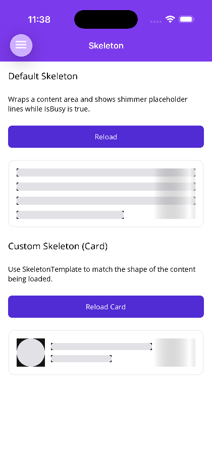
A content-wrapping control that shows animated shimmer placeholders while data is loading — conceptually similar to MAUI’s RefreshView. You wrap your real content and bind IsBusy; while it is true the content is hidden and shimmer placeholders are shown in its place. When IsBusy becomes false, the placeholders disappear and the real content is shown.
The built-in placeholder is a stack of shimmer “lines” (great for text/paragraph content). For anything else, supply a custom placeholder that matches the shape of the content being loaded — SkeletonTemplate on MAUI, SkeletonContent on Blazor.


 |  |
Features
Section titled “Features”- Wraps a content area and toggles between content and placeholders with
IsBusy - Built-in line placeholders (configurable count, height, spacing, corner radius, color)
- Custom placeholder layout via
SkeletonTemplate(MAUI) /SkeletonContent(Blazor) - Animated shimmer sweep — a translating
LinearGradientBrushband on MAUI, an animated CSS gradient on Blazor - Shimmer honors
prefers-reduced-motionon Blazor - Shimmer can be disabled for static placeholders (
ShimmerEnabled)
Quick Start
Section titled “Quick Start”MAUI — Default Placeholder (text lines)
Section titled “MAUI — Default Placeholder (text lines)”The child element is the Content (it is the ContentProperty), so you can nest it directly — no need to write <shiny:SkeletonView.Content> unless you also set SkeletonTemplate.
<shiny:SkeletonView xmlns:shiny="http://shiny.net/maui/controls" IsBusy="{Binding IsBusy}" ItemCount="4"> <VerticalStackLayout Spacing="8"> <Label Text="Loaded Article" FontSize="16" FontAttributes="Bold" /> <Label Text="This real content appears once loading finishes." /> </VerticalStackLayout></shiny:SkeletonView>MAUI — Custom Placeholder (match the content shape)
Section titled “MAUI — Custom Placeholder (match the content shape)”<shiny:SkeletonView IsBusy="{Binding IsBusy}"> <shiny:SkeletonView.SkeletonTemplate> <DataTemplate> <HorizontalStackLayout Spacing="12"> <BoxView WidthRequest="56" HeightRequest="56" CornerRadius="28" Color="#E1E1E6" /> <VerticalStackLayout Spacing="10" VerticalOptions="Center" WidthRequest="200"> <BoxView HeightRequest="14" CornerRadius="6" Color="#E1E1E6" HorizontalOptions="Fill" /> <BoxView HeightRequest="14" CornerRadius="6" Color="#E1E1E6" WidthRequest="120" HorizontalOptions="Start" /> </VerticalStackLayout> </HorizontalStackLayout> </DataTemplate> </shiny:SkeletonView.SkeletonTemplate> <shiny:SkeletonView.Content> <HorizontalStackLayout Spacing="12"> <BoxView WidthRequest="56" HeightRequest="56" CornerRadius="28" Color="#7C3AED" /> <VerticalStackLayout Spacing="4" VerticalOptions="Center"> <Label Text="Allan Ritchie" FontSize="16" FontAttributes="Bold" /> <Label Text="Shiny Controls maintainer" TextColor="#6B7280" /> </VerticalStackLayout> </HorizontalStackLayout> </shiny:SkeletonView.Content></shiny:SkeletonView>Use BaseColor for the placeholder fill in your SkeletonTemplate so it matches the built-in look.
Blazor — Default Placeholder (text lines)
Section titled “Blazor — Default Placeholder (text lines)”<SkeletonView IsBusy="@isBusy" ItemCount="4"> <ChildContent> <h3>Loaded Article</h3> <p>This real content appears once loading finishes.</p> </ChildContent></SkeletonView>Blazor — Custom Placeholder
Section titled “Blazor — Custom Placeholder”Add the shiny-skeleton__shape class to any element in SkeletonContent to give it the shimmer. The CSS custom properties for the colors/duration are inherited from the root, so your shapes shimmer automatically.
<SkeletonView IsBusy="@isBusy"> <SkeletonContent> <div style="display:flex; gap:12px; align-items:center;"> <div class="shiny-skeleton__shape" style="width:56px; height:56px; border-radius:50%;"></div> <div style="display:flex; flex-direction:column; gap:10px; flex:1;"> <div class="shiny-skeleton__shape" style="height:14px; border-radius:6px; width:60%;"></div> <div class="shiny-skeleton__shape" style="height:14px; border-radius:6px; width:40%;"></div> </div> </div> </SkeletonContent> <ChildContent> <!-- real content --> </ChildContent></SkeletonView>Properties
Section titled “Properties”| Property | Type | Default | Description |
|---|---|---|---|
| Content | View? | null | The real content shown when IsBusy is false (the ContentProperty) |
| IsBusy | bool | false | When true, hides content and shows animated placeholders |
| SkeletonTemplate | DataTemplate? | null | Custom placeholder layout; when null, built-in lines are used |
| ItemCount | int | 3 | Number of built-in placeholder lines (last line is shortened) |
| BaseColor | Color | #E1E1E6 | Fill color of the built-in placeholder shapes |
| ShimmerColor | Color | rgba(255,255,255,0.6) | Color of the sweeping highlight |
| ShimmerEnabled | bool | true | When false, placeholders are static (no sweep) |
| AnimationDuration | uint | 1200 | Duration (ms) of a single shimmer sweep |
| CornerRadius | double | 6 | Corner radius of the built-in placeholder lines |
| ItemHeight | double | 16 | Height of each built-in placeholder line |
| ItemSpacing | double | 12 | Vertical spacing between built-in placeholder lines |
Blazor
Section titled “Blazor”| Parameter | Type | Default | Description |
|---|---|---|---|
| IsBusy | bool | false | When true, hides content and shows placeholders |
| ChildContent | RenderFragment? | — | The real content shown when IsBusy is false |
| SkeletonContent | RenderFragment? | — | Custom placeholder markup; when null, built-in lines are used |
| ItemCount | int | 3 | Number of built-in placeholder lines |
| ItemHeight | double | 16 | Height (px) of each built-in placeholder line |
| ItemSpacing | double | 12 | Vertical spacing (px) between built-in lines |
| CornerRadius | double | 6 | Corner radius (px) of the built-in placeholder lines |
| BaseColor | string | #e1e1e6 | Base fill color of placeholder shapes |
| HighlightColor | string | rgba(255,255,255,0.6) | Color of the sweeping highlight |
| AnimationDuration | double | 1.4 | Duration (seconds) of a single shimmer sweep |
| ShimmerEnabled | bool | true | When false, placeholders are static (no sweep) |
| CssClass | string? | null | Additional CSS class on the root |
SkeletonViewswaps between content and placeholders by visibility, so the control’s height follows whichever is shown — size your placeholder to roughly match the loaded content to avoid layout jumps.- For a full-screen “loading the whole page” experience use Overlay & LoadingOverlay instead —
SkeletonViewis for inline content regions. - Both hosts mirror the same API:
IsBusy, a custom placeholder slot, item count/height/spacing, base/highlight colors, animation duration, and a shimmer on/off toggle.