Welcome to our documentation!
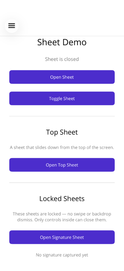
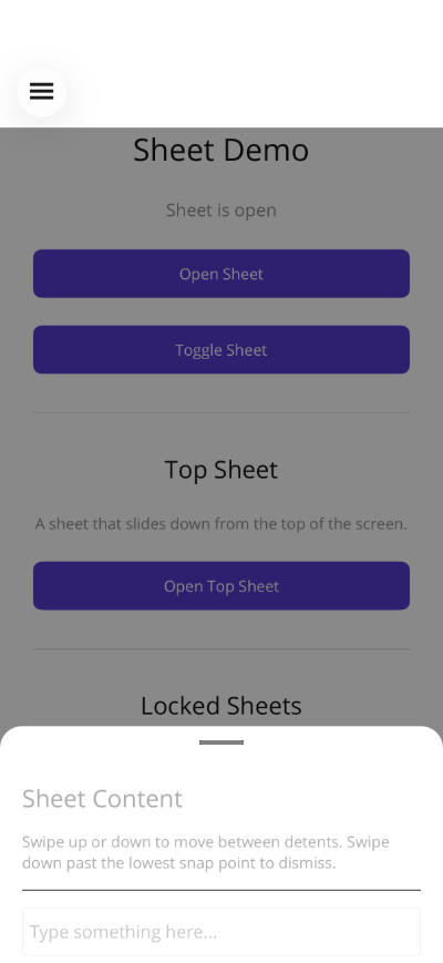
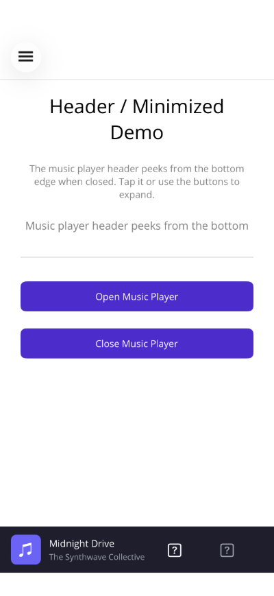
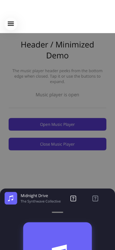
SheetView
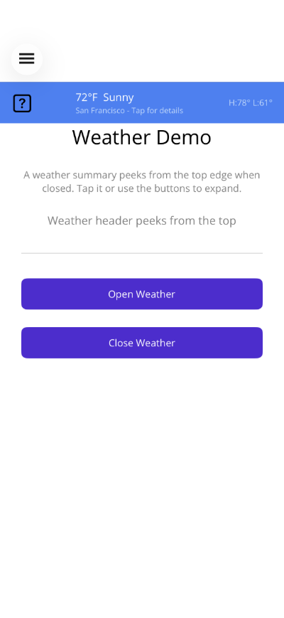
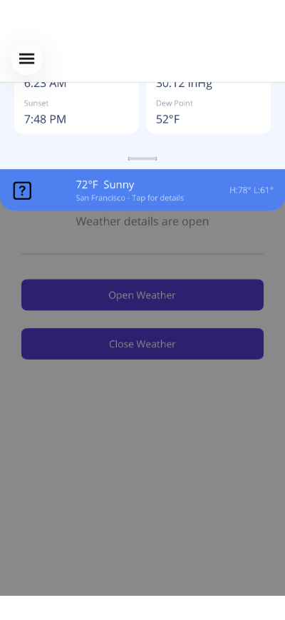
A sheet overlay that slides in from the bottom or top of the screen with configurable snap positions (detents), optional header peek when minimized, backdrop dimming, pan gestures, haptic feedback, and automatic keyboard handling.


Frameworks
.NET MAUI
Blazor
| Closed | Open | Header (Minimized) | Header (Open) | Top (Minimized) | Top (Open) |
|---|---|---|---|---|---|
 |  |  |  |  |  |
Basic Usage
Section titled “Basic Usage”<shiny:SheetView IsOpen="{Binding IsSheetOpen, Mode=TwoWay}"> <VerticalStackLayout Padding="20" Spacing="10"> <Label Text="Sheet Content" FontSize="18" FontAttributes="Bold" /> <Label Text="Drag the handle or tap the backdrop to close." /> <Button Text="Close" Command="{Binding CloseSheetCommand}" /> </VerticalStackLayout></shiny:SheetView><ContentPage> <Grid> <!-- Main page content --> <ScrollView> <VerticalStackLayout> <Button Text="Open Sheet" Command="{Binding OpenCommand}" /> </VerticalStackLayout> </ScrollView>
<!-- Sheet overlays on top --> <shiny:SheetView IsOpen="{Binding IsOpen, Mode=TwoWay}"> <Label Text="Sheet content" /> </shiny:SheetView> </Grid></ContentPage>Properties
Section titled “Properties”| Property | Type | Default | Description |
|---|---|---|---|
IsOpen | bool | false | Show/hide the sheet (TwoWay bindable) |
SheetContent | View? | null | Content displayed in the sheet (ContentProperty) |
Detents | ObservableCollection<DetentValue> | Quarter, Half, Full | Snap positions as ratios of available height |
SheetBackgroundColor | Color | White | Background of the sheet panel |
HandleColor | Color | Grey | Drag handle indicator color |
SheetCornerRadius | double | 16 | Top corner radius |
HasBackdrop | bool | true | Show dimming backdrop behind the sheet |
CloseOnBackdropTap | bool | true | Tap backdrop to close |
AnimationDuration | double | 250 | Animation speed in ms |
ExpandOnInputFocus | bool | true | Auto-expand when an input is focused |
IsLocked | bool | false | Prevents swipe, pan, and backdrop tap dismiss; sheet can only be controlled programmatically |
FitContent | bool | false | Measures content and auto-computes a single detent to fit it |
Direction | SheetDirection | Bottom | Direction the sheet slides from (Bottom or Top) |
HeaderTemplate | DataTemplate? | null | Custom header template displayed above the sheet content |
ShowHeaderWhenMinimized | bool | false | When true, shows the header as a peek strip when the sheet is closed |
UseHapticFeedback | bool | true | Haptic click on open, close, and detent snap |
DetentValue
Section titled “DetentValue”Predefined snap points:
| Static Property | Ratio | Description |
|---|---|---|
DetentValue.Quarter | 0.25 | 25% height |
DetentValue.Half | 0.50 | 50% height |
DetentValue.ThreeQuarters | 0.75 | 75% height |
DetentValue.Full | 1.0 | Full height |
Custom detent: new DetentValue(0.33) for 33%.
Custom Detents Example
Section titled “Custom Detents Example”<shiny:SheetView IsOpen="{Binding IsOpen, Mode=TwoWay}" SheetBackgroundColor="#1E1E1E" HandleColor="#888888" SheetCornerRadius="24"> <shiny:SheetView.Detents> <shiny:DetentValue Ratio="0.33" /> <shiny:DetentValue Ratio="0.66" /> <shiny:DetentValue Ratio="1.0" /> </shiny:SheetView.Detents> <VerticalStackLayout Padding="20"> <Label Text="Custom Sheet" TextColor="White" /> </VerticalStackLayout></shiny:SheetView>Events
Section titled “Events”| Event | Args | Description |
|---|---|---|
Opened | EventArgs | Sheet finished opening |
Closed | EventArgs | Sheet finished closing |
DetentChanged | DetentValue | Sheet snapped to a different detent |
Features
Section titled “Features”- Pan gesture — Drag up/down between detents; swipe past the lowest to close
- Keyboard handling — Auto-expands when an Entry/Editor is focused, restores on dismiss
- ScrollView integration — Scroll enabled only at the highest detent; disabled at lower detents for pan
- Backdrop — Semi-transparent overlay that dims proportionally to sheet position
- Locked mode — When
IsLocked="True", the drag handle is hidden, pan gestures are disabled, and backdrop tap is ignored. The sheet can only be opened/closed via binding. Ideal for signature capture, selectors, or confirmation dialogs. - Fit content — When
FitContent="True", the sheet measures its content and auto-computes a single detent to fit it, ignoring the Detents collection. - Top or bottom — Set
Direction="Top"to slide in from the top of the screen instead of the bottom - Header peek — Provide a
HeaderTemplateand setShowHeaderWhenMinimized="True"to show the header as a strip when the sheet is closed, giving users a tap/drag target to reopen - Haptic feedback — Tactile click feedback on open, close, and detent snap (disable with
UseHapticFeedback="False")
Top Sheet Example
Section titled “Top Sheet Example”<shiny:SheetView IsOpen="{Binding IsNotificationOpen}" Direction="Top" FitContent="True" SheetCornerRadius="0,0,16,16"> <VerticalStackLayout Padding="20" Spacing="10"> <Label Text="New Notification" FontAttributes="Bold" /> <Label Text="You have a new message." /> </VerticalStackLayout></shiny:SheetView>Header Peek Example
Section titled “Header Peek Example”<shiny:SheetView IsOpen="{Binding IsOpen}" ShowHeaderWhenMinimized="True"> <shiny:SheetView.HeaderTemplate> <DataTemplate> <Label Text="Now Playing — Drag up for details" Padding="16,8" FontSize="14" /> </DataTemplate> </shiny:SheetView.HeaderTemplate> <VerticalStackLayout Padding="20"> <Label Text="Full player controls here" /> </VerticalStackLayout></shiny:SheetView>Locked Sheet Example
Section titled “Locked Sheet Example”<!-- Signature capture: locked + auto-sized --><shiny:SheetView IsOpen="{Binding IsSignatureOpen}" IsLocked="True" FitContent="True" HasBackdrop="True" SheetCornerRadius="20"> <VerticalStackLayout Padding="20" Spacing="15"> <Label Text="Draw your signature" FontSize="18" FontAttributes="Bold" /> <!-- signature content --> <Button Text="Done" Command="{Binding DoneCommand}" /> </VerticalStackLayout></shiny:SheetView>AI Skill
Section titled “AI Skill”Step 1 — Add the marketplace:
claude plugin marketplace add shinyorg/skills Step 2 — Install the plugin:
claude plugin install shiny-controls@shiny Step 1 — Add the marketplace:
copilot plugin marketplace add https://github.com/shinyorg/skills Step 2 — Install the plugin:
copilot plugin install shiny-controls@shiny