


ImageViewer
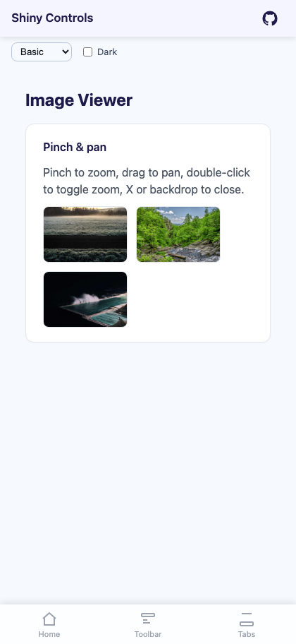
A full-screen image overlay with pinch-to-zoom, pan when zoomed, double-tap to toggle zoom, animated open/close transitions, and a close button.


MAUI
| Gallery | Viewer |
|---|---|
 |
 |
Blazor
| Thumbnail grid | Full-screen, zoomed and panned |
|---|---|
 |
 |
Basic Usage
Section titled “Basic Usage”<Grid> <!-- Page content with tappable images --> <ScrollView> <VerticalStackLayout> <Image Source="photo.png"> <Image.GestureRecognizers> <TapGestureRecognizer Command="{Binding OpenViewerCommand}" CommandParameter="photo.png" /> </Image.GestureRecognizers> </Image> </VerticalStackLayout> </ScrollView>
<!-- ImageViewer overlays on top --> <shiny:ImageViewer Source="{Binding SelectedImage}" IsOpen="{Binding IsViewerOpen}" /></Grid>Remote images (MAUI)
Section titled “Remote images (MAUI)”The thumbnail and the full-screen overlay are both a ShinyImage, so binding Uri instead of Source brings the whole loading pipeline with it — placeholder artwork, a loading ring that fills to a real percentage, error artwork, and IImageService memory + disk caching with a bounded download queue and de-duplication.
<shiny:ImageViewer Uri="{Binding PhotoUrl}" PlaceholderImage="blur_thumb.png" ErrorImage="broken_image.png" Aspect="AspectFill" RingSize="32" HeightRequest="180" />Use Uri for anything that comes off a server and Source for streams, embedded resources and font images. Source wins when both are set.
Three things follow from there being two images:
- The overlay is empty until it opens. Populating it up front would decode a second full-size bitmap for every viewer in a list. It is filled on open, from the same URI, so it comes back off the memory cache the thumbnail already warmed — there is no second download and no reason to preload it yourself.
ImageLoadedandImageFailedfire once, from the thumbnail. The overlay loading the same URI on open is not a second event.State,Progress,IsLoadingandLoadErrormirror the thumbnail — the copy that is always in the visual tree, so they still report something useful while the viewer is closed.
Properties
Section titled “Properties”| Property | Type | Default | Description |
|---|---|---|---|
Uri |
string? |
null |
The image to load. http/https goes through IImageService; anything else is treated as a local file or bundled resource (MAUI only) |
Source |
ImageSource? |
null |
An explicit source. Takes precedence over Uri and skips the service |
IsOpen |
bool |
false |
Show/hide the viewer (TwoWay bindable) |
Aspect |
Aspect |
AspectFit |
Thumbnail aspect ratio mode (MAUI only) |
OverlayAspect |
Aspect |
AspectFit |
Aspect ratio mode inside the overlay (MAUI only) |
MaxZoom |
double |
5.0 |
Maximum pinch zoom scale |
CloseButtonTemplate |
DataTemplate? |
null |
Custom close button template (tapping closes the viewer) |
HeaderTemplate |
DataTemplate? |
null |
Custom header overlay at the top of the viewer |
FooterTemplate |
DataTemplate? |
null |
Custom footer overlay at the bottom of the viewer |
OpenViewerOnTap |
bool |
true |
Whether tapping the thumbnail opens the overlay |
UseFeedback |
bool |
true |
Haptic click on double-tap zoom |
Loading (MAUI only)
Section titled “Loading (MAUI only)”| Property | Type | Default | Description |
|---|---|---|---|
PlaceholderImage |
ImageSource? |
null |
Artwork shown before and during the load, behind the ring |
ErrorImage |
ImageSource? |
null |
Artwork shown when the load fails. Ignored when ErrorTemplate is set |
LoadingTemplate |
DataTemplate? |
null |
Replaces the ring. Binding context is the live ImageLoadProgress |
ErrorTemplate |
DataTemplate? |
null |
Replaces the error artwork |
FadeInDuration |
uint |
150 |
Milliseconds each image fades in over once loaded. 0 shows it instantly |
RingSize |
double |
48 |
Diameter of the loading ring |
RingColor |
Color? |
null |
Progress arc colour; null uses the theme Primary token |
RingTrackColor |
Color? |
null |
Unfilled track; null uses SurfaceContainerHighest |
ProgressTextColor |
Color? |
null |
Percentage label; null uses OnSurface |
ShowProgressText |
bool |
true |
Draw the percentage inside the ring. Never shown when indeterminate |
CacheEnabled |
bool |
true |
Whether this image participates in the memory and disk caches |
CacheDuration |
TimeSpan? |
null |
Overrides ImageOptions.DiskCacheDuration for this image |
State |
ImageLoadState |
None |
Read-only: None, Queued, Downloading, Loaded, Failed |
Progress |
ImageLoadProgress |
— | Read-only live snapshot |
IsLoading |
bool |
false |
Read-only: true while Queued or Downloading |
LoadError |
Exception? |
null |
Read-only: why the last load failed |
ImageLoadedCommand |
ICommand? |
null |
Invoked with ImageLoadedEventArgs once on screen |
ImageFailedCommand |
ICommand? |
null |
Invoked with the exception when a load fails |
Events: ImageLoaded and ImageFailed. Methods: ReloadAsync() re-fetches, skipping both cache tiers; assigning ImageService overrides the resolved service for one instance.
Features
Section titled “Features”- Pinch-to-zoom — Two-finger pinch scales around the pinch origin, clamped between 1x and MaxZoom
- Pan when zoomed — One-finger pan enabled after zooming in, translation clamped to image bounds
- Double-tap to zoom — Double-tap zooms to 2.5x centered on the tap point; double-tap again resets
- Animated open/close — Backdrop, image, and close button fade together (250ms)
- Close button — “✕” button in the top-right corner (customizable via
CloseButtonTemplate) - Header/Footer templates — Optional overlays at the top/bottom for custom UI (e.g. image info, action buttons)
- Backdrop — Black overlay that swallows touches so nothing passes through to the page behind
- Remote loading (MAUI) —
Uriloads throughIImageServicewith caching, a progress ring, and placeholder/error artwork on both the thumbnail and the overlay
ViewModel Pattern
Section titled “ViewModel Pattern”public partial class ImageViewerViewModel : ObservableObject{ [ObservableProperty] ImageSource? selectedImage; [ObservableProperty] bool isViewerOpen;
[RelayCommand] void OpenViewer(string imageSource) { SelectedImage = imageSource; IsViewerOpen = true; }}Blazor Usage
Section titled “Blazor Usage”@using Shiny.Blazor.Controls
<div style="position: relative;"> <!-- Tappable image --> <img src="photo.jpg" @onclick="() => OpenViewer("photo.jpg")" style="cursor: pointer;" />
<!-- ImageViewer overlay --> <ImageViewer Source="@selectedImage" IsOpen="@isViewerOpen" IsOpenChanged="v => isViewerOpen = v" MaxZoom="5.0" /></div>
@code { string? selectedImage; bool isViewerOpen;
void OpenViewer(string imageUrl) { selectedImage = imageUrl; isViewerOpen = true; }}AI Skill
Section titled “AI Skill”Step 1 — Add the marketplace:
claude plugin marketplace add shinyorg/skillsStep 2 — Install the plugin:
claude plugin install shiny@shinyOne plugin installs all 35 Shiny skills. Your agent loads only the skill relevant to what you're building, so there's no cost to having them all available.
Step 1 — Add the marketplace:
copilot plugin marketplace add https://github.com/shinyorg/skillsStep 2 — Install the plugin:
copilot plugin install shiny@shinyOne plugin installs all 35 Shiny skills. Your agent loads only the skill relevant to what you're building, so there's no cost to having them all available.