


TextEntry
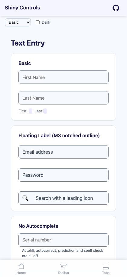
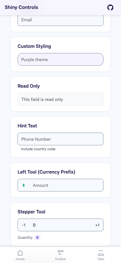
A text entry control with a Material 3 floating label, customizable border styling, left/right tool slots, hint text for validation errors, character count display, an autofill/autocorrect opt-out, and — on iOS and Android — a bar docked to the top of the soft keyboard.


MAUI

Blazor
| Floating label and tools | Validation state |
|---|---|
 |
 |
Features
Section titled “Features”| Feature | Description |
|---|---|
| Material 3 Floating Label | Variant="Floating" rides the label up onto the top border stroke, where it sits in a notch cut out of the outline. It leaves the text area entirely, so it can never overlap what is being typed. Classic (the default) leaves the placeholder to the native control. |
| Customizable Border | Configure border color, focused color, thickness, focused thickness, corner radius, and background color. |
| Tool Slots | Left and right tool areas for icons, text, or interactive buttons. Inline by default: a tinted glyph sitting on the field with no separator and no filled block. ToolStyle="Addon" restores the Bootstrap input-group look. |
| Keyboard Accessory | A bar docked to the top edge of the soft keyboard while the field has focus, on iOS and Android. See Keyboard Accessory. |
| Autocomplete Opt-Out | IsAutoCompleteEnabled="False" switches off autofill, autocorrect, predictive text and spell check together — the combination that otherwise rewrites serials and coupon codes mid-entry. |
| Hint Text | Helper text below the field for instructions or validation errors. Automatically switches to error styling when HasError is true. |
| Character Count | Optional counter display showing current length vs. max length. |
| Input Masking | Declarative Mask property for formatted input (phone, credit card, date, SSN, ZIP). Raw digits in Text, formatted display in FormattedText. |
| Input Modes | Password masking, read-only, keyboard type selection, return type configuration. |
| Reusable Tools | Built-in ClearButtonTool (auto-shows/hides based on text content) and TextEntrySpeechToTextTool (voice input via Shiny.Speech, in the SpeechAddins package). |
AI Skill
Section titled “AI Skill”Step 1 — Add the marketplace:
claude plugin marketplace add shinyorg/skillsStep 2 — Install the plugin:
claude plugin install shiny@shinyOne plugin installs all 48 Shiny skills. Your agent loads only the skill relevant to what you're building, so there's no cost to having them all available.
Step 1 — Add the marketplace:
copilot plugin marketplace add https://github.com/shinyorg/skillsStep 2 — Install the plugin:
copilot plugin install shiny@shinyOne plugin installs all 48 Shiny skills. Your agent loads only the skill relevant to what you're building, so there's no cost to having them all available.
Basic Usage
Section titled “Basic Usage”.NET MAUI
Section titled “.NET MAUI”<shiny:TextEntry Placeholder="Email" Text="{Binding Email, Mode=TwoWay}" Keyboard="Email" HasError="{Binding HasEmailError}" HintText="{Binding EmailError}"> <shiny:ClearButtonTool /></shiny:TextEntry>Blazor
Section titled “Blazor”<TextEntry Placeholder="Email" @bind-Text="email" HasError="@hasError" HintText="@errorMessage"> <RightTools> <TextEntryClearButton Text="@email" TextChanged="v => email = v" /> </RightTools></TextEntry>Properties
Section titled “Properties”| Property | Type | Default | Description |
|---|---|---|---|
Text |
string | "" |
Current text value (TwoWay) |
Placeholder |
string | "" |
Placeholder / floating label text |
Variant |
TextEntryVariant | Classic |
Classic (native placeholder) or Floating (M3 notched outline) |
ToolStyle |
TextEntryToolStyle | Inline |
Inline (glyph on the field) or Addon (filled block + separator) |
PlaceholderColor |
Color/string | Grey / #9CA3AF |
Placeholder color when unfocused |
FocusedPlaceholderColor |
Color/string | #007AFF |
Placeholder color when focused or floating |
BorderColor |
Color/string | #CCCCCC |
Border color when unfocused |
FocusedBorderColor |
Color/string | #007AFF |
Border color when focused |
BorderThickness |
double | 1 |
Border thickness (unfocused) |
FocusedBorderThickness |
double | 2 |
Border thickness (focused) |
CornerRadius |
CornerRadius/string | 8 / 8px |
Border corner radius |
EntryBackgroundColor |
Color/string | Transparent | Background inside the border |
FontSize |
double | 15 |
Text and placeholder font size |
FontFamily |
string? | null / inherit | Font family |
FontAttributes |
FontAttributes | None | Bold/Italic (MAUI only) |
TextColor |
Color/string | Black / inherit | Input text color |
IsReadOnly |
bool | false |
Read-only mode |
IsPassword |
bool | false |
Password masking |
ReturnType |
ReturnType | Default | Keyboard return button (MAUI only) |
Keyboard |
Keyboard | Default | Keyboard type (MAUI only) |
MaxLength |
int | unlimited | Maximum character count |
Mask |
string? | null | Input mask pattern (# = digit slot, others are auto-inserted literals) |
FormattedText |
string | "" |
Read-only formatted display value when Mask is set |
HintText |
string? | null | Hint/helper text below the field |
HintColor |
Color/string | Grey / #9CA3AF |
Hint text color |
HasError |
bool | false |
Error state (changes border/hint to ErrorColor) |
ErrorColor |
Color/string | #DC3545 |
Error state color |
ShowCharacterCount |
bool | false |
Show character count below the field |
IsAutoCompleteEnabled |
bool | true |
False switches off autofill, autocorrect, predictive text and spell check together |
IsSpellCheckEnabled |
bool | true |
Spell check (forced off when IsAutoCompleteEnabled is false) |
IsTextPredictionEnabled |
bool | true |
Suggestion strip (forced off when IsAutoCompleteEnabled is false) |
Accessory |
KeyboardAccessoryView? | null | Soft-keyboard accessory bar (MAUI, iOS + Android) |
AccessoryPreset |
KeyboardAccessoryPreset | None |
Stock bar: Done, Navigation, NavigationAndDone (MAUI) |
FieldGroup |
string? | null | Groups fields for accessory prev/next navigation (MAUI) |
LeftTools |
IList / RenderFragment | empty | Left tool slot |
RightTools |
IList / RenderFragment | empty | Right tool slot (ContentProperty on MAUI) |
TextChangedCommand |
ICommand? | null | Text change command (MAUI only) |
CompletedCommand |
ICommand? | null | Return key command (MAUI only) |
Tool Slots
Section titled “Tool Slots”TextEntry supports left and right tool areas on both MAUI and Blazor. Tools are TextEntryTool subclass instances — on MAUI they’re declared in XAML, on Blazor they’re passed as List<TextEntryTool>.
Built-in Tools
Section titled “Built-in Tools”ClearButtonTool — Automatically appears when text is non-empty and clears the field on tap/click. Available on both MAUI and Blazor.
<!-- MAUI --><shiny:TextEntry Placeholder="Search" Text="{Binding Query, Mode=TwoWay}"> <shiny:ClearButtonTool /></shiny:TextEntry><!-- Blazor --><TextEntry Placeholder="Search" @bind-Text="query" RightTools="tools" />
@code { string query = ""; List<TextEntryTool> tools = [new ClearButtonTool()];}TextEntrySpeechToTextTool (MAUI, requires Shiny.Maui.Controls.SpeechAddins) — Voice input tool that listens for speech via ISpeechToTextService and fills the entry text. Toggles listening state with visual feedback.
SpeechToTextTool (Blazor, requires Shiny.Blazor.Controls.SpeechAddins) — Voice input tool using the Web Speech API via JS interop.
Custom Tools
Section titled “Custom Tools”<!-- MAUI --><shiny:TextEntry Placeholder="Amount"> <shiny:TextEntry.LeftTools> <shiny:TextEntryTool Text="$" /> </shiny:TextEntry.LeftTools> <shiny:ClearButtonTool /></shiny:TextEntry><!-- Blazor --><TextEntry Placeholder="Amount" LeftTools="leftTools" RightTools="rightTools" />
@code { List<TextEntryTool> leftTools = [new TextEntryTool { Text = "$" }]; List<TextEntryTool> rightTools = [new ClearButtonTool()];}TextEntryTool Properties
Section titled “TextEntryTool Properties”MAUI:
| Property | Type | Description |
|---|---|---|
Icon |
ImageSource? | Tool icon |
Text |
string? | Tool text label |
ToolColor |
Color? | Tint. Unset follows the on-surface-variant theme token. Applies to the label and, when Icon is a FontImageSource, the glyph — MAUI cannot tint a bitmap Image |
FontSize |
double | Label size (default 14) |
IconSize |
double | Icon box size (default 20) |
Command |
ICommand? | Tap command |
CommandParameter |
object? | Command parameter |
Blazor:
| Property | Type | Description |
|---|---|---|
Icon |
string? | Icon text/emoji |
Text |
string? | Tool text label |
ToolColor |
string? | CSS color. Null follows the on-surface-variant theme token |
IsVisible |
bool | Whether the tool is shown (default: true) |
Clicked |
Action? | Click callback |
CssClass |
string? | Additional CSS class |
Creating Custom Tools
Section titled “Creating Custom Tools”MAUI — Implement ITextEntryAwareTool on a TextEntryTool subclass:
public interface ITextEntryAwareTool{ void Attach(TextEntry entry); void Detach();}Blazor — Override lifecycle methods on TextEntryTool:
public class MyTool : TextEntryTool{ public override void OnTextChanged(string? text) { /* react to text changes */ } protected override void OnClick() { SetEntryText("new value"); }}Input Masking
Section titled “Input Masking”Set Mask to automatically format input as the user types. The # character represents a digit slot; all other characters are literal separators inserted automatically.
When Mask is set:
Textalways contains raw digits only (e.g.,"5551234567")FormattedTextcontains the display value (e.g.,"(555) 123-4567")Keyboardauto-sets toNumeric- Cursor position is managed automatically
- Paste is handled gracefully (non-digits stripped, then reformatted)
.NET MAUI
Section titled “.NET MAUI”<shiny:TextEntry Placeholder="Phone Number" Mask="(###) ###-####" Text="{Binding Phone, Mode=TwoWay}" />
<shiny:TextEntry Placeholder="Credit Card" Mask="#### #### #### ####" Text="{Binding CardNumber, Mode=TwoWay}" />
<shiny:TextEntry Placeholder="MM/DD/YYYY" Mask="##/##/####" Text="{Binding DateString, Mode=TwoWay}" />Blazor
Section titled “Blazor”<TextEntry Placeholder="Phone Number" Mask="(###) ###-####" @bind-Text="phone" />
@code { string phone = ""; // Always raw digits, e.g. "5551234567"}Validation Example
Section titled “Validation Example”<shiny:TextEntry Placeholder="Email" Text="{Binding Email, Mode=TwoWay}" Keyboard="Email" HasError="{Binding HasEmailError}" HintText="{Binding EmailError}" ErrorColor="#DC3545"> <shiny:ClearButtonTool /></shiny:TextEntry>When HasError is true:
- The border changes to
ErrorColor - The floating placeholder changes to
ErrorColor - The hint text displays in
ErrorColor
Custom Styling Example
Section titled “Custom Styling Example”<shiny:TextEntry Placeholder="Purple theme" FocusedBorderColor="#7C3AED" FocusedPlaceholderColor="#7C3AED" FocusedBorderThickness="2" CornerRadius="16" EntryBackgroundColor="#F5F3FF"> <shiny:ClearButtonTool /></shiny:TextEntry>