


TabbedPage
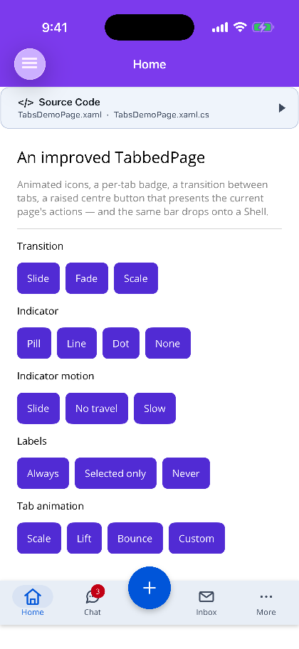
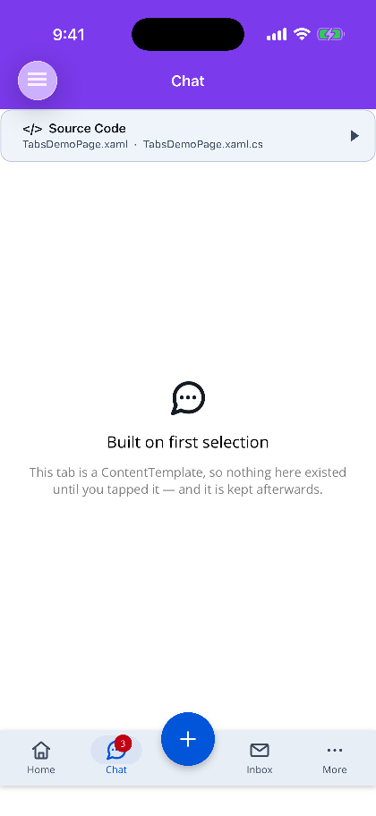
An improved TabbedPage: motion icons in the tabs, per-tab badges, an animated transition between tabs, tab content that is built the first time you reach it, and a raised centre button that presents the current page’s actions. The same bar drops onto a Shell without changing a line of its structure.

Nothing in it touches a platform SDK — the icons are drawn GraphicsViews and the transitions are MAUI animations — so it renders on every MAUI head, including macOS AppKit (net10.0-macos) and Linux GTK4, where MAUI’s own TabbedPage does not go.
MAUI
| The tab bar | Switching tabs |
|---|---|
 |
 |
Which host
Section titled “Which host”| Use when | Navigation is owned by | |
|---|---|---|
ShinyTabbedPage |
tabs are screens, with no stack inside them | the tabbed page — one screen per tab |
ShinyTabBarBehavior on a Shell |
tabs have their own stacks, routes and deep links | Shell |
Reach for the Shell form whenever the app already has a Shell. It keeps routing, ShellContent’s own lazy loading and each tab’s navigation stack, and replaces only the chrome.
The page
Section titled “The page”<shiny:ShinyTabbedPage xmlns="http://schemas.microsoft.com/dotnet/2021/maui" xmlns:x="http://schemas.microsoft.com/winfx/2009/xaml" xmlns:shiny="http://shiny.net/maui/controls" x:Class="MyApp.MainTabs" Transition="Slide" IndicatorStyle="Pill">
<shiny:ShinyTabbedPage.CenterButton> <shiny:TabCenterButton Icon="plus" Mode="Menu" /> </shiny:ShinyTabbedPage.CenterButton>
<shiny:ShinyTabItem Title="Home" Icon="home" Route="home"> <views:HomeView /> </shiny:ShinyTabItem>
<shiny:ShinyTabItem Title="Chat" Icon="message" Route="chat" Badge="3"> <shiny:ShinyTabItem.ContentTemplate> <DataTemplate><views:ChatView /></DataTemplate> </shiny:ShinyTabItem.ContentTemplate> </shiny:ShinyTabItem></shiny:ShinyTabbedPage>public partial class MainTabs : ShinyTabbedPage{ public MainTabs() => this.InitializeComponent();}Tabs is the content property, so the ShinyTabItems need no wrapper element.
Icon is a motion icon name — it animates when its tab is selected. IconImage takes an ordinary ImageSource instead for artwork that is not one.
Lazy content
Section titled “Lazy content”Inline Content is built with the markup. A ContentTemplate is built the first time its tab is selected and then kept, so four tabs behind templates cost one view tree on launch rather than four.
CacheTabContent (default true) turns the caching off, which rebuilds — and therefore resets — the tab every time it is entered.
A ContentPage in a template
Section titled “A ContentPage in a template”A template may inflate a plain View or a whole ContentPage, which is the shape MAUI’s own TabbedPage takes. A page is adopted: its Content is hosted, its Title fills in a tab that has none, its BindingContext is mirrored onto the hosted view, and its ShinyTabs attached values are read straight off it. ShinyTabItem.AdoptedPage hands it back.
Two things an adopted page does not get:
A place on a navigation stack. The page object is not the page on screen — the ShinyTabbedPage is. this.Navigation in its code-behind resolves, because the adopted page is parented to the tabbed page, but it pushes onto the tabbed page’s stack.
OnAppearing. MAUI raises page lifecycle from the platform, for the page the platform actually presented — and an adopted page never is, so IPageController.SendAppearing() on it does nothing at all. Rather than call a method that silently does nothing, the contract is declared:
public class InboxViewModel : ITabAware{ public void OnTabAppearing() => this.StartPolling(); public void OnTabDisappearing() => this.StopPolling();}ITabAware is called on the tab’s content, on the adopted page, and on either one’s BindingContext — each object once, even when it is reachable both ways. OnTabAppearing runs as soon as the tab becomes selected (for the first tab, while the page is still being built) and again when the page itself is returned to; OnTabDisappearing runs when another tab is chosen and when the page leaves the screen. Neither ever fires twice in a row. ShinyTabItem.Appearing/Disappearing are the event form.
Transitions
Section titled “Transitions”Transition takes the same StateTransition as StateView and Wizard: None, Fade, Slide, SlideLeft, SlideRight, SlideUp, SlideDown, Scale.
Slide is the default and is direction-aware — a tab later in Tabs enters from the right, an earlier one from the left. That direction is the only cue telling a user which way they just moved, which is why it is the default rather than a cross-fade.
TransitionDuration is milliseconds (zero swaps instantly) and TransitionEasing defaults to CubicOut.
The centre button
Section titled “The centre button”
<shiny:ShinyTabbedPage.CenterButton> <shiny:TabCenterButton Icon="plus" Mode="Menu" Size="60" RotateOnOpen="45" /></shiny:ShinyTabbedPage.CenterButton>It is not a tab — it never becomes the selection.
Mode="Action"runsCommandand raisesCenterClicked. Nothing is presented.Mode="Menu"(the default) presents the current page’s actions above it, and falls back toActionwhen neither the page nor the button declares anything — so a centre button that is only ever a button behaves like one, without being reconfigured.
Overhang is how far the circle rises above the bar. Left at -1 it is half of Size, which centres the circle on the bar’s top edge.
An empty menu is never shown — not from a tap, and not from OpenMenu() or IsMenuOpen = true either, and an open menu closes when its last action is removed. When the fallback click would also do nothing (no Command, no CenterClicked handler), the button dims like a disabled one, and it re-evaluates as tabs change and as the page’s ShinyTabs.Actions change.
An odd number of tabs is handled: the halves either side of the button are padded with an empty column so the button stays truly centred. Without that, a five-tab bar puts more star weight on one side and the “centre” button drifts by half a tab.
What it presents — the page decides
Section titled “What it presents — the page decides”This is the half owned by the page rather than the bar, and it is deliberately the same shape as ToolbarItems. Set it on whatever the tab is showing: the adopted ContentPage, the content view, or the ShellContent.
<ContentPage xmlns:shiny="http://shiny.net/maui/controls"             shiny:ShinyTabs.Badge="{Binding UnreadText}">
<shiny:ShinyTabs.Actions> <shiny:TabActionCollection> <shiny:TabAction Text="New message" Icon="edit" Command="{Binding ComposeCommand}" /> <shiny:TabAction Text="Mark all read" Icon="check" Command="{Binding MarkReadCommand}" /> <shiny:TabAction IsSeparator="True" /> <shiny:TabAction Text="Empty inbox" Icon="trash" IsDestructive="True" Command="{Binding EmptyCommand}" /> </shiny:TabActionCollection> </shiny:ShinyTabs.Actions></ContentPage>For a menu that is not a list of rows, hand the bar a view instead. It wins over Actions:
<shiny:ShinyTabs.MenuContent> <VerticalStackLayout Padding="20" Spacing="10" WidthRequest="260"> <Label Text="Saved searches" FontAttributes="Bold" /> </VerticalStackLayout></shiny:ShinyTabs.MenuContent>ShinyTabs.MenuContentTemplate is the same thing built fresh on every open, which is what shows current data rather than whatever it captured the first time.
Precedence, highest first: the page’s MenuContentTemplate, the page’s MenuContent, the button’s MenuContentTemplate, the button’s MenuContent, the page’s Actions, the button’s Actions.
Transparency
Section titled “Transparency”BarBackgroundOpacity (1 by default) makes the bar translucent. It fades the background only —
icons, labels, badges and the indicator stay fully opaque.
<shiny:ShinyTabbedPage BarBackgroundOpacity="0.6" ContentBehindTabBar="True" />That distinction is the feature. A bar whose tabs fade along with it is not a translucent bar, it is a
faded one, and it is unreadable long before the background gets interesting. So the alpha goes on the
colour, never on a view: Opacity on the surface would take everything inside it down too, and
opacity multiplies down the tree, so a child cannot undo it.
It multiplies into any alpha the colour already carried — a semi-transparent BarBackgroundColor
keeps what it asked for — and it follows a theme swap rather than snapping back to opaque.
Pair it with ContentBehindTabBar, or BarStyle="Floating" which implies it. Without content running
under the bar there is nothing behind it to see.
Liquid Glass
Section titled “Liquid Glass”
BarMaterial swaps the painted background for real Apple glass — a UIGlassEffect behind the
bar, not a blur that approximates one:
<shiny:ShinyTabbedPage BarMaterial="Glass" BarStyle="Floating" />TabBarMaterial is Solid (the default), Glass — the weight the system uses for its own bars — or
GlassClear, which lets far more of the page through and needs something with contrast behind it to
read as glass at all. BarGlassTint washes the glass with a colour; SetDynamicResource it to a
theme token if the bar should follow your palette rather than the system’s light and dark. A tint on
glass is not a fill: the surface is still refracting what is behind it, so an opaque brand colour
gives you tinted glass rather than a tinted rectangle.
Where it does apply, glass takes the background over completely:
BarBackgroundColorandBarBackgroundOpacitystop being painted — anything painted there would sit between the glass and the page, leaving nothing to refract.HasShadowis ignored. Glass carries its own edge shading, and a Material drop shadow under it reads as a sticker laid on the page rather than as depth.- The content is allowed to run underneath the bar for you, exactly as
BarStyle="Floating"already does — so leave roughlyBarHeightof room at the bottom of anything scrollable. - A floating glass bar is a capsule natively, so its ends stay semicircles as the bar resizes rather than being recomputed from the height.
Two things Apple’s own bar does that this one does not, both deliberate for now. The glass is not
interactive — UIGlassEffect.Interactive keys off touches delivered to the effect view, and every
gesture in the bar belongs to the MAUI views above it, so switching it on would do nothing. And a
centre button does not merge with the bar the way UIGlassContainerEffect merges neighbouring panes;
each is its own pane.
Menus close when the tab changes
Section titled “Menus close when the tab changes”Both the centre button’s menu and the overflow tab’s close on any change of selected tab — a tap,
GoTo, or a binding on SelectedIndex. A menu belongs to the tab it was opened over, and changing
tabs swaps the page underneath it, so a card left standing is annotating content that is no longer
there. A reselect leaves it alone: the page is the same one the menu was opened over.
Overflow — the “More” tab
Section titled “Overflow — the “More” tab”Too many tabs fold themselves away. Nothing to switch on.
MaxVisibleTabs is 0 by default, which means work it out from the bar’s own width: the cap is
the width divided by MinTabWidth (72), less the column the centre button owns. Anything past it
folds behind a synthesized More tab, and the split is recomputed whenever the width changes — a
rotation, a window resize, a Shell bar moving to a page with different chrome. So six tabs are six
tabs on a tablet and four plus a More on a phone in portrait, from the same markup.
<shiny:ShinyTabbedPage MaxVisibleTabs="4" <!-- 0 = auto, the default --> MinTabWidth="72" <!-- what "does not fit" means --> OverflowTitle="More" OverflowIcon="more" />The cap counts the More tab: MaxVisibleTabs="4" over six tabs draws three real tabs and a More,
because adding the More cell to four would put the bar straight back over the width that caused the
overflow. A cap of 1 is treated as 2 — a bar that is nothing but an overflow button is not a tab
bar.
Two details that are the difference between this working and merely existing:
- The More tab draws as selected whenever the tab on screen is one it folded away. It selects nothing of its own, so without that the whole bar reads as having nothing selected the moment you pick something out of the menu.
- A folded tab keeps its badge, on its row in the menu. A tab that just disappeared behind More is exactly the one whose unread count nobody can see any more.
It reuses the centre button’s menu card, backdrop and animation, anchored to the trailing edge rather than the middle — and the centre button does not rotate into its close glyph for it, because that affordance belongs to the menu the button itself opened.
In code: HasOverflow, OverflowItems, OpenOverflow() and SelectOverflowItem(item) on
ShinyTabBar. The cell’s AutomationId is tab-more.
Docked or floating
Section titled “Docked or floating”BarStyle decides whether the bar is welded to the bottom edge or laid over the page as a capsule — the shape iOS’s own tab bar now takes.
<shiny:ShinyTabbedPage BarStyle="Floating" ...>Docked (default) |
Floating |
|
|---|---|---|
| Shape | square, edge to edge | capsule, inset 16 either side and 8 below |
| Corners | theme corner token | half the bar height |
| Content | stops where the bar starts | runs the full height of the page, under the bar |
| Safe area | background paints down through the home indicator | the whole capsule is inset above it |
| Shadow | Level 2 | Level 3 |
BarMargin and BarCornerRadius still win when you set them, so a floating bar can be nudged or squared off without leaving the style.
Floating implies ContentBehindTabBar — a capsule laid over the page has nothing to stop above — but that property stays useful on its own for a docked bar you have made translucent.
In Shell, ShinyTabBarBehavior already hosts the bar as an overlay over the page, so BarStyle="Floating" needs nothing extra there.

The docked bar is the first screenshot at the top of this page.
Badges
Section titled “Badges”Badge takes a string. An empty string draws a dot; null draws nothing — an empty string is not “no badge”.
Where to put it depends on who knows the count:
- On the
ShinyTabItem(or theShellContent) when it must show on a tab the user has never opened. There is no page to ask yet. - On the page, with
ShinyTabs.Badge, when the page computes it.
The page’s value wins — but only for the tab that page is showing, so the two never fight and one page’s count never lands on every tab in the bar.
Colours
Section titled “Colours”Every colour follows the theme when unset: SelectedColor → primary, UnselectedColor → on-surface-variant, IndicatorColor → secondary-container, BarBackgroundColor → surface-container. Only set them to override.
IndicatorStyle is Pill (the Material 3 default), Line (top edge), Underline (bottom edge), Dot, or None. LabelMode is Always, SelectedOnly or Never.
Step 1 — Add the marketplace:
claude plugin marketplace add shinyorg/skillsStep 2 — Install the plugin:
claude plugin install shiny@shinyOne plugin installs all 39 Shiny skills. Your agent loads only the skill relevant to what you're building, so there's no cost to having them all available.
Step 1 — Add the marketplace:
copilot plugin marketplace add https://github.com/shinyorg/skillsStep 2 — Install the plugin:
copilot plugin install shiny@shinyOne plugin installs all 39 Shiny skills. Your agent loads only the skill relevant to what you're building, so there's no cost to having them all available.