


CountryPicker
A country search control built on AutoCompleteEntry with flag emoji display, country name, and dial code. Searches all ISO 3166-1 countries with instant local filtering.


Frameworks
.NET MAUI
Blazor
| MAUI — empty | Blazor — with selection | Blazor — type-ahead |
|---|---|---|
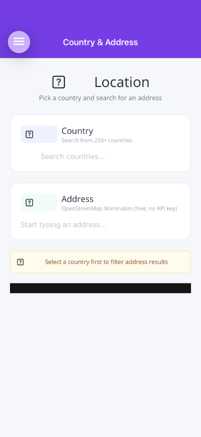 |
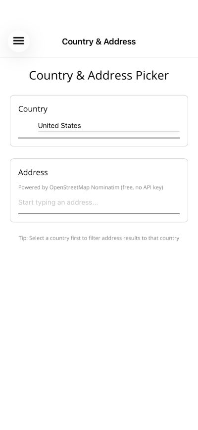 |
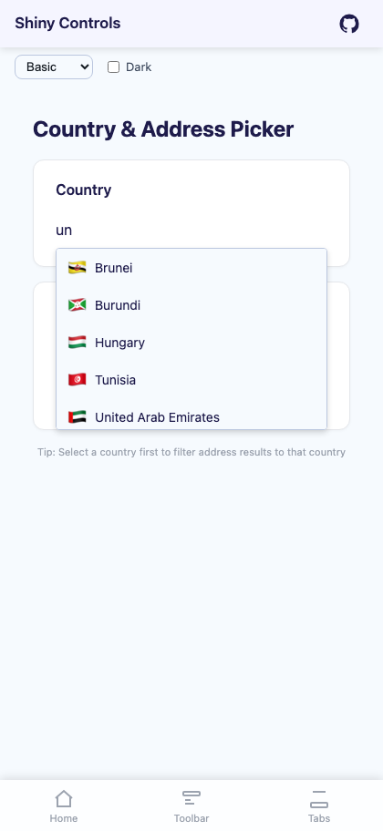 |
Basic Usage
Section titled “Basic Usage”<shiny:CountryPicker SelectedCountry="{Binding Country}" Placeholder="Select country..." />The dropdown shows each country’s flag emoji, name, and dial code. Selecting a country displays the flag next to the input text.
Properties
Section titled “Properties”| Property | Type | Default | Description |
|---|---|---|---|
SelectedCountry |
Country? |
null |
Selected country (TwoWay) |
Placeholder |
string |
"Search countries..." |
Placeholder text |
MaxDropDownHeight |
double |
200 |
Maximum dropdown height |
TextColor |
Color? / string? |
null |
Text color |
PlaceholderColor |
Color? / string? |
null |
Placeholder color |
DropDownBackgroundColor |
Color? / string? |
null |
Dropdown background |
DropDownBorderColor |
Color? / string? |
null |
Dropdown border color |
SpinnerColor |
Color? / string? |
null |
Loading spinner color |
FontSize |
double |
14 |
Font size |
FontFamily |
string? |
null |
Font family (MAUI only) |
CornerRadius |
double |
4 |
Dropdown corner radius (MAUI only) |
Events
Section titled “Events”| Event | Args | Description |
|---|---|---|
CountrySelected |
Country |
Fires when a country is selected |
Country Model
Section titled “Country Model”The Country record provides:
| Property | Type | Description |
|---|---|---|
Name |
string |
Country name (e.g. “United States”) |
Iso2 |
string |
ISO 3166-1 alpha-2 code (e.g. “US”) |
Iso3 |
string |
ISO 3166-1 alpha-3 code (e.g. “USA”) |
DialCode |
string |
International dial code (e.g. “+1”) |
FlagEmoji |
string |
Flag emoji (e.g. “🇺🇸”) |
Styling
Section titled “Styling”<shiny:CountryPicker SelectedCountry="{Binding Country}" FontSize="18" TextColor="Black" PlaceholderColor="DarkGray" DropDownBackgroundColor="#F9FAFB" DropDownBorderColor="#6B7280" CornerRadius="12" />Blazor Usage
Section titled “Blazor Usage”<CountryPicker SelectedCountry="@selectedCountry" SelectedCountryChanged="OnCountryChanged" Placeholder="Select country..." FontSize="16" TextColor="#333" InputClass="my-input" DropDownClass="my-dropdown" />
@code { Country? selectedCountry;
void OnCountryChanged(Country? country) { selectedCountry = country; }}Blazor-Only Properties
Section titled “Blazor-Only Properties”| Property | Type | Default | Description |
|---|---|---|---|
InputClass |
string? |
null |
CSS class for the input element |
DropDownClass |
string? |
null |
CSS class for the dropdown |
ViewModel Pattern
Section titled “ViewModel Pattern”public partial class MyViewModel : ObservableObject{ [ObservableProperty] Country? selectedCountry;
partial void OnSelectedCountryChanged(Country? value) { if (value is not null) { Console.WriteLine($"Selected: {value.Name} ({value.DialCode})"); } }}AI Skill
Section titled “AI Skill”Step 1 — Add the marketplace:
claude plugin marketplace add shinyorg/skillsStep 2 — Install the plugin:
claude plugin install shiny@shinyOne plugin installs all 48 Shiny skills. Your agent loads only the skill relevant to what you're building, so there's no cost to having them all available.
Step 1 — Add the marketplace:
copilot plugin marketplace add https://github.com/shinyorg/skillsStep 2 — Install the plugin:
copilot plugin install shiny@shinyOne plugin installs all 48 Shiny skills. Your agent loads only the skill relevant to what you're building, so there's no cost to having them all available.