


ImageEditor
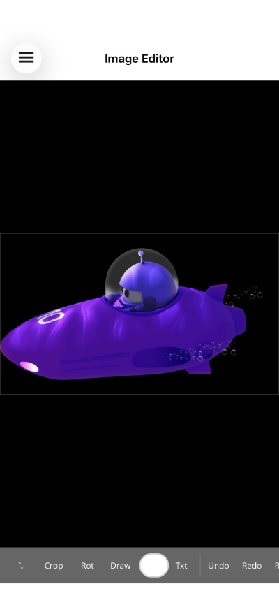
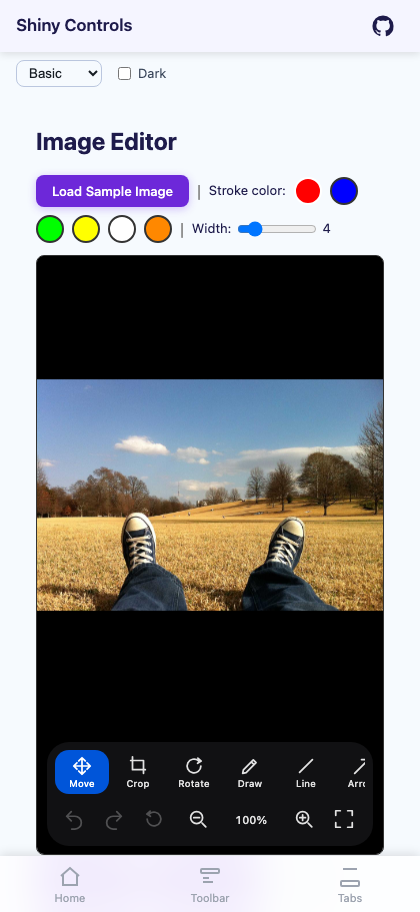
An inline image editor with cropping (drag-handle selection with dimmed overlay and rule-of-thirds grid), rotation, freehand drawing with integrated color picker, line and arrow drawing, inline text annotations with font family and font size selection, zoom and pan that stay live in every tool, undo/redo, reset-to-original, and save/export to PNG/JPEG/WEBP. Every feature can be toggled on or off, and the default toolbar can be replaced with a custom template.


Screenshots
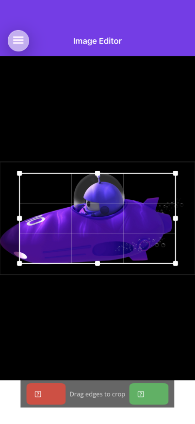
Section titled “Screenshots”| MAUI — editor | Blazor — editor | Blazor — crop mode |
|---|---|---|
 |
 |
 |
Basic Usage
Section titled “Basic Usage”<shiny:ImageEditor Source="{Binding ImageSource}" CurrentToolMode="{Binding ToolMode}" AllowCrop="True" AllowRotate="True" AllowDraw="True" AllowTextAnnotation="True" DrawStrokeColor="{Binding DrawColor}" DrawStrokeWidth="3" SaveCommand="{Binding SaveCommand}" />Features
Section titled “Features”- Zoom & pan in every tool – Pinch anywhere, two-finger drag to pan, double-tap to toggle, plus a toolbar zoom cluster with a live percentage; Blazor adds wheel-zoom about the cursor and middle-drag pan. The transform is applied to the drawing surface rather than the native view, so the image re-renders crisply as you magnify and touch points are mapped back through it – meaning you can zoom to 800% and draw, crop or place text with pixel accuracy. See Zoom & Pan.
- Move mode – The neutral tool: one-finger drag pans when zoomed, double-tap toggles zoom.
- Crop – Dedicated crop toolbar with Apply/Cancel buttons. Visible initial crop area with 8 drag handles (4 corners + 4 midpoints) and a rule-of-thirds grid overlay. Areas outside the crop are dimmed. Entering crop mode returns to fit-to-view, since the crop rect is normalised against the whole image.
- Rotate – 90-degree increments or arbitrary angles. Each rotation is a separate undoable action.
- Freehand drawing – Draw strokes on the image with configurable color and width. Drawing is constrained to the image bounds. Integrated color picker button on the toolbar. Each completed stroke is one undoable action.
- Line & arrow drawing – Draw straight lines or arrows between two points with configurable color and width. Toggle between Line and Arrow modes in the toolbar.
- Text annotations – Tap the image to place an inline text entry directly on the canvas. Configurable font size, color, and font family. Enable
AllowFontSelectionandAllowFontSizeSelectionto show font picker buttons in the toolbar. - Font selection – When enabled, a
FontPickerButtonappears in the toolbar during text mode, allowing users to choose fromAvailableFonts. AFontSizePickerButtoncan also be shown for size selection. - Undo/redo – Every edit action is pushed to a stack. Undo moves the last action to a redo stack; redo re-applies it. New actions clear the redo stack.
- Reset – Clears all actions and restores the original image.
- Save – Bind
SaveCommandto receive anEditedImageobject. CallToStreamAsync(format, quality, width, height)to export as PNG, JPEG, or WEBP at any resolution. The Save button only appears in the toolbar whenSaveCommandis bound. - Image border – A subtle border around the image shows the drawable surface area.
- Resolution-independent annotations – Strokes, lines and text record the on-screen image width they were captured at, so a mark made on a small preview (or while zoomed in) keeps its proportions when exported at full resolution.
- Toolbar – A floating rounded bar with vector icons (not unicode glyphs, which render at different weights on every platform). Row one is the tool picker in a horizontal scroller so it never clips on a phone; row two shows options for the active tool only – colour swatch, pen-weight presets, font and size pickers; row three carries undo/redo/reset, the zoom cluster and save. Setting
AllowX=falsehides a tool,ShowToolLabels="False"gives a compact icon-only bar, andToolbarTemplatereplaces the whole thing. On Blazor,ToolbarActionsadds your own buttons to the trailing edge of the default bar without replacing it.
AI Skill
Section titled “AI Skill”Step 1 — Add the marketplace:
claude plugin marketplace add shinyorg/skillsStep 2 — Install the plugin:
claude plugin install shiny@shinyOne plugin installs all 35 Shiny skills. Your agent loads only the skill relevant to what you're building, so there's no cost to having them all available.
Step 1 — Add the marketplace:
copilot plugin marketplace add https://github.com/shinyorg/skillsStep 2 — Install the plugin:
copilot plugin install shiny@shinyOne plugin installs all 35 Shiny skills. Your agent loads only the skill relevant to what you're building, so there's no cost to having them all available.