


Quick Entry
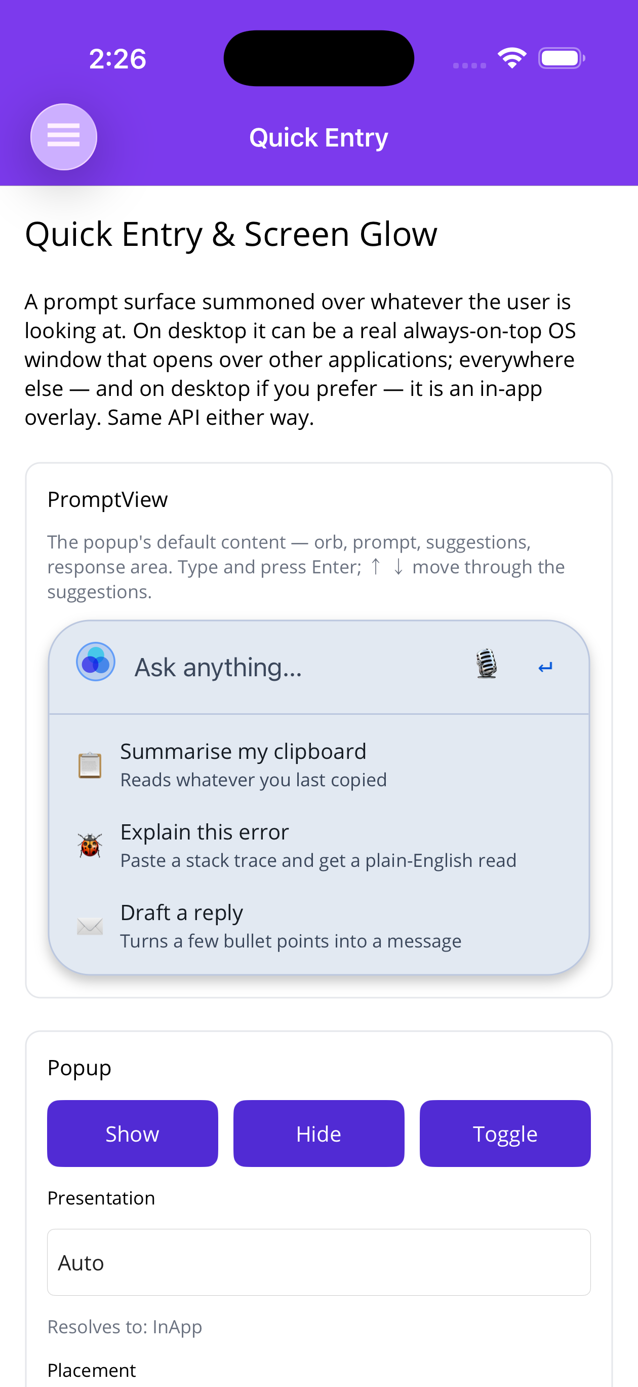
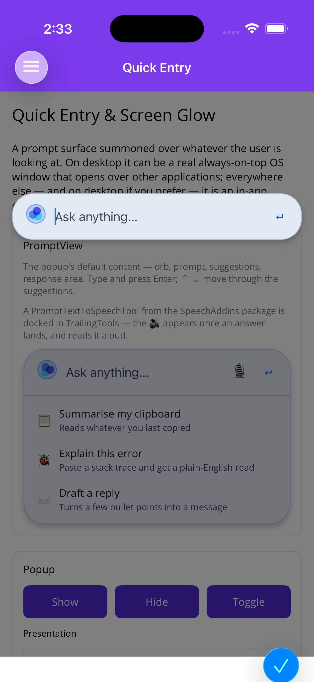
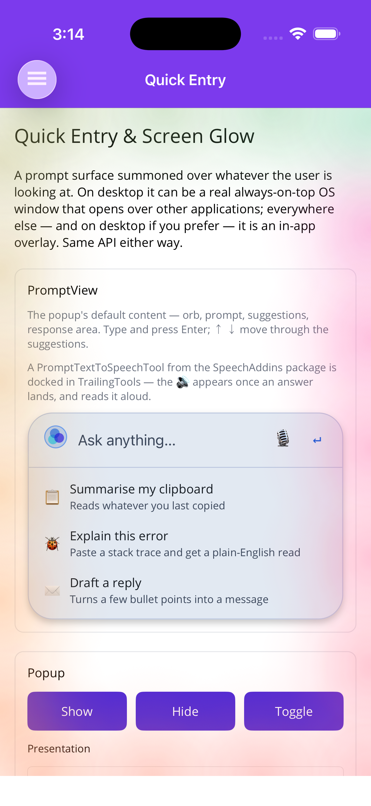
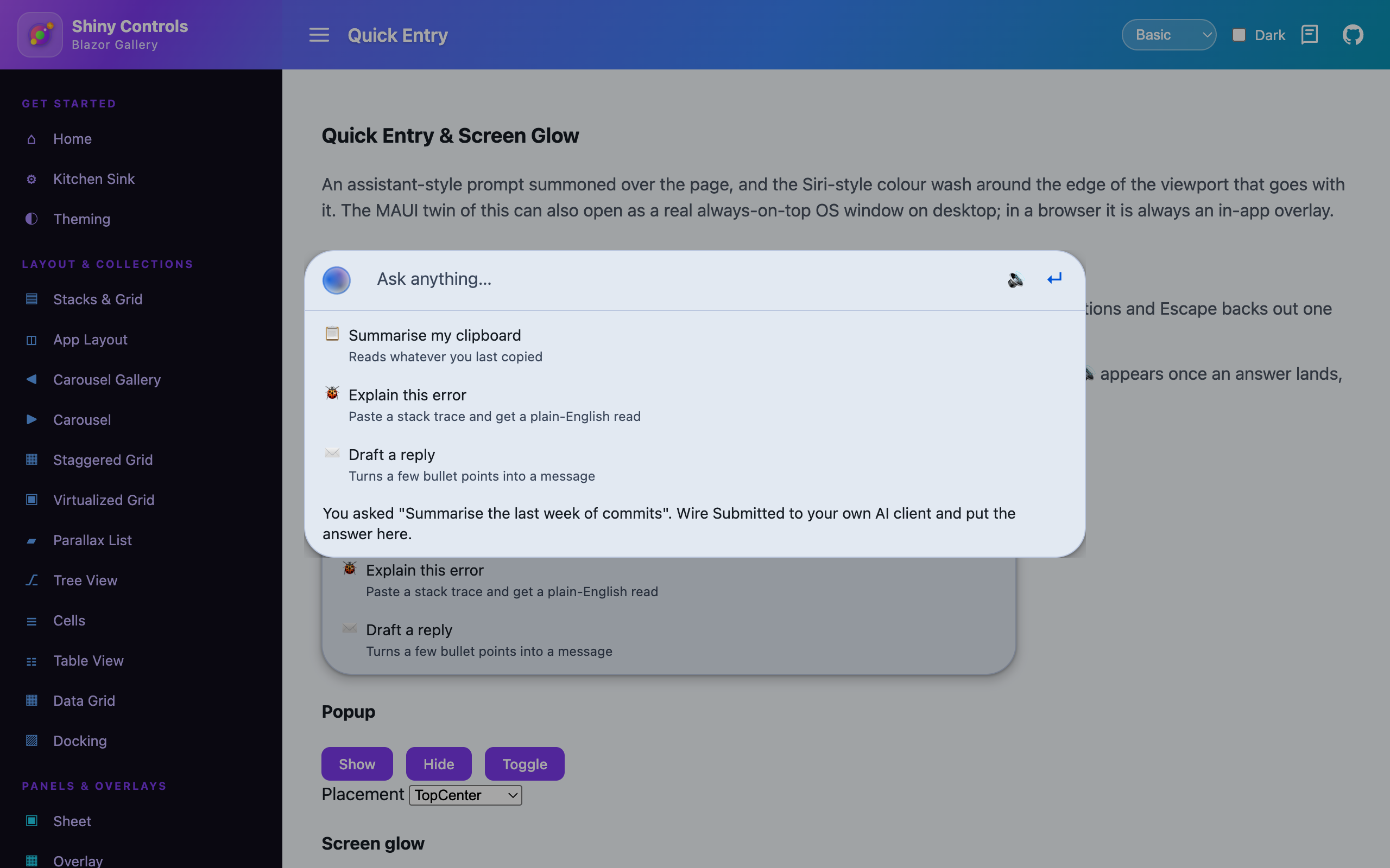
An assistant-style prompt summoned over whatever the user is looking at — PromptView in a popup — plus an optional Siri-style glow around the screen edge on the same service.
It ships in the core packages on both hosts, so it works everywhere out of the box:


Screenshots
Section titled “Screenshots”.NET MAUI
Section titled “.NET MAUI”Inline PromptView |
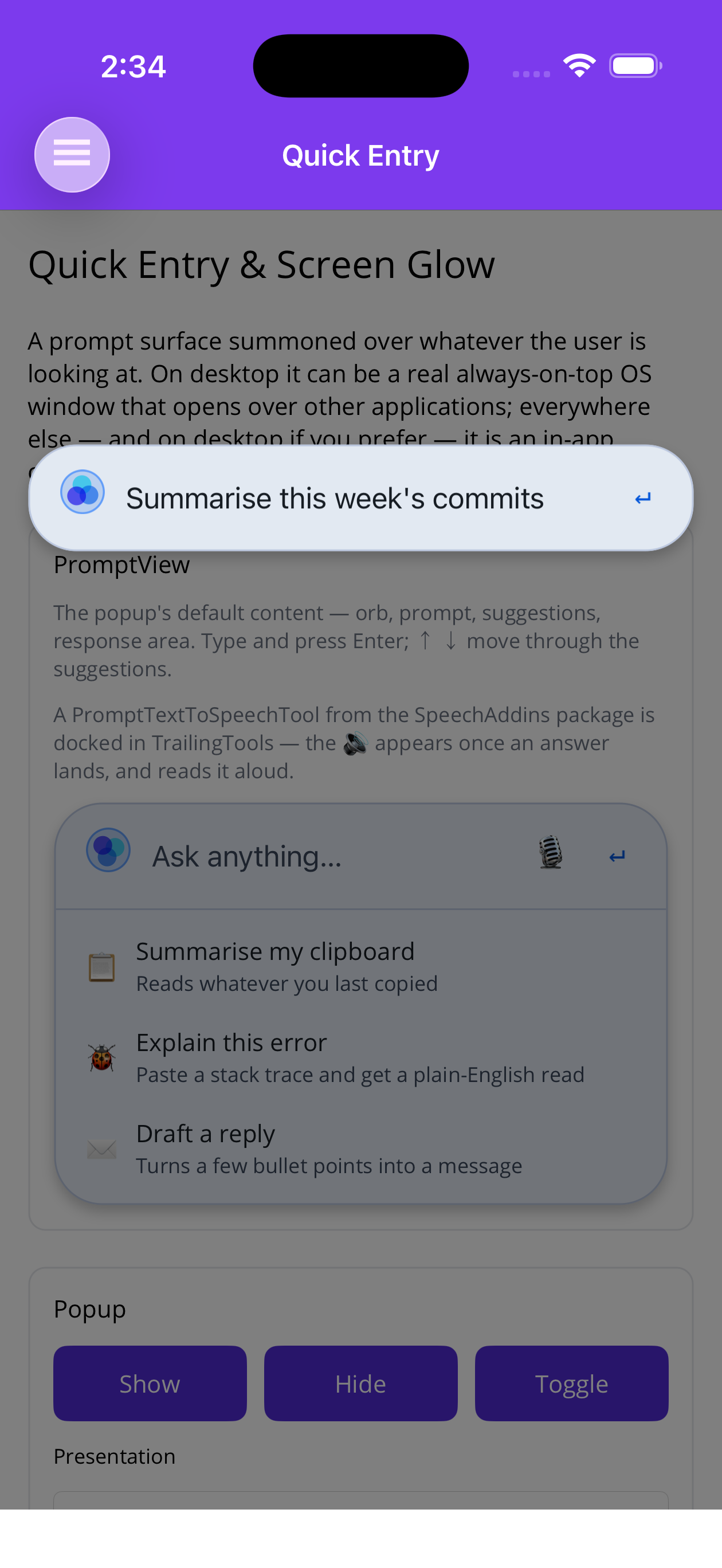
Popup over the page | Typing a prompt | Screen glow |
|---|---|---|---|
 |
 |
 |
 |
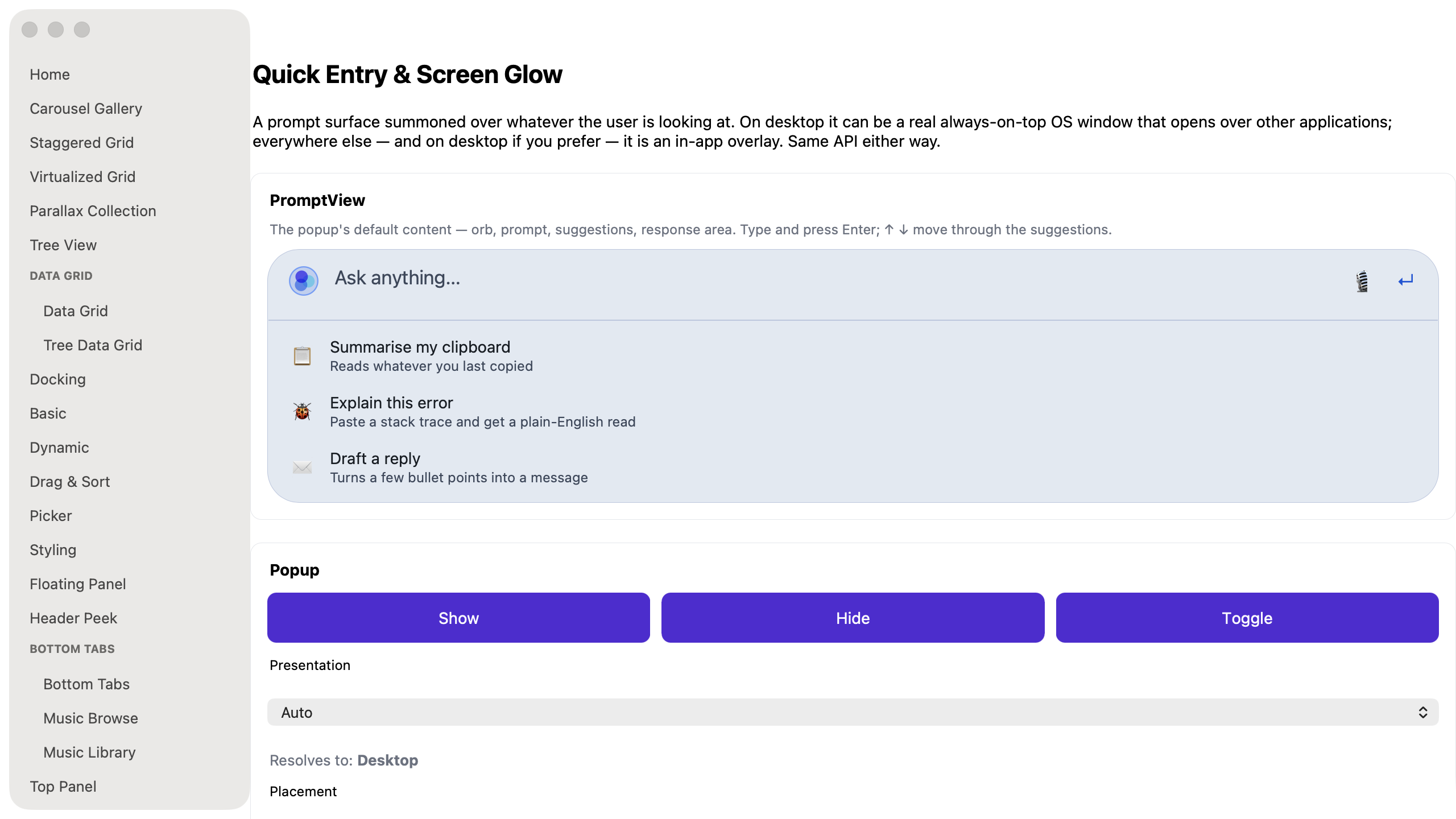
On desktop the same page resolves to the Desktop presentation, which opens a borderless always-on-top OS window instead of an in-app overlay:
| macOS |
|---|
 |
Blazor
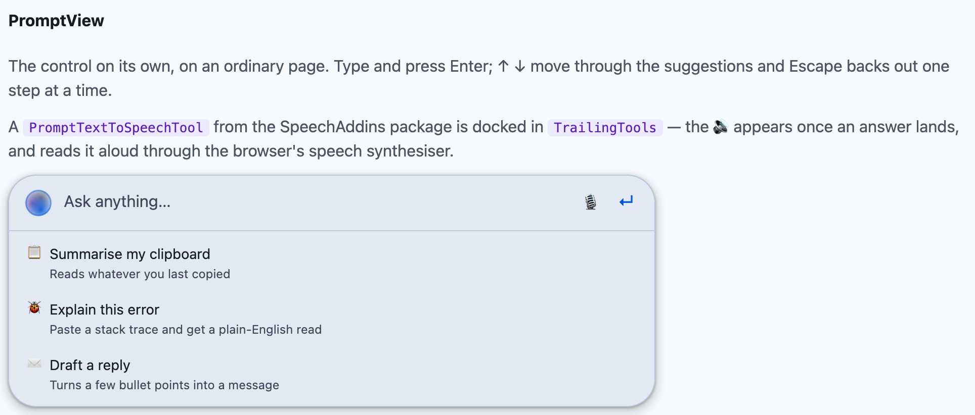
Section titled “Blazor”Inline PromptView |
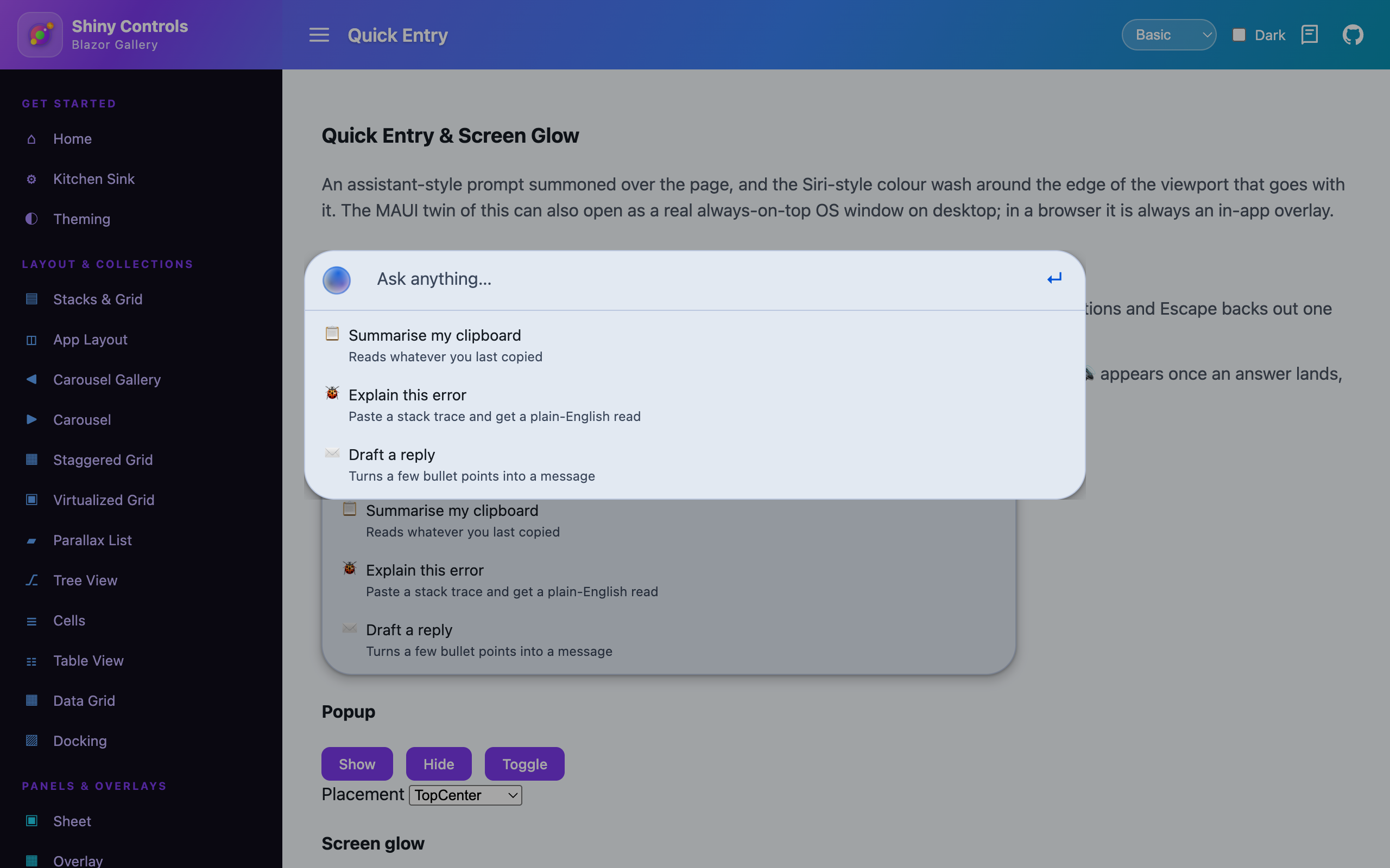
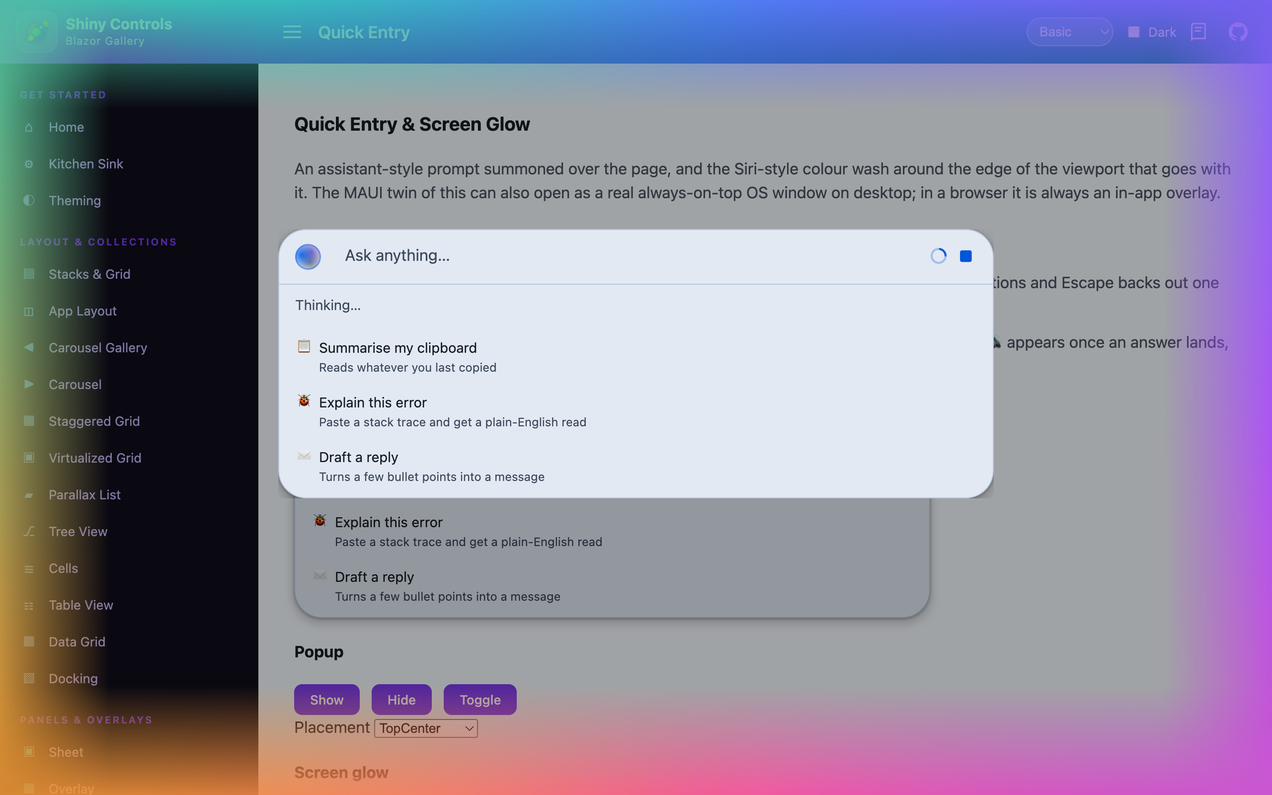
Popup over the page | Busy, with the screen glow | The answer |
|---|---|---|---|
 |
 |
 |
 |
Two presentations, one API
Section titled “Two presentations, one API”| Presentation | What it is | Where |
|---|---|---|
| In-app | An overlay drawn over the current page | Everywhere — iOS, Android, Mac Catalyst, Windows, macOS, Linux, Blazor |
| Desktop | A borderless, always-on-top OS window that opens over other applications | Windows, macOS (AppKit), Linux — with the Shiny.Maui.Controls.Desktop add-on |
QuickEntryOptions.Presentation picks between them:
Auto(the default) — the native window where one is available, the overlay everywhere else. One setting for a shared codebase, with no platform checks at the call site.InApp— always the overlay, including on desktop. Right for a popup that should stay inside your app rather than float over the whole machine.Desktop— force the OS window. Where it isn’t available it falls back to the overlay and logs why, rather than failing to open.
IQuickEntryService.ResolvedPresentation tells you which you actually got.
The in-app presentation is built on the library’s own Overlay control, so it shares the page’s OverlayHost backdrop with everything else that uses one — a popup opened over a floating panel dims the page once, not twice — and inherits the blur, the close-on-backdrop-tap and the show/hide worker. A page with no host gets one installed automatically.
MAUI — registered by UseShinyControls(), so this only changes the settings:
using Shiny;using Shiny.Maui.Controls.QuickEntry;
builder    .UseMauiApp<App>()    .UseShinyControls(cfg => cfg.ConfigureQuickEntry(o =>    {        o.Presentation = QuickEntryPresentation.Auto;        o.Placement    = QuickEntryPlacement.TopCenter;        o.ScreenGlow   = ScreenGlowTrigger.WhileBusy;    }));
For a real desktop window — and global hotkeys — add the desktop package and one more call:
dotnet add package Shiny.Maui.Controls.Desktopbuilder .UseShinyControls(cfg => cfg.ConfigureQuickEntry(o => o.HotKey = "Ctrl+Alt+Space")) .UseDesktopQuickEntry();Safe to call unconditionally: on Mac Catalyst and anywhere else that isn’t a desktop, the presenters report themselves unsupported and the core service quietly stays with the overlay.
Blazor — registered by AddShinyControls(), plus one host component in the root layout:
services.AddShinyControls(cfg => cfg.ConfigureQuickEntry(o =>{ o.Placement = QuickEntryPlacement.TopCenter; o.ScreenGlow = ScreenGlowTrigger.WhileBusy;}));{/* MainLayout.razor */}<QuickEntryHost />Driving the popup
Section titled “Driving the popup”public class QuickEntryHost(IQuickEntryService quickEntry){ public async Task StartAsync() { // Optional: builds the native window ahead of time so the first open is instant await quickEntry.PreloadAsync(); }
public void OnTrayIconClicked() => quickEntry.Toggle();}| Member | Notes |
|---|---|
Show() / Hide() / Toggle() |
Toggle is what a hotkey, tray click or button binds to |
PreloadAsync() (MAUI) |
Builds the popup ahead of first use — also how you reach Content before the user opens anything |
Resize(width, height) (MAUI) |
Manual sizing. Height is clamped to MaxHeight |
ResolvedPresentation |
Which presentation you actually got, with Auto and any fallback applied |
IsOpen · Content |
Content is the hosted view — cast to PromptView to wire it up |
ShowGlow() · HideGlow() · PulseGlowAsync() |
The screen glow lives on this same service |
Opened / Closed |
Raised however the popup was dismissed |
In desktop presentation the popup is a real window, so it does not grow to fit its content the way an overlay would — AutoSize (on by default) follows the content’s height for you, clamped between CollapsedHeight and MaxHeight. In-app none of that applies: the overlay is laid out by the page and MaxHeight is simply a ceiling.
Options
Section titled “Options”| Property | Default | Notes |
|---|---|---|
HotKey |
null |
Desktop only. Accelerator that toggles the popup |
Width |
720 |
Device-independent pixels |
CollapsedHeight |
76 |
Height with just the prompt row |
MaxHeight |
560 |
Ceiling for auto-sizing |
Placement |
TopCenter |
TopCenter · BottomCenter · Center · NearCursor · Manual. In-app, NearCursor reads as centred — a touch screen has no pointer. Blazor has only the first three |
TopMarginRatio |
0.18 |
Top edge as a fraction of the screen for TopCenter |
BottomMarginRatio |
0.12 |
Gap below the popup for BottomCenter, as a fraction of the working area |
X / Y |
0 |
Screen coordinates for Manual |
AutoSize |
true |
Follow the content’s measured height |
DismissOnFocusLost |
true |
Close when another application takes focus |
DismissOnEscape |
true |
Content gets first refusal — see Keyboard |
ActivateOnShow |
true |
Take keyboard focus. Turn off for a passive HUD |
ShowInTaskbar |
false |
Desktop only; applied when the native window is created |
JoinAllSpaces |
true |
macOS desktop presentation: appear on every Space and over full-screen apps |
ContentFactory |
null |
Builds the content. Defaults to a new PromptView |
RecreateContentOnShow |
false |
Off, so a half-typed prompt survives an accidental dismiss |
ScreenGlow |
None |
None · WhileOpen · WhileBusy |
Glow |
— | The glow’s appearance: thickness, palette, speed, intensity, blob count, layers, frame rate |
ScrimColor · DismissOnScrimTap |
35% black · true |
In-app only — the backdrop, and the touch equivalent of DismissOnFocusLost |
Placement is resolved against the screen under the mouse pointer, so the popup follows the user across a multi-monitor setup rather than pinning itself to the app’s window.
PromptView
Section titled “PromptView”The popup’s default content: an animated orb, a single-line prompt, and an area beneath it that expands for suggestions and a response.
It does no AI itself. It raises Submitted and leaves the request to you — which is what keeps it usable with any client, local or hosted.
var prompt = (PromptView)quickEntry.Content!;
prompt.Suggestions = new List<PromptSuggestion>{    new("Summarise my clipboard", "Reads whatever you last copied", "📋"),    new("Explain this error",     "Paste a stack trace",            "🐞"),    new("Draft a reply",          "Bullet points in, message out",  "✉️")};
prompt.Submitted += async (_, e) =>{    prompt.ResponseContent = null;    prompt.IsBusy = true;
    var answer = await chatClient.GetResponseAsync(e.Text);
    prompt.IsBusy = false;    prompt.ResponseContent = new MarkdownView { Markdown = answer.Text };};
prompt.Cancelled += (_, _) => cts.Cancel();
It is an ordinary ContentView, so it also works inline on a normal page — including on iOS and Android, where the popup itself does not exist:
<ContentPage xmlns:qe="clr-namespace:Shiny.Maui.Controls.Desktop.QuickEntry;assembly=Shiny.Maui.Controls.Desktop"> <qe:PromptView Placeholder="Ask anything…" Text="{Binding Prompt}" IsBusy="{Binding IsThinking}" SubmitCommand="{Binding AskCommand}" ShowMicrophone="True" MicrophoneCommand="{Binding DictateCommand}" /></ContentPage>| Property | Notes |
|---|---|
Text |
The prompt. Two-way by default |
Placeholder |
Default "Ask anything…" |
Icon |
An ImageSource in place of the built-in animated orb |
IconContent |
Any view in the leading slot. Wins over Icon |
ShowIcon · IconSize |
Hide the slot entirely, or resize the orb/image. Default true · 26 |
IsBusy / BusyText |
Spins the orb, shows a spinner, swaps submit for a stop button |
Suggestions |
Honours INotifyCollectionChanged, so an ObservableCollection updated as the user types behaves like autocomplete |
SuggestionTemplate |
Render your own rows; the binding context is the item |
MaxVisibleSuggestions |
Default 6 — it is a HUD, not a list view |
DropdownContent |
Any view for the expanding area under the prompt — a command palette, recent items, your own list. Renders above Suggestions, so both can be used together |
DropdownHeight |
Unset (-1) sizes the dropdown to its content and the window follows. Set a value to pin it and scroll instead — right for a list that changes length as the user types |
Response |
The answer as plain text, rendered in a built-in label. This is what a read-aloud tool speaks |
ResponseContent |
Any View. Wins over Response; null collapses the area |
Footer |
Optional bottom strip — a model picker, a keyboard legend |
LeadingTools · TrailingTools |
IList<PromptTool>, created for you. Leading sits beside the orb, trailing before the microphone and submit glyphs |
SubmitCommand · SuggestionCommand · MicrophoneCommand |
Command equivalents of the events |
ShowMicrophone |
Default false — there is no speech engine in this package |
ShowSubmitButton · ClearOnSubmit |
Both default true |
AccentColor, SurfaceColor, OutlineColor, TextColor, PlaceholderColor, SubtleTextColor, HighlightColor, CornerRadius, PromptFontSize |
The colours default to app-theme bindings, so they follow light/dark until you assign one |
Events: Submitted (carrying Text and the chosen Suggestion, or null for a typed submit), SuggestionSelected, Cancelled, ResponseChanged.
LeadingTools and TrailingTools are the prompt-bar equivalent of TextEntry’s tool slots. PromptTool shares the IconTextTool base with TextEntryTool, so Text, Icon, ToolColor, FontSize, Command / CommandParameter and Clicked behave the same way.
<qe:PromptView> <qe:PromptView.TrailingTools> <speech:PromptTextToSpeechTool AutoSpeak="True" /> <qe:PromptTool Text="⚙" Command="{Binding SettingsCommand}" /> </qe:PromptView.TrailingTools></qe:PromptView>A tool that needs to read or drive the prompt implements IPromptAwareTool:
public class MyTool : PromptTool, IPromptAwareTool{    PromptView? prompt;
    void IPromptAwareTool.Attach(PromptView view)    {        this.prompt = view;        this.prompt.ResponseChanged += this.OnResponse;    }
    void IPromptAwareTool.Detach()    {        if (this.prompt is not null)            this.prompt.ResponseChanged -= this.OnResponse;
this.prompt = null; }}Read aloud
Section titled “Read aloud”PromptTextToSpeechTool, in Shiny.Maui.Controls.SpeechAddins and Shiny.Blazor.Controls.SpeechAddins, speaks the answer through Shiny.Speech. It hides itself while there is nothing to read and turns into a stop button while it is speaking.
prompt.TrailingTools!.Add(new PromptTextToSpeechTool { AutoSpeak = true });
prompt.Submitted += async (_, e) =>{ prompt.IsBusy = true; prompt.Response = await AskAsync(e.Text); // Response, not ResponseContent prompt.IsBusy = false;};| Property | Notes |
|---|---|
AutoSpeak |
Read the answer the moment it lands, instead of waiting for a tap. Default false |
HideWhenEmpty |
Hide the tool until there is something to read. Default true |
TextSelector |
Func<PromptView, string?>. Needed when the answer only lives in ResponseContent |
SpeechRate · Pitch · Volume · VoiceName · Culture |
Passed through to TextToSpeechOptions |
SpeakingText · SpeakingColor |
The stop-state glyph and tint |
Register the engine with AddSpeechServices() (or just AddTextToSpeech()). See Speech Add-ons.
Keyboard
Section titled “Keyboard”MAUI has no cross-platform key-down event, so the popup host reads keys off the native window and hands them to its content.
- ↑ / ↓ walk the suggestions, wrapping back to the prompt at either end
- Enter submits, or picks the highlighted suggestion
- Escape unwinds one layer of state at a time — cancel the request, drop the highlight, clear the response, clear the prompt — and only then falls through to the host, which closes the popup
Custom content takes part by implementing IQuickEntryKeyHandler:
public class MyPopupContent : ContentView, IQuickEntryKeyHandler{ // return true to swallow the key; false lets the host act on it public bool HandleKey(QuickEntryKey key) => key == QuickEntryKey.Tab && this.CycleSection();}Three more optional hooks: IQuickEntryPresentationAware (OnQuickEntryOpened / OnQuickEntryClosed), IQuickEntryBusyState (lets the glow’s WhileBusy trigger see your content’s working state), and IQuickEntryAutoSize (GetDesiredHeight(width) + DesiredHeightChanged). PromptView implements all of them.
Blazor
Section titled “Blazor”Same control, same service, no OS window. <PromptView> takes ordinary parameters:
<PromptView Width="640" @bind-Text="prompt" Placeholder="Ask anything…" IsBusy="busy" Suggestions="suggestions" Response="@answer" Submitted="OnSubmitted" />The popup’s own prompt is configured through the service instead, because a service cannot hand a component parameters directly — the two meet at PromptViewState:
@inject IQuickEntryService QuickEntry
@code {    protected override void OnInitialized() => QuickEntry.ConfigurePrompt(prompt =>    {        prompt.Suggestions = suggestions;        prompt.Submitted += async (_, e) =>        {            prompt.IsBusy = true;            prompt.Response = await AskAsync(e.Text);            prompt.IsBusy = false;        };    });}
Blazor tools are plain objects rather than components, so a tool can be built in a view model and handed over as a parameter — which is also the only way the popup’s own prompt gets one:
<PromptView Response="@answer" TrailingTools="tools" />
@code {    readonly List<PromptTool> tools = new() { new PromptTextToSpeechTool() };
    protected override void OnInitialized() => QuickEntry.ConfigurePrompt(prompt =>        prompt.TrailingTools.Add(new PromptTextToSpeechTool()));}
PromptViewState.LeadingTools / TrailingTools are ObservableCollection<PromptTool>, so a tool added after the popup has been built still appears. Override OnAttached / OnDetached in place of IPromptAwareTool — both hand over Prompt and the app’s Services, so a tool can resolve what it needs without the hosting page wiring it — and call RefreshAsync() after changing the tool’s own glyph.
SetContent(RenderFragment) replaces the built-in prompt with your own markup for every open; Show(RenderFragment) does it for one.
Global hotkeys
Section titled “Global hotkeys”Desktop only, and registered by UseDesktopQuickEntry() — a system-wide key grab does not exist on mobile or in a browser. Useful on its own:
var registration = hotKeys.Register("Ctrl+Shift+K", () => ToggleRecording());if (registration == null){ // Could not be claimed. A normal outcome, not an exception: unsupported platform, // unparseable string, or another application already owns the combination.}The callback is marshalled to the UI thread, so it is safe to touch MAUI objects directly. Dispose the registration to release the key.
Accelerators use the same grammar as tray menu accelerators — modifiers joined with +, then the key: "Ctrl+Alt+Space", "Cmd+Shift+K", "Ctrl+F12". Recognised modifiers are Ctrl/Control, Alt/Option/Opt, Shift, and Cmd/Command/Meta/Win/Super.
| Platform | Mechanism | Notes |
|---|---|---|
| Windows | RegisterHotKey on a message-only window |
Reliable. Fails if another process owns the combination |
| macOS (AppKit) | Carbon RegisterEventHotKey |
No Accessibility permission prompt, unlike an NSEvent global monitor |
| Linux / X11 | XGrabKey on the root window |
Grabbed with every lock-modifier combination, so Caps/Num Lock do not break it |
| Linux / Wayland | org.freedesktop.portal.GlobalShortcuts |
GNOME 45+, KDE Plasma 6+ |
| MacCatalyst | — | Not supported |
Screen glow
Section titled “Screen glow”An animated colour wash around the edge of the display, click-through and always-on-top, so it never interrupts anything the user is doing.
cfg.ConfigureQuickEntry(o =>{ o.Glow.Thickness = 130; // how far the colour reaches in from the edge o.Glow.Palette = new List<Color> { Colors.DeepSkyBlue, Colors.MediumPurple, Colors.HotPink }; o.Glow.Speed = 0.22; // laps of the perimeter per second o.Glow.Intensity = 0.9; o.Glow.BlobCount = 5; // *minimum* pools; enough to rim the screen are always drawn o.Glow.Layers = 3; // falloff passes: more is a deeper edge and costs more o.Glow.FrameRate = 30;});Thickness is how far the colour reaches inward, and it is an absolute distance: 110 is a band around a desktop display and most of the width of a phone. Turn it down for a tight rim on a small screen.
BlobCount is a floor rather than the count. How many colour pools it takes to rim a screen without unlit gaps between them depends on the screen, so enough are always drawn — on a large display, well over five.
The glow is part of IQuickEntryService rather than a service of its own: the two are almost always used together, and splitting them meant an app wiring up an assistant had to resolve, configure and keep two objects in step for one visible behaviour. It works with no popup involved — for a listening, recording or long-running-job indicator of your own.
quickEntry.ShowGlow();quickEntry.HideGlow();await quickEntry.PulseGlowAsync(TimeSpan.FromSeconds(3)); // one-shot acknowledgementWire it to the popup with QuickEntryOptions.ScreenGlow:
| Name | Description |
|---|---|
None |
never (you can still drive it by hand) |
WhileOpen |
the whole time the popup is up |
WhileBusy |
only while the content reports itself working. This is the closest match to Siri, which lights the edge while listening and thinking rather than the whole time it is on screen. Works with PromptView.IsBusy out of the box; custom content implements IQuickEntryBusyState |
It rims the display in desktop presentation and the page in-app — the same thing on a phone, and not the same thing on a desktop with your app in a window. Availability differs from the popup, so check IsGlowSupported separately:
| Platform | How it is drawn |
|---|---|
| In-app, every platform | An overlay layer on the current page |
| macOS, Linux / X11 desktop | A transparent, click-through OS window |
| Windows desktop | A WinUI 3 window has no per-pixel alpha, so the glow is rendered with GDI+ into four layered Win32 windows, one per screen edge — which is also why the Windows glow has square corners rather than following a rounded display |
| Blazor | A CSS conic gradient masked to a band around the viewport |
| MacCatalyst, Linux / Wayland desktop | No whole-display glow; the in-app one is used instead |
The glow is a full-screen animation. FrameRate is the first thing to turn down on an older GPU, then Layers.
Wayland
Section titled “Wayland”Under Wayland a client is not allowed to position its own toplevel, raise itself above other windows, or grab the keyboard — and GTK 4 dropped gtk_window_move and set_keep_above to match. So on a Wayland session:
- The popup is still undecorated and transparent, but the compositor decides where it appears and it is an ordinary window in the stack
- Hotkeys go through the desktop portal. Binding shows the user a system confirmation dialog, so the hotkey starts working asynchronously after startup — and the trigger you pass is a preference: the compositor may bind something else, and the user can rebind it. Never present the configured accelerator as fact on Wayland
- The screen glow is unavailable
Under X11 everything behaves as it does on Windows and macOS. Where IGlobalHotKeyService.IsSupported is false, fall back to opening the popup from a tray icon.