


CoverFlowView
A Cover Flow carousel in the style of the classic album-art browser. The current item faces you in the centre, and the items on each side tilt toward it and stack up like records in a crate. Drag or flick to browse. Tapping a side item brings it to the centre, and tapping the centre item selects it.


Frameworks
.NET MAUI
Blazor
Screenshots
Section titled “Screenshots”MAUI (iOS)
| With reflection | Steeper angle, no reflection |
|---|---|
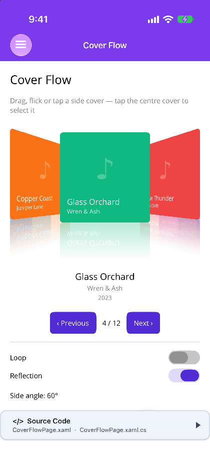 |
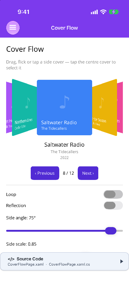 |
Blazor
| With reflection | Looping, 75° |
|---|---|
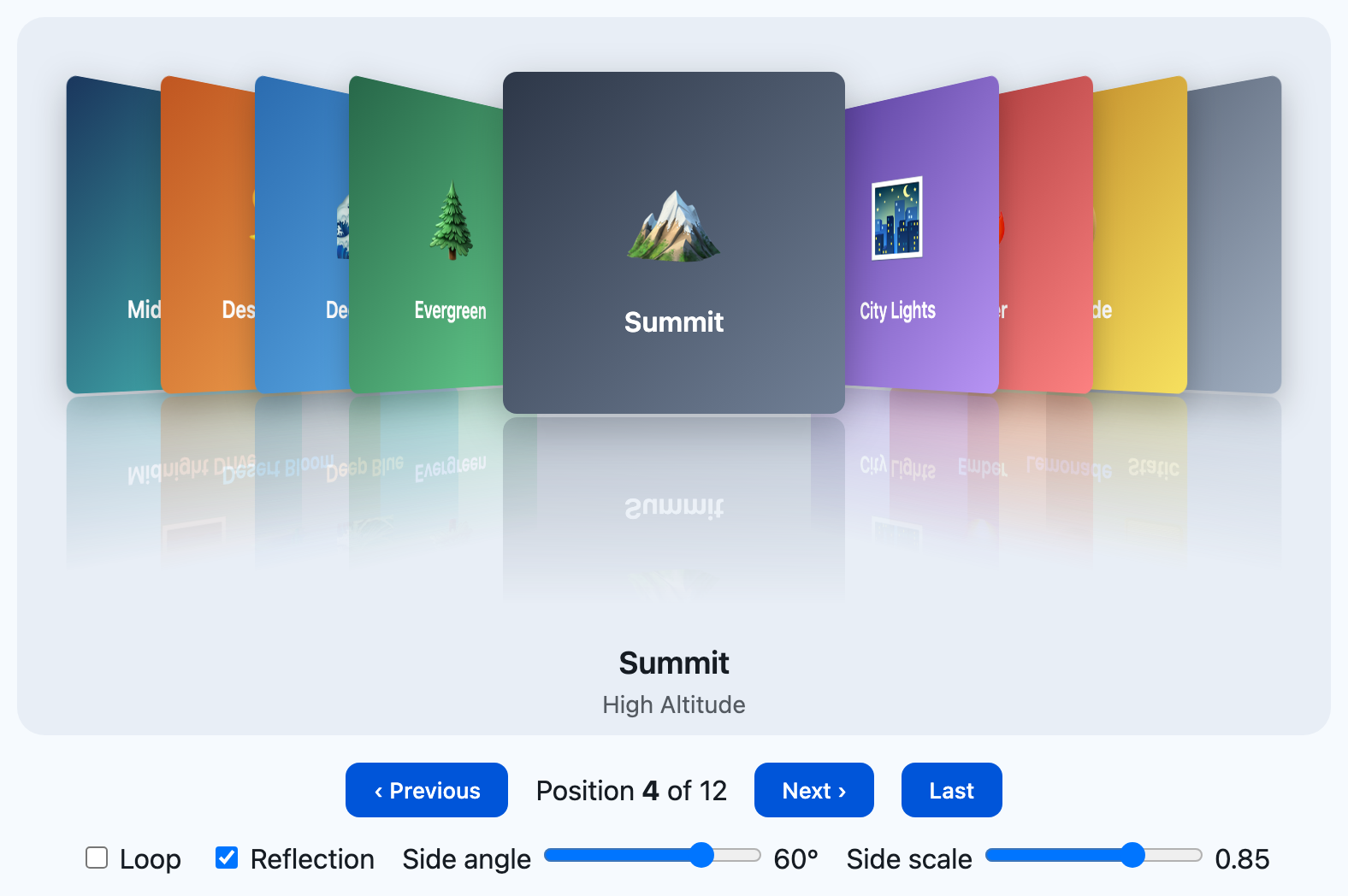 |
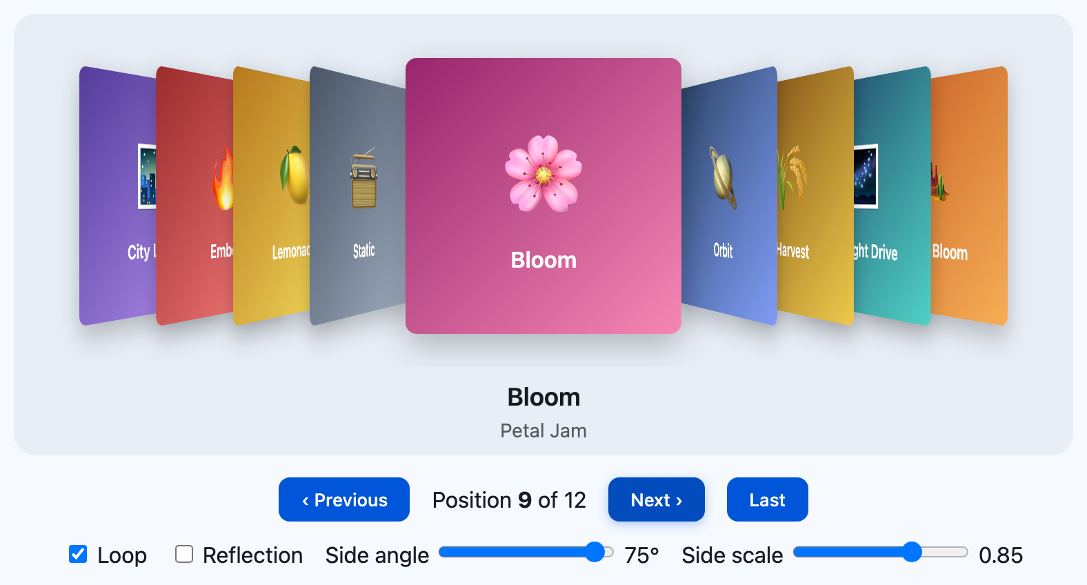 |
Features
Section titled “Features”| Feature | Description |
|---|---|
| 3D side stacks | Side items turn SideAngle degrees toward the centre, shrink to SideScale, and stack ItemSpacing apart. The first one sits CenterSpacing from the centre. |
| Drag & flick | The position follows your finger as a fractional number. When you let go, a flick carries on with momentum and settles on a whole item. Without Loop, dragging past either end stretches and springs back. |
| Tap to centre, tap to select | Tap a side item to bring it to the centre. Tap the centre item to raise ItemSelected. A drag is never treated as a tap. |
| Looping | Loop="true" wraps around, and GoTo takes the shorter way round. |
| Reflections | ShowReflection puts a mirrored copy under each item that fades out, at ReflectionOpacity. |
| Caption | CaptionTemplate is shown below the items for the centre item. |
| Virtualized | Only VisibleItems items on each side are created, so long lists stay cheap. |
| Same everywhere | MAUI uses plain cross-platform transforms with no native handler. Blazor drives CSS 3D transforms from a small JS engine. Both use the same geometry. |
AI Skill
Section titled “AI Skill”Step 1 — Add the marketplace:
claude plugin marketplace add shinyorg/skillsStep 2 — Install the plugin:
claude plugin install shiny@shinyOne plugin installs all 48 Shiny skills. Your agent loads only the skill relevant to what you're building, so there's no cost to having them all available.
Step 1 — Add the marketplace:
copilot plugin marketplace add https://github.com/shinyorg/skillsStep 2 — Install the plugin:
copilot plugin install shiny@shinyOne plugin installs all 48 Shiny skills. Your agent loads only the skill relevant to what you're building, so there's no cost to having them all available.
Quick Start
Section titled “Quick Start”.NET MAUI
Section titled “.NET MAUI”<shiny:CoverFlowView ItemsSource="{Binding Albums}" CurrentPosition="{Binding Position}" ItemWidth="180" ItemHeight="180" Loop="True" ShowReflection="True" ItemSelectedCommand="{Binding OpenAlbumCommand}"> <shiny:CoverFlowView.ItemTemplate> <DataTemplate x:DataType="local:Album"> <Image Source="{Binding Artwork}" Aspect="AspectFill" /> </DataTemplate> </shiny:CoverFlowView.ItemTemplate> <shiny:CoverFlowView.CaptionTemplate> <DataTemplate x:DataType="local:Album"> <Label Text="{Binding Title}" HorizontalTextAlignment="Center" /> </DataTemplate> </shiny:CoverFlowView.CaptionTemplate></shiny:CoverFlowView>Blazor
Section titled “Blazor”<CoverFlowView TItem="Album" Items="@albums" Loop="true" ShowReflection="true" @bind-CurrentPosition="position" ItemSelected="OpenAlbum"> <ItemTemplate Context="a"><img src="@a.Artwork" alt="@a.Title" /></ItemTemplate> <CaptionTemplate Context="a"><strong>@a.Title</strong> — @a.Artist</CaptionTemplate></CoverFlowView>Properties
Section titled “Properties”| Property | Type | Default | Description |
|---|---|---|---|
ItemsSource (MAUI) / Items (Blazor) |
IEnumerable / IReadOnlyList<TItem> |
— | The items |
ItemTemplate |
DataTemplate / RenderFragment<TItem> |
— | How each item is drawn |
CaptionTemplate |
DataTemplate / RenderFragment<TItem> |
null |
Shown below the items for the centre item |
ItemWidth / ItemHeight |
double |
200 / 200 |
Size of an item |
CurrentPosition |
int |
0 |
Index of the centre item. Two-way |
SideAngle |
double |
60 |
Degrees each side item turns toward the centre |
SideScale |
double |
0.85 |
Scale of a side item |
SideOpacity |
double |
1.0 |
Opacity of the farthest visible item |
CenterSpacing |
double |
130 |
Distance in px from the centre to the first side item. It is also how far you drag to move one item |
ItemSpacing |
double |
50 |
Distance in px between stacked side items |
VisibleItems |
int |
4 |
Items shown on each side |
Loop |
bool |
false |
Wrap around |
ShowReflection |
bool |
false |
Mirrored reflection under each item |
ReflectionOpacity |
double |
0.3 |
How strong the reflection is |
AnimationDuration |
int |
300 |
ms for one step. Longer jumps take up to twice as long |
IsSwipeEnabled |
bool |
true |
Turns dragging on or off. Taps and the methods still work |
Perspective |
double |
800 |
Blazor only. The CSS perspective distance in px |
EmptyTemplate / AriaLabel |
Blazor only |
Events, commands & methods
Section titled “Events, commands & methods”| MAUI | Blazor | Description |
|---|---|---|
PositionChanged / PositionChangedCommand |
CurrentPositionChanged |
Raised once each time it settles on a new index |
ItemSelected / ItemSelectedCommand |
ItemSelected |
The centre item was tapped (or, on Blazor, Enter/Space was pressed) |
Next() / Previous() |
NextAsync() / PreviousAsync() |
Move one item |
GoTo(index, animate) |
GoToAsync(index, animate) |
Jump to an item |
- On MAUI, a tap with no position (an accessibility activation, or UI automation) counts as a tap on the centre item and selects it.
- On MAUI, tapping the centre while a move is still settling (straight after a swipe, Next, or a
CurrentPositionchange) finishes the move and selects the cover arriving there; a tap on any other cover goes to that cover. On Blazor, a press during a move catches it where it is, as a finger would, and it settles from there. - Item templates are for display. The control handles every tap itself, so a button inside an item does not get the tap.
- On MAUI, the reflection fades into the theme’s Surface colour, so place the control on a Surface background. On Blazor, the reflection uses a CSS
mask-imageand works on any background. - On Blazor, ←/→, Home/End and Enter/Space work when the control has focus. A horizontal trackpad swipe and Shift+wheel also scroll, and
prefers-reduced-motionturns off the animation.