


ZoomPanView
Wraps any content in pinch-to-zoom, pan and double-tap zoom — a StackLayout, a chart, a form, a table, a Grid of anything at all. Not only a picture.


| MAUI (iOS) | Blazor | Blazor, zoomed to 2× |
|---|---|---|
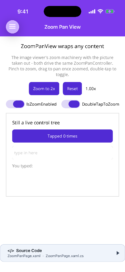 |
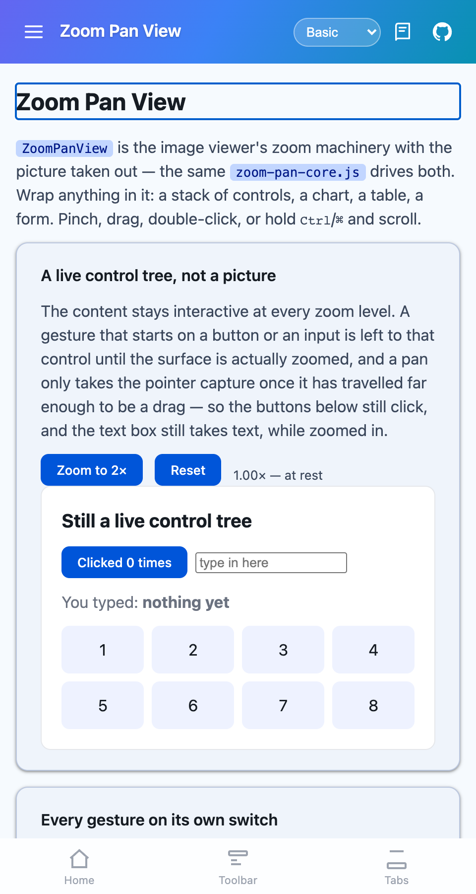 |
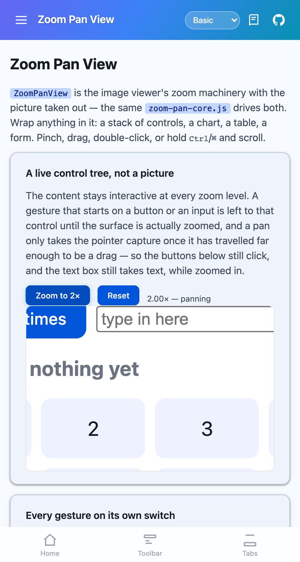 |
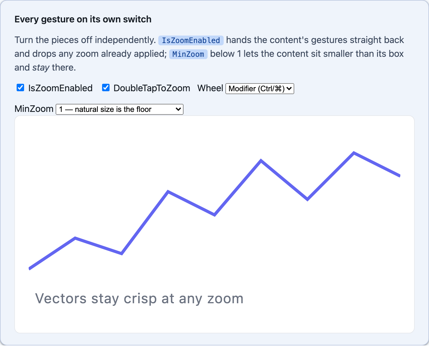
| Blazor — every gesture on its own switch |
|---|
 |
What it is
Section titled “What it is”This is ImageViewer’s zoom machinery with the picture taken out. Both hosts share one implementation with the viewer — ZoomPanController on MAUI, zoom-pan-core.js on Blazor — so the pan limits and the gesture arbitration are one piece of code rather than two.
What differs is the purpose. ImageViewer is a full-screen lightbox you open; ZoomPanView is an inline surface that stays where you put it and clips its content to its own bounds.
MAUI
<shiny:ZoomPanView MaxZoom="4"> <VerticalStackLayout Padding="20" Spacing="12"> <Label Text="Pinch me" /> <Button Text="Still clickable" Command="{Binding TapCommand}" /> </VerticalStackLayout></shiny:ZoomPanView>Blazor
<ZoomPanView MaxZoom="4" @bind-ZoomLevel="zoom"> <div> <h3>Pinch me</h3> <button @onclick="() => clicks++">Still clickable</button> </div></ZoomPanView>The content stays live
Section titled “The content stays live”Zoom is a render transform, so the content keeps its laid-out size: nothing re-flows, and no measure pass runs while a pinch is in progress. What is inside stays interactive at every scale — and two rules are what make that true rather than merely hoped for.
The pan gesture is only attached while the content is actually zoomed. A pan recognizer on a container competes with everything inside it, so at rest the content owns its gestures outright. On Blazor the same trade is made with touch-action, which is only claimed once there is somewhere to pan — otherwise a ZoomPanView in the middle of a long page would take scrolling away from it.
On Blazor a gesture that starts on a control is left to that control until the surface is zoomed, and a pan takes the pointer capture only once the pointer has travelled far enough to be a drag rather than a click. Capturing on pointerdown instead would swallow the click on every button inside.
Parameters
Section titled “Parameters”| Parameter | Type | Default | Notes |
|---|---|---|---|
MinZoom |
double |
1 |
Below 1 the content may sit smaller than its box — and stay there. Only a reset or a double-tap-out returns it to 1 |
MaxZoom |
double |
5 |
|
ZoomLevel |
double |
1 |
Two-way bindable. Writing it zooms; every gesture reports back through it |
IsZoomed |
bool |
false |
Read-only. Scaled past natural size — the same thing as “there is something to pan” |
IsZoomEnabled |
bool |
true |
Turns every gesture off without unbinding anything, and drops any zoom already applied |
DoubleTapToZoom |
bool |
true |
Off when the content wants double taps of its own |
DoubleTapZoom |
double |
2.5 |
Capped by MaxZoom |
AnimationLength |
int |
250 |
Milliseconds. Zero snaps |
WheelMode |
ZoomPanWheelMode |
Modifier |
Blazor only. Disabled / Modifier (Ctrl or ⌘ — also what a trackpad pinch sends) / Always |
UseFeedback |
bool |
false |
MAUI only. Platform feedback on a double tap |
Methods and events
Section titled “Methods and events”ResetZoomAsync() animates back to natural size and position. ZoomToAsync(zoom) animates to a scale, clamped into the limits — on MAUI it also takes an optional focus Point in the view’s own coordinates, which keeps that point where it is.
ZoomChanged carries a ZoomPanChangedEventArgs(ZoomLevel, IsZoomed) on every change of scale, mid-pinch included. MAUI adds ZoomChangedCommand.
Platform notes
Section titled “Platform notes”- Wheel zoom is Blazor-only. MAUI has no equivalent cross-platform hook for a scroll wheel over a view, so on a desktop MAUI head the gestures are pinch (trackpad), double-tap, and the programmatic API.
- A
ZoomPanViewinside aScrollViewshares the drag with it. Give it a fixed height and keep it out of the scroll direction where you can, or drive the zoom fromZoomLevelinstead.
Known gap: clipping on iOS
Section titled “Known gap: clipping on iOS”A zoomed surface is not clipped to the control’s bounds on iOS. The zoom itself is correct — the content scales, stays interactive, and reports its level — but content scaled past the control’s box paints over whatever is laid out around it instead of being cut off at the edge. Neither IsClippedToBounds on the control, an explicit Clip geometry, nor an inner Layout with IsClippedToBounds holds a scaled child in on that platform, and an enclosing Border does not either. Blazor clips correctly, so this is an iOS-only gap.
Until it is resolved, give a MAUI ZoomPanView room around it, or keep MaxZoom low enough that the overflow does not reach neighbouring content.
Step 1 — Add the marketplace:
claude plugin marketplace add shinyorg/skillsStep 2 — Install the plugin:
claude plugin install shiny@shinyOne plugin installs all 48 Shiny skills. Your agent loads only the skill relevant to what you're building, so there's no cost to having them all available.
Step 1 — Add the marketplace:
copilot plugin marketplace add https://github.com/shinyorg/skillsStep 2 — Install the plugin:
copilot plugin install shiny@shinyOne plugin installs all 48 Shiny skills. Your agent loads only the skill relevant to what you're building, so there's no cost to having them all available.