


Tooltip
Tooltip is a themed bubble that points at a target. It either wraps the thing it describes or
points at something else, and it is drawn above the page rather than in the tree — so it is never
clipped by the scroll view, card or grid cell its target lives in.


Screenshots
Section titled “Screenshots”MAUI (iOS)
| Wrapping a control | Placement | Bound to a view-model | Styled |
|---|---|---|---|
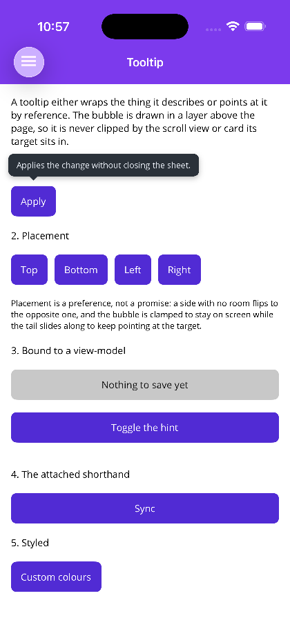 |
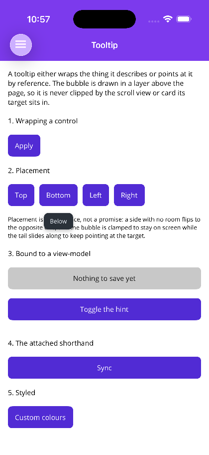 |
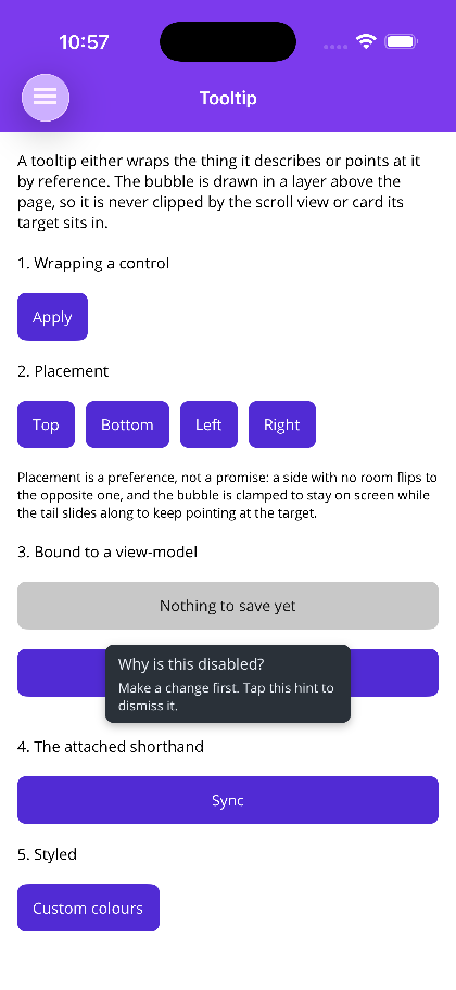 |
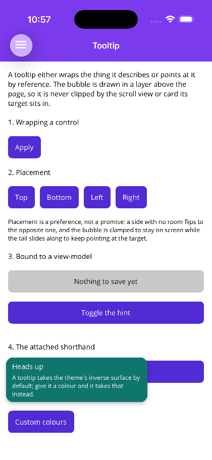 |
Blazor
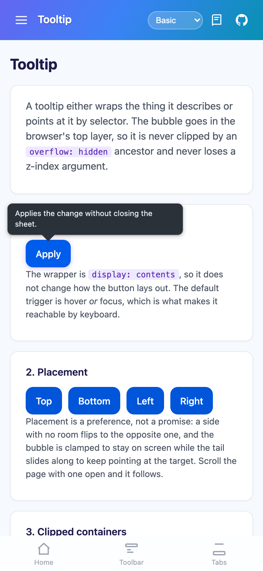
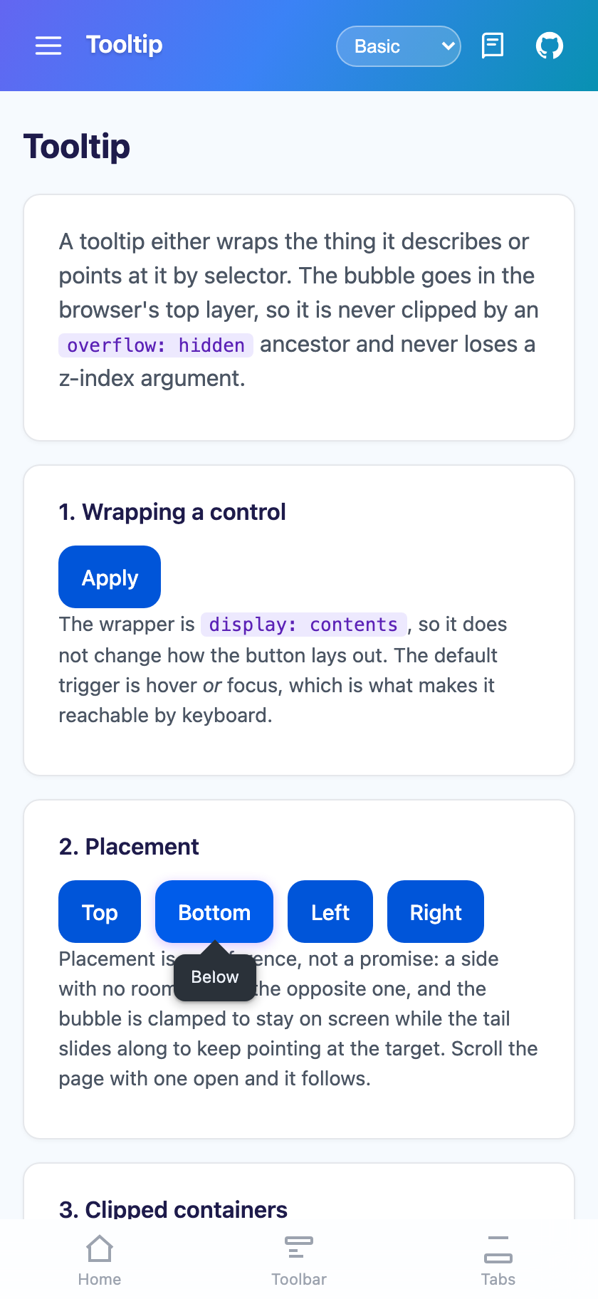
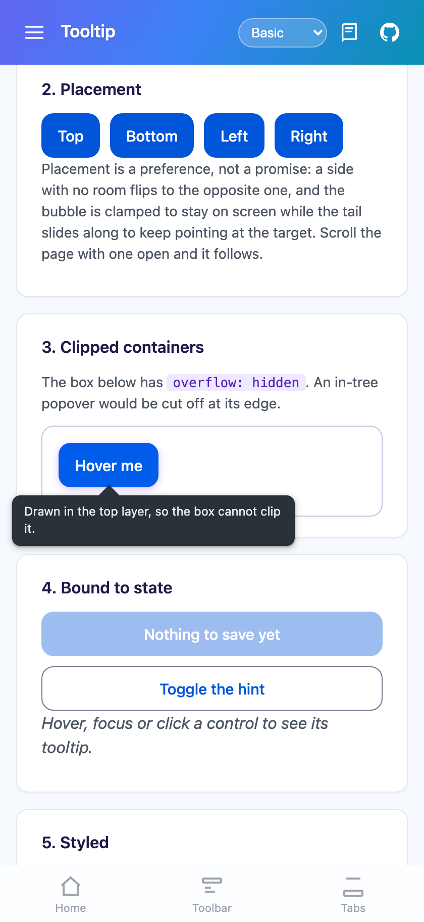
| Wrapping a control | Placement | Never clipped |
|---|---|---|
 |
 |
 |
Features
Section titled “Features”- Two shapes — wrap the control, or point at one by reference (MAUI) or CSS selector (Blazor)
- Auto-flipping placement — a side with no room flips to its opposite, then to the roomiest of the four
- A tail that keeps pointing — it slides along the bubble’s edge after clamping, so it still aims at the target the bubble was moved away from
- Never clipped — a page-level layer on MAUI, the browser’s top layer on Blazor
- Triggers — manual, tap/click, long-press, hover, focus
- Follows its target — re-places while open when the page scrolls or resizes
- Themed — takes the theme’s inverse surface by default, and follows a live theme swap
- Templated content —
ContentTemplate(MAUI) orBubbleContent(Blazor) instead of title and text - An attached shorthand on MAUI for places an element does not fit
xmlns:shiny="http://shiny.net/maui/controls"
<!-- 1. Wrapping: it finds its own target, and the wrapper does not disturb the layout. --><shiny:Tooltip Text="Saves without closing" Placement="Top" Trigger="LongPress">    <Button Text="Apply" /></shiny:Tooltip>
<!-- 2. Anchored and bound: it does not have to sit near its target in the markup. --><shiny:Tooltip Target="{x:Reference SaveButton}"               Title="Why is this disabled?"               Text="Make a change first. Tap this hint to dismiss it."               Placement="Bottom"               ShowTail="True"               IsOpen="{Binding ShowSaveHint}"               Command="{Binding DismissHint}" />
The attached shorthand
Section titled “The attached shorthand”For a one-liner where an element does not fit — inside a DataTemplate or a cell, where {x:Reference}
cannot see out anyway:
<Button Text="Sync" shiny:TooltipProperties.Text="Pushes local changes to the server" shiny:TooltipProperties.Placement="Right" shiny:TooltipProperties.Trigger="LongPress" />It builds a real Tooltip behind the scenes and drives it from the target’s own lifecycle. Reach for the
element form when you need binding, templated content or a command.
Blazor
Section titled “Blazor”@* 1. Wrapping. The wrapper is display:contents, so layout is untouched. *@<Tooltip Text="Saves without closing" Placement="TooltipPlacement.Top"> <ShinyButton Text="Apply" /></Tooltip>
@* 2. Anchored by selector, bound. *@<Tooltip Target="#save" Title="Why is this disabled?" Text="Make a change first." Placement="TooltipPlacement.Bottom" Trigger="TooltipTrigger.Manual" @bind-IsOpen="showHint" Clicked="OnHintClickedAsync" />Differences from MAUI:
Targetis a CSS selector string, resolved each time the bubble opens.TriggeraddsHoverOrFocus, which is the default and the accessible one — a hover-only tooltip is unreachable by keyboard.TapisClick;LongPressis the touch equivalent of hover.ClickedreplacesCommand;DismissOnClickreplacesDismissOnTap.MaxWidth,BubbleColorandTextColorare CSS strings.- Methods are async:
ShowAsync(),HideAsync(),ToggleAsync(). - There is no
DismissOnTapOutside: the bubble is in the top layer and never blocks the page.
Placement is a preference, not a promise
Section titled “Placement is a preference, not a promise”Four rules, applied in order. Auto prefers below, then above, then right, then left.
- A side with no room flips to its opposite.
- If neither fits, the roomiest side wins.
- The bubble is clamped to stay inside
ScreenMargin. - The tail slides along the bubble’s edge to keep pointing at the target, pulled in from the corners so it always meets a straight edge rather than detaching on a curve.
So Placement="Left" on a control hard against the left edge gives a bubble on the right. That is
deliberate — a tooltip you cannot read is worse than one on the other side.
On MAUI this is TooltipPlacementSolver, which is public and pure: rects in, rects out. On Blazor the same
rules run in the tooltip module, because placement needs the bubble’s rendered size and measuring that from
.NET would mean a round trip per candidate side.
Not being clipped
Section titled “Not being clipped”The bubble is never drawn where the tooltip is declared.
- MAUI — it goes into a layer above the page’s content, shared with the walkthrough and dialogs, so a
target inside a
ScrollView, aBorderor a grid cell gets a bubble that escapes all of them. - Blazor — it goes into the browser’s top layer via the popover API, which escapes both
overflow: hiddenancestors and every z-index argument on the page. Browsers without the API fall back to fixed positioning, which still works but can be trapped by a transformed ancestor’s containing block.
Properties
Section titled “Properties”| Property | Default | Notes |
|---|---|---|
Text / Title |
null |
Body, and an optional bold heading |
ContentTemplate (MAUI) / BubbleContent (Blazor) |
null |
Replaces the title/text pair |
Target |
null |
{x:Reference} on MAUI, a CSS selector on Blazor. Defaults to the wrapped content |
TargetName |
null |
MAUI only — x:Name through the name scope |
IsOpen |
false |
Two-way. Not IsVisible |
Trigger |
Manual (MAUI) / HoverOrFocus (Blazor) |
On MAUI, Tap anchors through Clicked for a Button / ImageButton |
Placement |
Auto |
Top / Bottom / Left / Right / Center |
ShowTail / TailSize |
true / 7 |
Always off for Center |
ShowDelay |
0 (MAUI) / 120 (Blazor) |
ms a trigger must persist |
AutoDismissDelay |
0 |
ms before it closes itself |
LongPressDelay |
450 |
|
DismissOnTap / DismissOnClick |
true |
|
DismissOnTapOutside |
true |
MAUI only. Ignored for hover and focus |
Offset / ScreenMargin |
8 / 12 |
Gap to the target; clearance from the edges |
MaxBubbleWidth / MaxWidth |
280 / 280px |
|
BubbleColor / TextColor / BorderColor |
null |
Unset follows the theme |
CornerRadius |
unset | Negative follows the theme’s corner token (MAUI) |
Animation / AnimationDuration |
Scale / 160 |
None / Fade / Scale / Slide |
Command (MAUI) / Clicked (Blazor) |
null |
Runs when the bubble is tapped, before dismissal |
Methods: Show / Hide / Toggle (async on Blazor). Events: Opened, Closed, and Tapped on MAUI.
Gotchas
Section titled “Gotchas”- MAUI’s
Hovertrigger needs a pointer, so it is a no-op on phones. UseLongPressthere, andFocusfor keyboard reachability. - A tooltip on a control inside a scroll view follows it while open.
DismissOnTapOutside(MAUI) puts a transparent catcher over the page while the bubble is up, so that tap does not also reach what is underneath. That is what you want from a popover and not from a hover hint, which is why it is ignored for theHoverandFocustriggers.
See also
Section titled “See also”- Walkthrough — a guided tour built on this bubble
- Dialogs — when the message needs an answer rather than a glance