


Ribbon
The desktop ribbon: a strip of tabs over a body of titled command groups, in the shape Office made the convention for applications with more commands than a toolbar can hold. Tabs, groups, large and small buttons, toggles, split and menu buttons, contextual tabs, a quick access row, a collapsing body, and groups that fold themselves into buttons when the window gets narrow.
It ships in the core package on both hosts, and targets everything they do:
| Package | Description |
|---|---|
Shiny.Maui.Controls |
MAUI, every target including iOS and Android, in the Shiny.Maui.Controls.Ribbons namespace. |
Shiny.Blazor.Controls |
Blazor. |
Neither host needs any registration — the ribbon is markup, not a service.


Screenshots
Section titled “Screenshots”Blazor
| Expanded, Home tab | Insert tab | Narrow window |
|---|---|---|
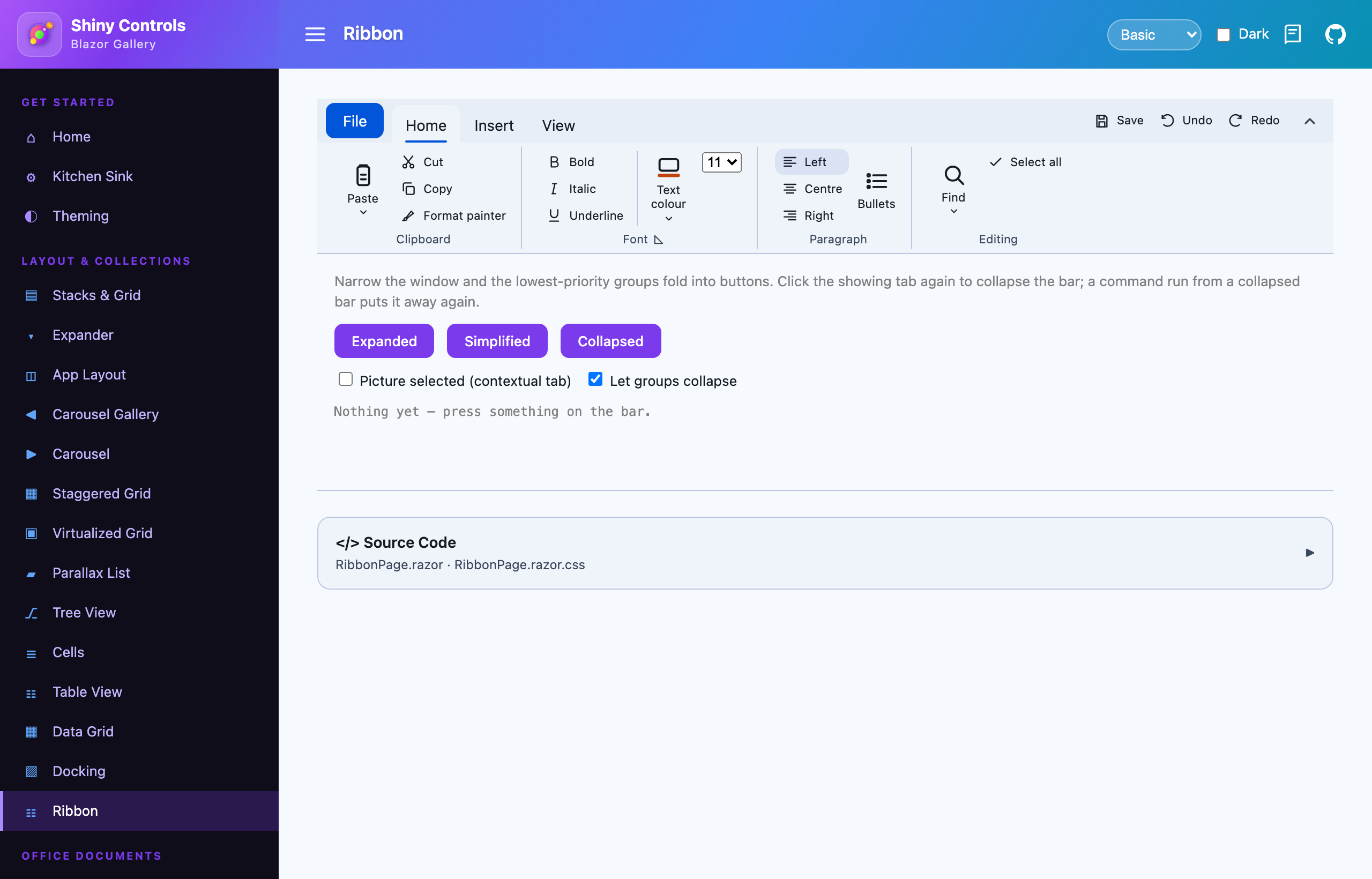 |
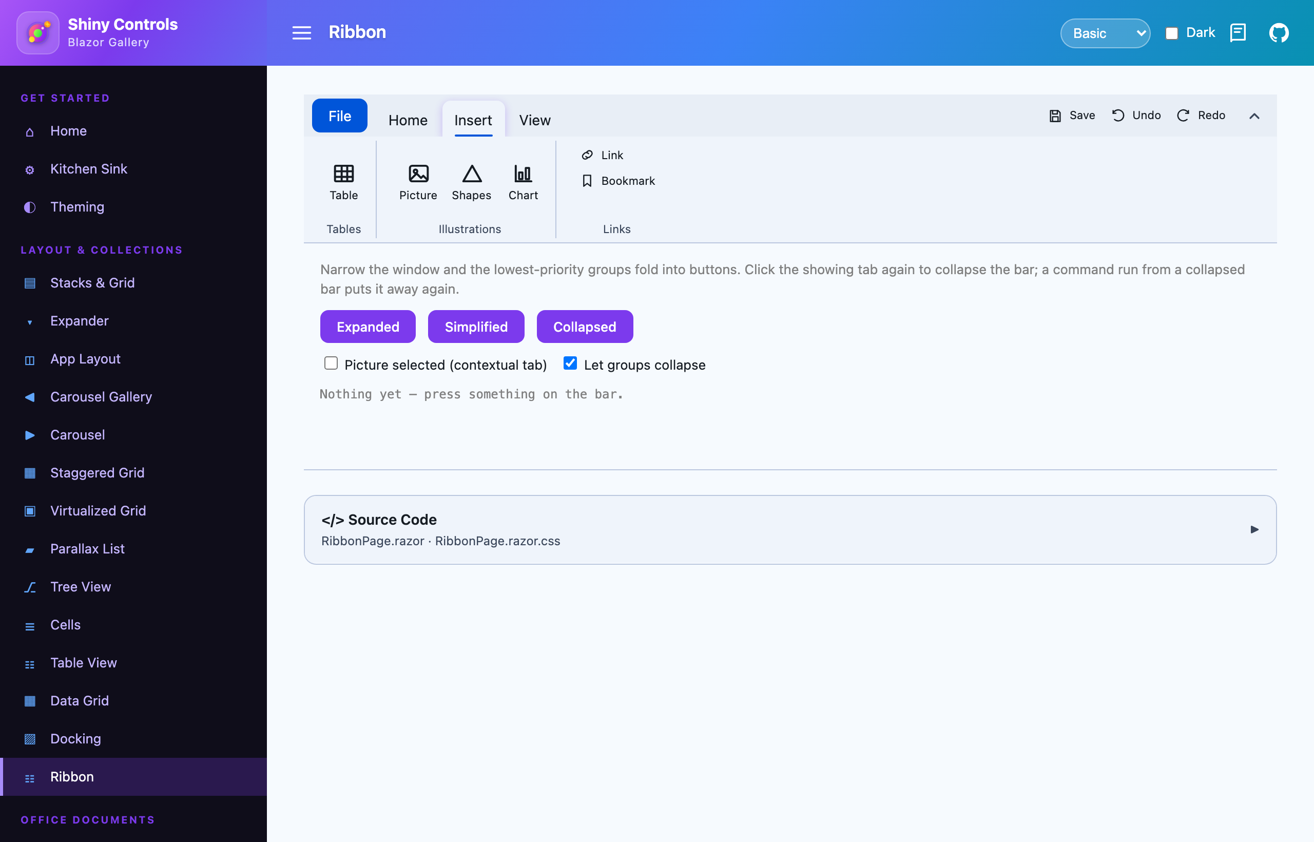 |
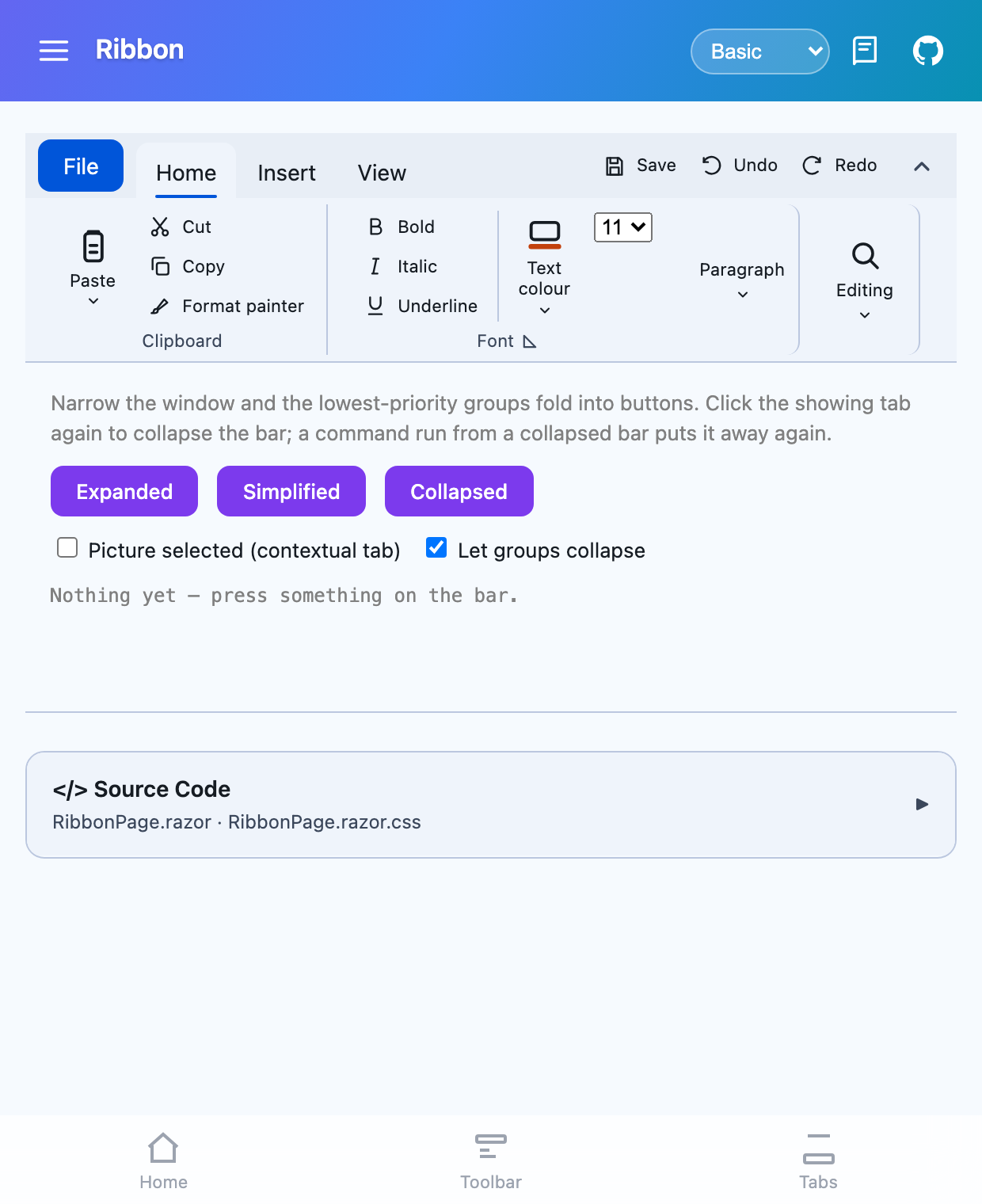 |
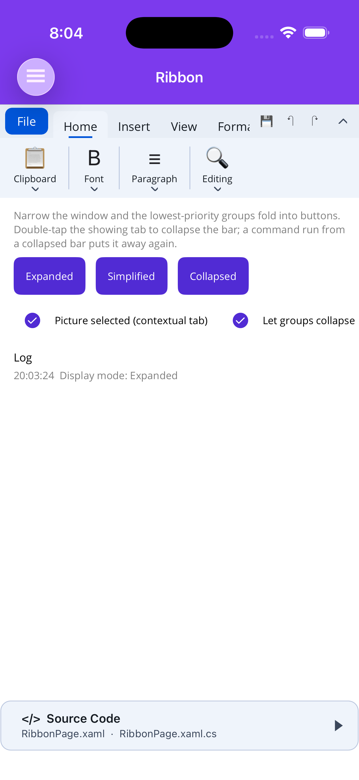
MAUI (iOS)
| Groups folded into buttons | A contextual tab |
|---|---|
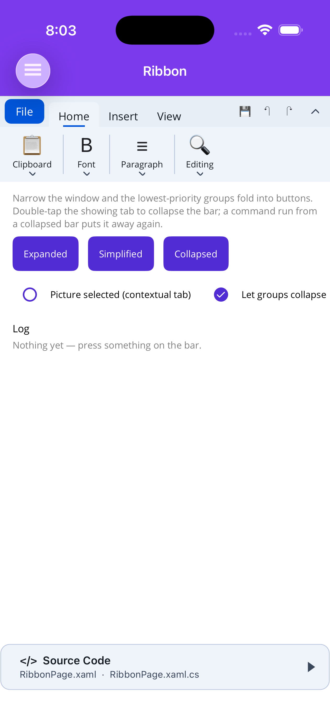 |
 |
The shape
Section titled “The shape”Ribbon└── RibbonTab "Home", "Insert", "Review" — one row of the strip └── RibbonGroup "Clipboard", "Font" — a titled box of related commands └── items buttons, toggles, split/menu buttons, separators, your own contentEverything is authored declaratively: nested elements on MAUI, nested components on Blazor.
.NET MAUI
Section titled “.NET MAUI”dotnet add package Shiny.Maui.Controlsxmlns:shiny="http://shiny.net/maui/controls" — the same prefix as the core controls; the ribbon is
mapped onto it from the Desktop assembly, so a XAML author never has to know there are two assemblies
involved.
<shiny:Ribbon ApplicationButtonText="File"              ApplicationButtonCommand="{Binding OpenFileMenu}"              DisplayMode="{Binding DisplayMode}">
    <shiny:Ribbon.QuickAccessItems>        <shiny:RibbonButton Text="Save" Size="Small" Icon="save.png" Command="{Binding Save}" />        <shiny:RibbonButton Text="Undo" Size="Small" Icon="undo.png" Command="{Binding Undo}" />    </shiny:Ribbon.QuickAccessItems>
    <shiny:RibbonTab Title="Home" Key="home">
        <shiny:RibbonGroup Title="Clipboard" Priority="30">            <shiny:RibbonSplitButton Text="Paste" Icon="paste.png" Command="{Binding Paste}">                <shiny:RibbonMenuEntry Text="Keep source formatting" Command="{Binding PasteKeep}" />                <shiny:RibbonMenuEntry Text="Text only" Command="{Binding PasteText}" />                <shiny:RibbonMenuEntry IsSeparator="True" />                <shiny:RibbonMenuEntry Text="Paste special…" Command="{Binding PasteSpecial}" />            </shiny:RibbonSplitButton>
            <shiny:RibbonButton Text="Cut"  Size="Small" Icon="cut.png"  Command="{Binding Cut}" />            <shiny:RibbonButton Text="Copy" Size="Small" Icon="copy.png" Command="{Binding Copy}" />        </shiny:RibbonGroup>
        <shiny:RibbonGroup Title="Font" ShowDialogLauncher="True"                           DialogLauncherCommand="{Binding OpenFontDialog}">            <shiny:RibbonToggleButton Text="Bold"   Size="Small" Icon="bold.png"   IsChecked="{Binding Bold}" />            <shiny:RibbonToggleButton Text="Italic" Size="Small" Icon="italic.png" IsChecked="{Binding Italic}" />
            <shiny:RibbonSeparator />
            <!-- any view at all can sit in a group -->            <shiny:RibbonContentItem Size="Small">                <shiny:FontSizePicker SelectedFontSize="{Binding FontSize}" WidthRequest="86" />            </shiny:RibbonContentItem>        </shiny:RibbonGroup>    </shiny:RibbonTab></shiny:Ribbon>
Blazor
Section titled “Blazor”dotnet add package Shiny.Blazor.Controls@using Shiny.Blazor.Controls
<Ribbon ApplicationButtonText="File" ApplicationButtonClicked="OpenFileMenu" @bind-DisplayMode="mode" @bind-SelectedKey="tab">
<QuickAccess> <RibbonButton Size="RibbonItemSize.Small" Text="Save" Icon="@SaveSvg" Clicked="Save" /> </QuickAccess>
<ChildContent> <RibbonTab Title="Home" Key="home"> <RibbonGroup Title="Clipboard" Priority="30"> <RibbonSplitButton Text="Paste" Icon="@PasteSvg" Clicked="Paste" Menu="@pasteMenu" /> <RibbonButton Size="RibbonItemSize.Small" Text="Cut" Icon="@CutSvg" Clicked="Cut" /> </RibbonGroup>
<RibbonGroup Title="Font" ShowDialogLauncher="true" DialogLauncherClicked="OpenFontDialog"> <RibbonToggleButton Size="RibbonItemSize.Small" Text="Bold" Icon="@BoldSvg" @bind-Checked="bold" /> <RibbonSeparator /> <RibbonContent Size="RibbonItemSize.Small"> <select @bind="fontSize">…</select> </RibbonContent> </RibbonGroup> </RibbonTab> </ChildContent></Ribbon>
@code { List<RibbonMenuEntry> pasteMenu = new() { new() { Text = "Keep source formatting", OnClick = … }, new() { IsSeparator = true }, new() { Text = "Text only", OnClick = … } };}Two Razor-specific rules: Size is a qualified enum (Size="RibbonItemSize.Small"), and once you use
<QuickAccess> you must name <ChildContent> too — Blazor’s rule for a component with more than one
RenderFragment, not the ribbon’s.
Columns fall out of the sizes
Section titled “Columns fall out of the sizes”Nothing declares a column. A Large item takes one to itself — icon over label, the shape a primary
command wants — and Small items stack up to SmallItemRows (three, the ribbon convention) deep in a
shared column. A RibbonSeparator, or a large item, ends the current column and starts a fresh one.
┌──────────┬──────────────────┬─────────┐│ │ Cut │ │ Paste = Large → its own column│ Paste │ Copy │ Bullets │ Cut/Copy/Format = three Small → one column│ ▾ │ Format painter │ │ Bullets = Large → the next column└──────────┴──────────────────┴─────────┘That is the whole of a ribbon’s layout language, and it is why reordering a group’s items re-flows it
with nothing else touched. On MAUI the columns are built in code; on Blazor they are a CSS grid using
grid-auto-flow: column, which fills a column top to bottom before moving across.
Item kinds
Section titled “Item kinds”| Kind | What it is |
|---|---|
RibbonButton |
A plain command. Command/CommandParameter and Clicked on MAUI, Clicked on Blazor |
RibbonToggleButton |
Stays pressed. IsChecked (MAUI) / Checked (Blazor) is two-way — bind it and skip the handler |
RibbonSplitButton |
Face runs the default action, chevron opens the dropdown |
RibbonMenuButton |
The whole face opens the dropdown; no default action |
RibbonSeparator |
A full-height rule, and a break in the column flow |
RibbonContentItem (MAUI) / RibbonContent (Blazor) |
Hosts arbitrary content — a picker, a combo, a swatch strip |
RibbonGallery (MAUI) / RibbonGallery<TItem> (Blazor) |
An in-ribbon gallery of previews — Word’s Styles. Steps a row at a time with its up/down arrows and drops the whole set as a grid from its “more” arrow. See Galleries |
RibbonNumberBox |
A labelled number field with a spinner — Word’s Layout “Left: 0"” / “Before: 0 pt”. See Number boxes |
Every item carries Text, Icon, Tooltip, Description, Shortcut, Size and enabled/visible flags.
Shortcut ("Ctrl+B") is appended to the tooltip in brackets the way Office shows it — “Bold
(Ctrl+B)” — and carried into the command list. Put the key there rather than in the
tooltip text. The ribbon does not bind the key itself; the host or editor does. Bind the
enabled flag rather than removing an item: a command that disappears when it cannot run makes the bar
move under the pointer. A group can dim its whole contents in one place without every item having to be
bound.
Dropdown entries are RibbonMenuEntry — Text, Icon, IsChecked (draws a tick), IsSeparator, and
nestable Children that fly out as a submenu. They are markup children on MAUI and a
List<RibbonMenuEntry> on Blazor, the same split ToolbarItem.Children already uses: XAML has no
comfortable way to write a nested object graph inline, and Razor does.
| Platform | Details |
|---|---|
| MAUI | Icon is an ImageSource, so a PNG, an SVG or a FontImageSource glyph all work. For an icon that is drawn rather than loaded, set IconTemplate to a DataTemplate returning a view; it wins over Icon and is instantiated per drawn button, so it must not return a shared instance. |
| Blazor | Icon is a string: inline SVG markup, an image URL, or a glyph. Exactly what a ToolbarItem takes, so one icon convention covers both controls. |
Contextual tabs
Section titled “Contextual tabs”Nothing special declares one. Setting ContextTitle captions the coloured band above the strip and
marks the tab contextual; binding its visibility to whatever the tab is about is what makes it come
and go.
<shiny:RibbonTab Title="Format" Key="picture" ContextTitle="Picture Tools" IsVisible="{Binding PictureSelected}"><RibbonTab Title="Format" Key="picture" ContextTitle="Picture Tools" Visible="@pictureSelected">When the showing tab stops being selectable — hidden, disabled or removed — the ribbon falls back to
the nearest tab that still is, so a vanished selection never leaves an empty body. Both hosts report
that as a Fallback reason on their tab-changed event.
A contextual tab underlines in ContextColor (the theme’s tertiary by default) rather than the accent
the permanent tabs use, so it reads as a different kind of thing rather than the selected one of the
same kind.
Collapsing the ribbon
Section titled “Collapsing the ribbon”DisplayMode is two-way on both hosts:
| Mode | |
|---|---|
Expanded |
Tab strip plus the open body. The default |
Collapsed |
Only the strip. Picking a tab peeks the body back; the next command puts it away again |
Simplified |
One dense row — every item drawn small, group titles dropped |
The chevron at the trailing end of the strip toggles Expanded ⇄ Collapsed, and so does a second click
on the tab already showing. AllowCollapse="false" removes both gestures; DisplayMode still works
from code.
Groups that do not fit
Section titled “Groups that do not fit”When the showing tab is wider than the bar, groups fold into a single button that opens the whole group
in a popup — lowest Priority first, rightmost breaking ties. Items are never dropped individually,
because half a group is worse than a closed one.
Raise Priority on the groups that should survive longest, and set CanCollapse="false" on one that
must stay open. AllowGroupCollapse="false" turns the behaviour off and lets the body scroll
horizontally instead, which is the better answer when every group is small.
The decision needs real measured widths, so on Blazor it is made in the ribbon’s JS module and handed back to the component. It degrades cleanly: with no module — prerendering, a locked-down host — every group stays open and the body scrolls.
Galleries
Section titled “Galleries”<!-- MAUI --><shiny:RibbonGallery Text="Styles" ItemsSource="{Binding Styles}" SelectedItem="{Binding CurrentStyle}" Columns="5" Rows="1" ItemWidth="76" ItemHeight="58" SelectionCommand="{Binding ApplyStyle}"> <shiny:RibbonGallery.ItemTemplate> <DataTemplate><Label Text="{Binding Name}" /></DataTemplate> </shiny:RibbonGallery.ItemTemplate></shiny:RibbonGallery>@* Blazor *@<RibbonGallery TItem="MyStyle" Text="Styles" Items="styles" @bind-SelectedItem="current" ItemText="s => s.Name" Columns="5" ItemSelected="Apply"> <ItemTemplate><span style="@context.Css">AaBbCc</span><small>@context.Name</small></ItemTemplate> <PanelFooter><button @onclick="ClearFormatting">Clear Formatting</button></PanelFooter></RibbonGallery>Columns × Rows is the in-ribbon window (default 5 × 1); ExpandedColumns sets the drop-down grid,
and a newly selected entry is scrolled into the strip. The strip never scrolls freely — it steps a row
per arrow press, as Office does — and on MAUI every cell is built once and only shown or hidden, so it
works on the AppKit head. ItemText names each entry for tooltips and for the command list. MAUI also
has ItemSelected and a PanelFooterTemplate. The Office add-on’s OfficeStyleGallery is this item
pre-dressed with “AaBbCc” style previews.
Number boxes
Section titled “Number boxes”<shiny:RibbonNumberBox Text="Before:" Unit="pt" Step="6" Minimum="0" Maximum="1584" Value="{Binding SpaceBefore}" /><RibbonNumberBox Text="Left:" Unit=""" Step="0.1" Decimals="1" @bind-Value="leftIndent" />A text entry rather than a numeric input, so the unit shows and can be typed (“12 pt”, “0.5"”). The
value commits on Enter or blur (the ValueCommitted event on MAUI), and the arrow keys and spinner move
by Step, clamped to Minimum–Maximum and rounded to Decimals. The field is FieldWidth on MAUI
and InputWidth on Blazor. Small by default.
Header end
Section titled “Header end”HeaderEndContent (a View on MAUI) / the HeaderEnd fragment (Blazor) puts content at the far right of
the tab strip — where an Office window keeps its Comments, Editing / Reviewing / Viewing and Share
buttons. The Office add-on’s OfficeRibbonActions is made for it; see Office Shell.
<Ribbon> <HeaderEnd><OfficeRibbonActions @bind-EditMode="mode" ShareClicked="Share" /></HeaderEnd> <ChildContent>…</ChildContent></Ribbon>Command list
Section titled “Command list”GetCommands() returns every command on the bar as a RibbonCommandInfo — Label, Category
(“Tab › Group”), Shortcut, IsEnabled, and an Invoke / InvokeAsync delegate that behaves exactly
like the click. It covers buttons, toggles, split-button faces, every leaf of every dropdown (“Page
Number › Top of Page”) and every named gallery entry (“Styles › Heading 1”). It is what a “Search for
tools” box searches.
- MAUI walks it fresh from the item model on each call, so it includes tabs never opened.
- Blazor items index themselves as they render — a tab’s items only exist while it is showing — so
the list grows as tabs are visited and
CommandsChangedsays when. A host that needs every command searchable from the first keystroke adds the rest to its own list.
The Office add-on’s OfficeCommandIndex.SyncRibbon(ribbon) turns this into the
title bar’s command search (on Blazor call it once the @ref
is set, e.g. in OnAfterRender(first)).
MAUI also has ribbon.Invoke(item) — press an item from code, running its command, flipping a
toggle and raising ItemInvoked exactly as a click would — so a keyboard shortcut and the button it
duplicates go down one path.
Theming
Section titled “Theming”Both hosts follow the Shiny theme with no configuration: MAUI resolves ShinyThemeKeys.Color.* through
dynamic resources, Blazor through the --shiny-color-* custom properties, and both flip with
light/dark. AccentColor, HeaderBackgroundColor and BodyBackgroundColor override just those three;
everything else stays on the theme.
Platform notes
Section titled “Platform notes”- Dropdowns are drawn above the page rather than inside the bar, which is what stops a menu being clipped by a body only three rows tall. On Blazor that is the browser’s top layer via the popover API, with Escape and a click-away both closing the panel; on MAUI it is the shared page overlay.
- macOS AppKit (
net10.0-macos) gives no native view to a child added after the page has been laid out. The ribbon is built for that: every tab’s body is created up front and switched withIsVisible, so tab switching, collapsing and group folding all work. Adding a tab, group or item after the fact does rebuild, and the dropdown panels are added on demand — those are the two paths that head cannot follow. Every other desktop target is unaffected. - Collapsed group buttons fall back to the first item’s icon on MAUI; on Blazor set
CollapsedIconexplicitly, since a group’s items are components it cannot read an icon out of. - Key tips — the Alt-key letter badges — are not implemented on either host.