Toast
A service-first toast notification system. Unlike other controls in the library, Toast is invoked entirely from code — no XAML placement or special base class required. Show lightweight, transient messages with auto-dismiss, manual dismiss via IDisposable, queue/stack behavior, spinner, progress bar, and full styling control.


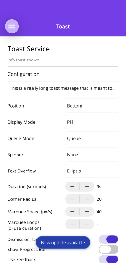 |  |
Features
Section titled “Features”- Code-invoked — inject
IToasterand callawait toaster.ShowAsync("text")with no XAML setup required - IDisposable dismiss —
ShowAsyncreturns anIDisposablefor programmatic dismiss - Auto-dismiss — configurable duration (default 3s), or
TimeSpan.Zerofor manual only - Pill or Fill — rounded pill (centered, offset from edges) or full-width bar (flush with edges)
- Top or Bottom — position at top or bottom of screen
- Queue or Stack — one-at-a-time queue (default) or multiple visible stacked toasts
- Spinner — indeterminate loading indicator on left or right
- Progress bar — countdown bar that drains over the duration
- Icon — optional icon image
- Tap action —
ICommand(MAUI) orAction(Blazor) on tap, with optional dismiss-on-tap - Feedback — tactile feedback on show/dismiss (MAUI)
- Accessibility —
SemanticScreenReader.Announce()on show (MAUI),role="alert"(Blazor) - Safe area aware — respects iOS home indicator and status bar
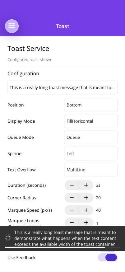
- Text overflow — ellipsis (truncate), multi-line (wrap), or marquee (scrolling ticker) with configurable speed
- Styling — background color, text color, border, corner radius
MAUI Usage
Section titled “MAUI Usage”IToaster is registered automatically by UseShinyControls(). Inject it via constructor injection. The toast overlay auto-attaches to the current page on first use — no XAML setup required.
using Shiny.Maui.Controls.Toast;
public class MyViewModel(IToaster toaster){    // Simple toast    await toaster.ShowAsync("Item saved!");
    // With configuration    IDisposable toast = await toaster.ShowAsync("Uploading...", cfg =>    {        cfg.Spinner = ToastSpinnerPosition.Left;        cfg.Duration = TimeSpan.Zero; // manual dismiss only        cfg.DismissOnTap = false;    });
    // Dismiss when done    toast.Dispose();}
Full Configuration Example
Section titled “Full Configuration Example”await toaster.ShowAsync("Connection lost", cfg =>{ cfg.Duration = TimeSpan.FromSeconds(5); cfg.Position = ToastPosition.Bottom; cfg.DisplayMode = ToastDisplayMode.FillHorizontal; cfg.DismissOnTap = true; cfg.QueueMode = ToastQueueMode.Stack; cfg.UseFeedback = true; cfg.ShowProgressBar = true; cfg.BackgroundColor = Colors.Red; cfg.TextColor = Colors.White; cfg.BorderColor = Colors.DarkRed; cfg.BorderThickness = 1; cfg.Icon = ImageSource.FromFile("warning.png"); cfg.TapCommand = new Command(() => NavigateToDetails());});Themed Methods (MAUI)
Section titled “Themed Methods (MAUI)”Convenience methods with preset colors for common notification types:
await toaster.InfoAsync("Update available");        // Blueawait toaster.SuccessAsync("File saved");           // Greenawait toaster.WarningAsync("Storage almost full");  // Amberawait toaster.DangerAsync("Save failed");           // Orangeawait toaster.CriticalAsync("System error");        // Red
// Override after theme defaults are appliedawait toaster.SuccessAsync("Done!", cfg =>{    cfg.Duration = TimeSpan.FromSeconds(5);    cfg.ShowProgressBar = true;});
Customizing Theme Colors
Section titled “Customizing Theme Colors”Define ToastTypeStyle resources in App.xaml to override the built-in defaults:
<Application.Resources> <shiny:ToastTypeStyle x:Key="ShinyToastSuccessStyle" BackgroundColor="#065F46" TextColor="White" BorderColor="#10B981" /> <shiny:ToastTypeStyle x:Key="ShinyToastCriticalStyle" BackgroundColor="#7F1D1D" TextColor="White" BorderColor="#DC2626" BorderThickness="2" /></Application.Resources>Style keys: ShinyToastInfoStyle, ShinyToastSuccessStyle, ShinyToastWarningStyle, ShinyToastDangerStyle, ShinyToastCriticalStyle
Blazor Usage
Section titled “Blazor Usage”Register the toast service in Program.cs:
using Shiny.Blazor.Controls.Toast;
builder.Services.AddShinyToast();
Place <ToastHost /> once in your layout (e.g., MainLayout.razor):
@using Shiny.Blazor.Controls.Toast
<div class="page">    <main>@Body</main></div>
<ToastHost />@inject IToastService ToastService
<button @onclick="ShowToast">Save</button>
@code { async Task ShowToast() { await ToastService.ShowAsync("Saved!", cfg => { cfg.Position = ToastPosition.Bottom; cfg.Duration = TimeSpan.FromSeconds(3); }); }}Themed Methods (Blazor)
Section titled “Themed Methods (Blazor)”await ToastService.InfoAsync("Update available");await ToastService.SuccessAsync("File saved");await ToastService.WarningAsync("Storage almost full");await ToastService.DangerAsync("Save failed");await ToastService.CriticalAsync("System error");Properties
Section titled “Properties”| Property | Type (MAUI / Blazor) | Default | Description |
|---|---|---|---|
Text | string | (required) | Toast message text |
Duration | TimeSpan | 3s | Auto-dismiss duration. TimeSpan.Zero = manual only |
Position | ToastPosition | Bottom | Top or Bottom |
DisplayMode | ToastDisplayMode | Pill | Pill (rounded, offset) or FillHorizontal (flush, full width) |
DismissOnTap | bool | true | Tap to dismiss |
QueueMode | ToastQueueMode | Queue | Queue (one at a time) or Stack (multiple visible) |
Offset | Thickness / double | 12 | Margin from edges (pill mode only) |
Spinner | ToastSpinnerPosition | None | None, Left, or Right |
UseFeedback | bool | true | Feedback on show/dismiss (MAUI only) |
ShowProgressBar | bool | false | Countdown progress bar |
BackgroundColor | Color? / string? | dark gray | Background fill |
TextColor | Color? / string? | white | Text color |
BorderColor | Color? / string? | none | Border stroke |
BorderThickness | double | 0 | Border width |
CornerRadius | double | 20 | Corner radius (pill mode) |
Icon | ImageSource? | null | Optional icon (MAUI) |
IconHtml | string? | null | Optional HTML/SVG icon (Blazor) |
TapCommand | ICommand? | null | Command on tap (MAUI) |
TapCallback | Action? | null | Callback on tap (Blazor) |
TextOverflow | ToastTextOverflow | Ellipsis | Ellipsis (truncate with …), MultiLine (word wrap), or Marquee (scrolling ticker) |
MarqueeSpeedPixelsPerSecond | double | 40 | Scroll speed for marquee mode (pixels per second) |
AnnounceToScreenReader | bool | true | Screen reader announce (MAUI) |
Text Overflow
Section titled “Text Overflow”Controls how long text is displayed when it exceeds the available toast width:
// Ellipsis (default) — truncates with "..."await toaster.ShowAsync("Very long message...", cfg =>{    cfg.TextOverflow = ToastTextOverflow.Ellipsis;});
// Multi-line — wraps text to multiple linesawait toaster.ShowAsync("Very long message that will wrap to the next line", cfg =>{    cfg.TextOverflow = ToastTextOverflow.MultiLine;});
// Marquee — scrolling ticker animationawait toaster.ShowAsync("Very long message that scrolls continuously", cfg =>{    cfg.TextOverflow = ToastTextOverflow.Marquee;    cfg.MarqueeSpeedPixelsPerSecond = 80; // faster scroll (default: 40)    cfg.Duration = TimeSpan.FromSeconds(10); // give time to read});
Works identically in both MAUI and Blazor. Marquee speed is controlled via MarqueeSpeedPixelsPerSecond (default 40). Increase Duration for marquee toasts to give users time to read the scrolling content.
ViewModel Pattern
Section titled “ViewModel Pattern”public partial class UploadViewModel(IToaster toaster) : ObservableObject{ IDisposable? uploadToast;
[RelayCommand] async Task Upload() { uploadToast = await toaster.ShowAsync("Uploading...", cfg => { cfg.Spinner = ToastSpinnerPosition.Left; cfg.Duration = TimeSpan.Zero; });
await DoUploadAsync(); uploadToast.Dispose();
await toaster.ShowAsync("Upload complete!"); }}AI Skill
Section titled “AI Skill”Step 1 — Add the marketplace:
claude plugin marketplace add shinyorg/skills Step 2 — Install the plugin:
claude plugin install controls@shiny Step 1 — Add the marketplace:
copilot plugin marketplace add https://github.com/shinyorg/skills Step 2 — Install the plugin:
copilot plugin install controls@shiny