


FontPicker
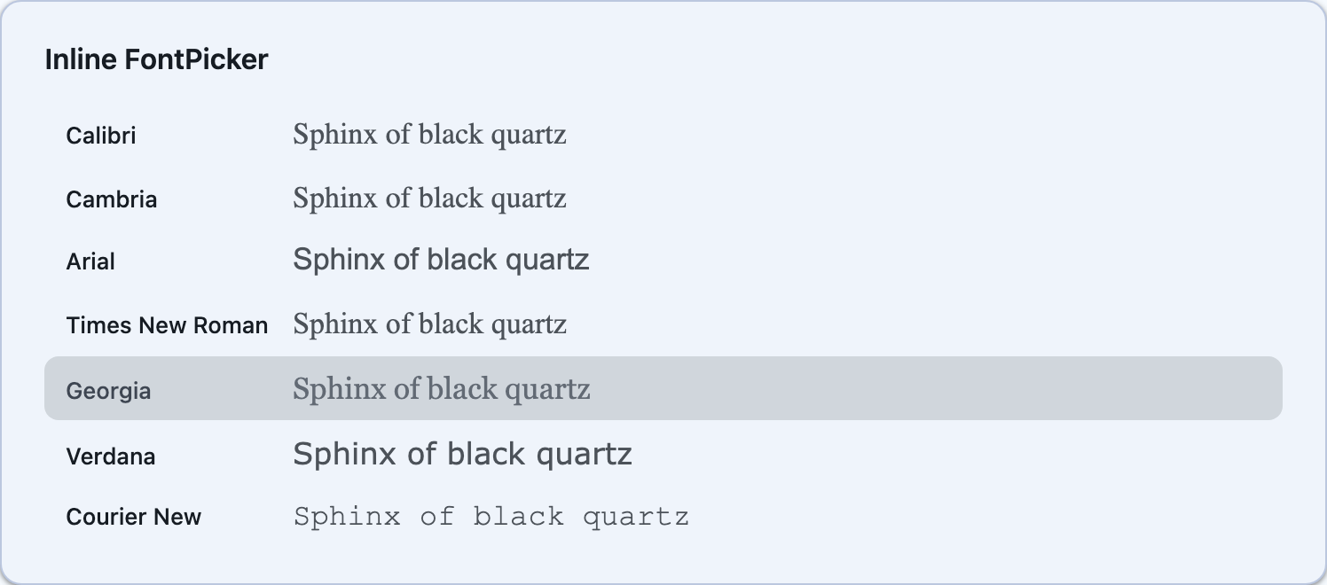
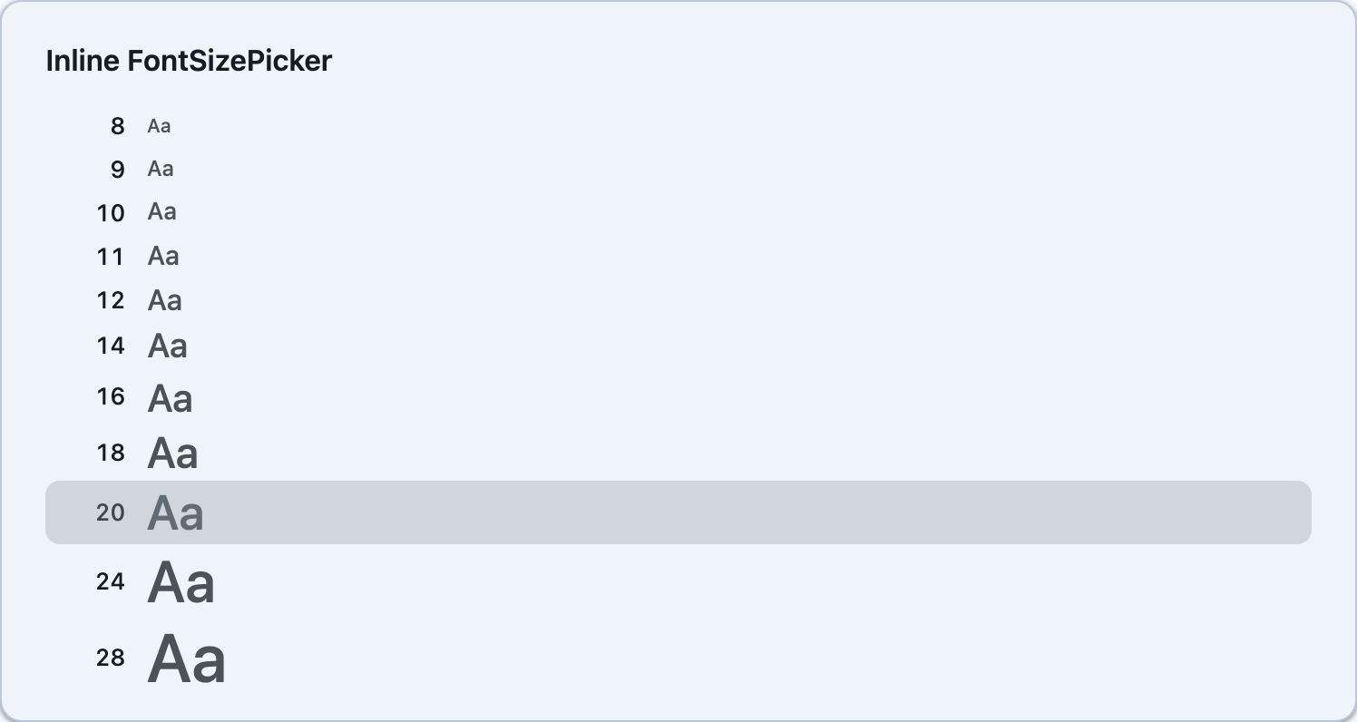
Font selection controls for .NET MAUI and Blazor. Includes an inline FontPicker list, a popup FontPickerButton, an inline FontSizePicker, and a popup FontSizePickerButton. Each font is rendered in its own typeface for instant visual preview.


Screenshots
Section titled “Screenshots”| Preview and popup buttons | Inline FontPicker | Inline FontSizePicker |
|---|---|---|
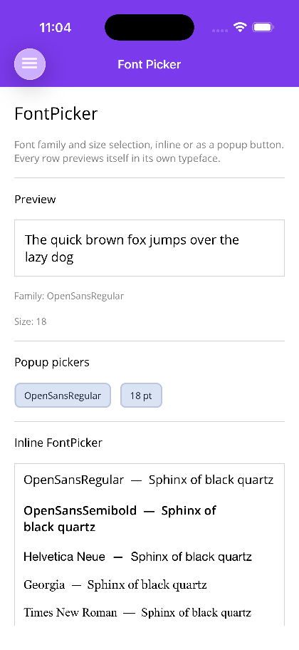 |
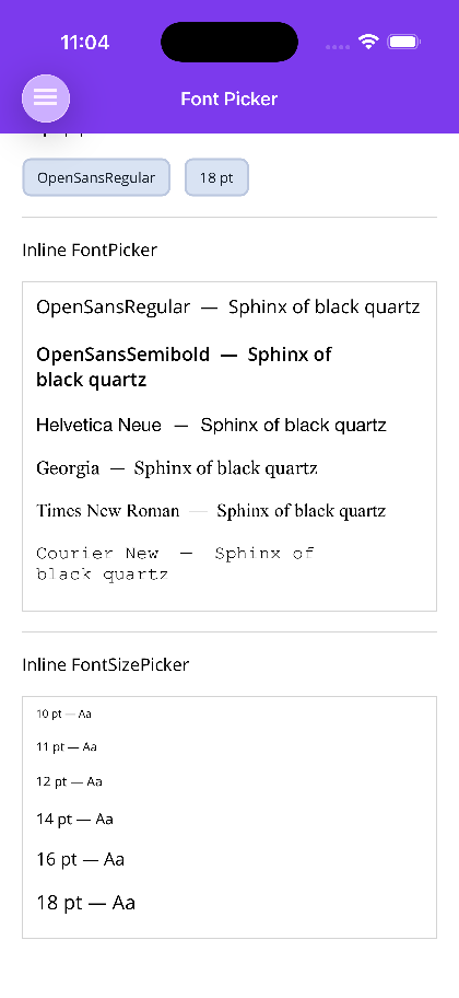 |
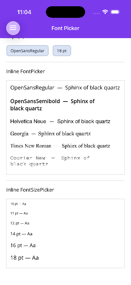 |
Blazor
| FontPickerButton popup | Inline FontPicker | Inline FontSizePicker |
|---|---|---|
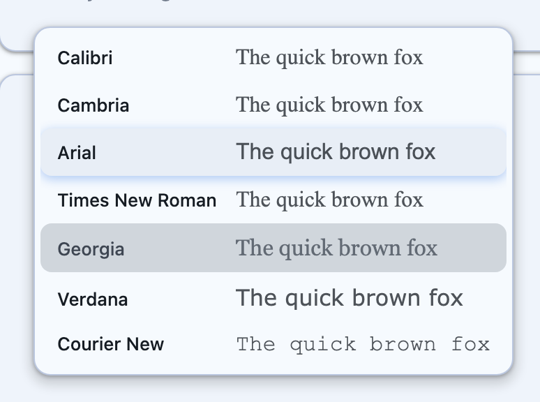 |
 |
 |
Blazor usage
Section titled “Blazor usage”<FontPickerButton @bind-SelectedFont="family" /><FontSizePickerButton @bind-SelectedFontSize="size" />
<FontPicker @bind-SelectedFont="family" PreviewText="Sphinx of black quartz" PreviewFontSize="17" /><FontSizePicker @bind-SelectedFontSize="size" PreviewText="Aa" />The Blazor components take the same AvailableFonts / AvailableFontSizes, PreviewText and change callbacks as MAUI; a null list falls back to FontPicker.DefaultFonts / FontSizePicker.DefaultFontSizes.
FontPicker
Section titled “FontPicker”An inline scrollable list of fonts. Each row shows the font name rendered in its own typeface alongside a preview string.
<shiny:FontPicker AvailableFonts="{Binding Fonts}" SelectedFont="{Binding SelectedFont, Mode=TwoWay}" PreviewText="The quick brown fox" PreviewFontSize="18" />| Property | Type | Default | Description |
|---|---|---|---|
AvailableFonts |
IList<string>? |
null |
Font family names to display |
SelectedFont |
string? |
null |
Currently selected font (TwoWay) |
PreviewText |
string |
"The quick brown fox" |
Text rendered in each font row |
PreviewFontSize |
double |
18 |
Size of the preview text |
Event: FontChanged — fires with the selected font name.
FontPickerButton
Section titled “FontPickerButton”A compact button that opens a popup font picker dialog with a Done button — DoneText labels that button, for apps that do not ship in English.
<shiny:FontPickerButton AvailableFonts="{Binding Fonts}" SelectedFont="{Binding SelectedFont, Mode=TwoWay}" Placeholder="Font" FontChangedCommand="{Binding OnFontChangedCommand}" />| Property | Type | Default | Description |
|---|---|---|---|
AvailableFonts |
IList<string>? |
null |
Font family names to display |
SelectedFont |
string? |
null |
Currently selected font (TwoWay) |
Placeholder |
string |
"Font" |
Button text when no font is selected |
CornerRadius |
int |
8 |
Button corner radius |
FontChangedCommand |
ICommand? |
null |
Command invoked with the selected font name |
DoneText |
string |
Done |
Text of the popup’s confirm button |
Event: FontChanged — fires with the selected font name.
FontSizePicker
Section titled “FontSizePicker”An inline scrollable list of font sizes. Each row shows the size value rendered at that size.
<shiny:FontSizePicker AvailableFontSizes="{Binding Sizes}" SelectedFontSize="{Binding SelectedSize, Mode=TwoWay}" PreviewText="Aa" />| Property | Type | Default | Description |
|---|---|---|---|
AvailableFontSizes |
IList<double>? |
null |
Font sizes to display |
SelectedFontSize |
double |
16 |
Currently selected size (TwoWay) |
PreviewText |
string |
"Aa" |
Text rendered at each size |
Event: FontSizeChanged — fires with the selected size.
FontSizePickerButton
Section titled “FontSizePickerButton”A compact button that opens a popup font size picker dialog.
<shiny:FontSizePickerButton AvailableFontSizes="{Binding Sizes}" SelectedFontSize="{Binding SelectedSize, Mode=TwoWay}" FontSizeChangedCommand="{Binding OnSizeChangedCommand}" />| Property | Type | Default | Description |
|---|---|---|---|
AvailableFontSizes |
IList<double>? |
null |
Font sizes to display |
SelectedFontSize |
double |
16 |
Currently selected size (TwoWay) |
CornerRadius |
int |
8 |
Button corner radius |
FontSizeChangedCommand |
ICommand? |
null |
Command invoked with the selected size |
DoneText |
string |
Done |
Text of the popup’s confirm button |
Event: FontSizeChanged — fires with the selected size.
Usage with ImageEditor
Section titled “Usage with ImageEditor”The FontPicker and FontSizePicker are integrated into the ImageEditor toolbar when font selection is enabled:
<shiny:ImageEditor Source="{Binding ImageSource}" AllowTextAnnotation="True" AllowFontSelection="True" AllowFontSizeSelection="True" AvailableFonts="{Binding Fonts}" AvailableFontSizes="{Binding FontSizes}" />AI Skill
Section titled “AI Skill”Step 1 — Add the marketplace:
claude plugin marketplace add shinyorg/skillsStep 2 — Install the plugin:
claude plugin install shiny@shinyOne plugin installs all 48 Shiny skills. Your agent loads only the skill relevant to what you're building, so there's no cost to having them all available.
Step 1 — Add the marketplace:
copilot plugin marketplace add https://github.com/shinyorg/skillsStep 2 — Install the plugin:
copilot plugin install shiny@shinyOne plugin installs all 48 Shiny skills. Your agent loads only the skill relevant to what you're building, so there's no cost to having them all available.