


TreeView | Getting Started
A hierarchical TreeView for .NET MAUI and Blazor with lazy-loaded branches, configurable expand/collapse icons, single or multi-selection, per-item CanExpand / CanSelect predicates, retry on load failure, optional guide lines, and drag/drop reorder.
| GitHub |  |
| MAUI |  |
| Blazor |  |
MAUI
| Initial | Expanded | Multi-level | Lazy load | Multi-select |
|---|---|---|---|---|
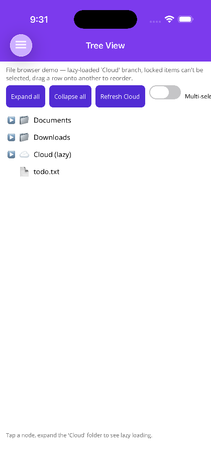 |
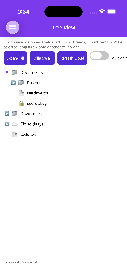 |
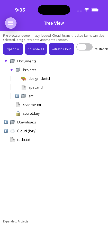 |
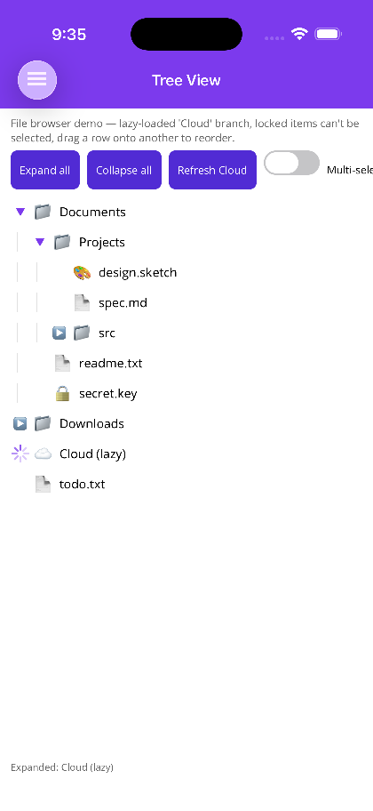 |
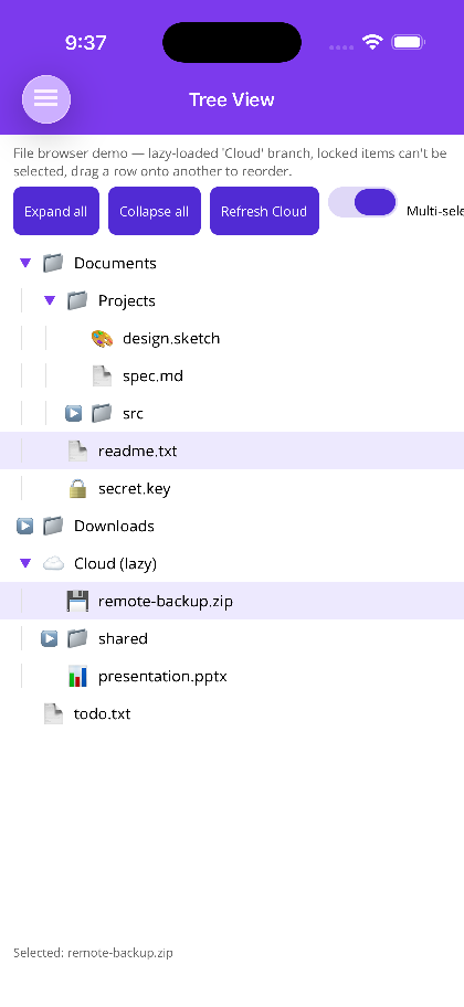 |
Blazor
| Collapsed | Expanded | Lazy-load spinner | Multi-selection |
|---|---|---|---|
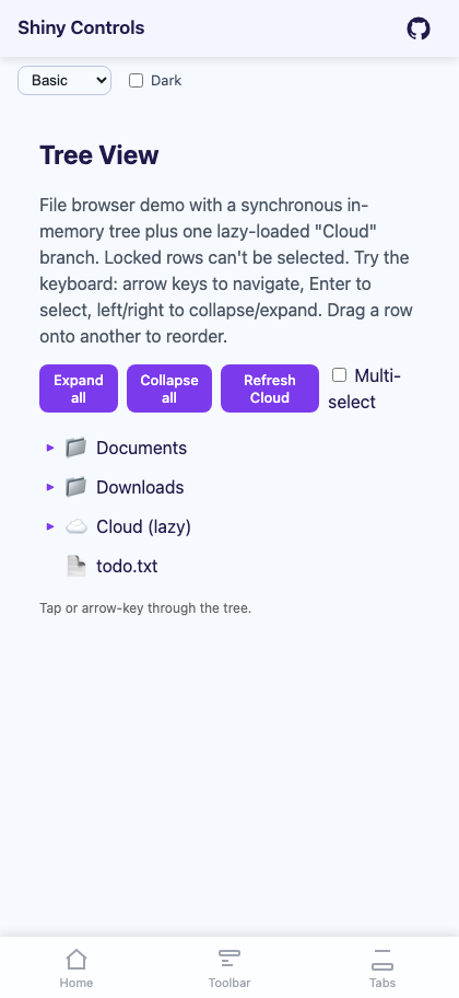 |
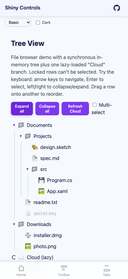 |
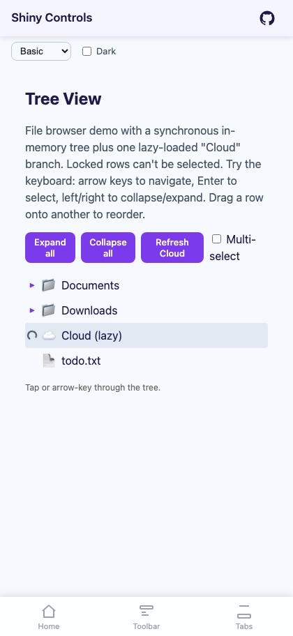 |
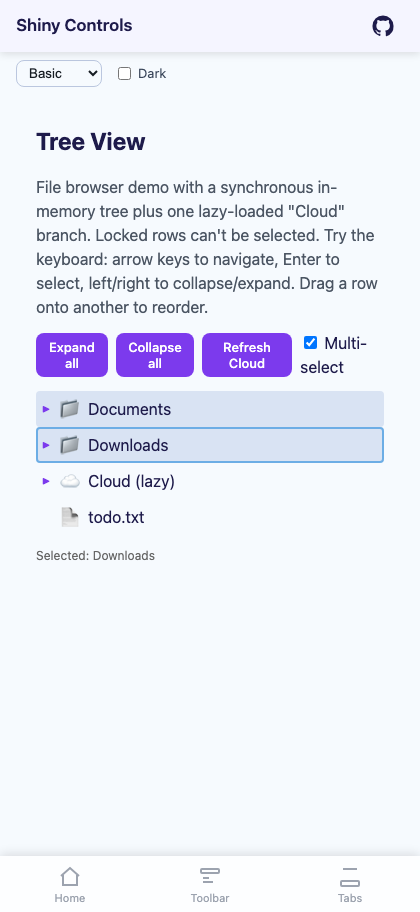 |
Features
Section titled “Features”- Hierarchical data binding via
ItemsSource+ChildrenSelector(sync) and/orChildrenLoader(async) - Lazy loading — children load on first expand; chevron is replaced with a spinner; failures show a retry icon
- Async root loader — top-level items can also be lazy
- Configurable expand/collapse/retry icons — pass any
ImageSource(MAUI) orRenderFragment(Blazor), fall back to built-in glyphs - Per-item
CanExpandandCanSelectpredicates — gate gestures without removing rows HasChildrenSelector— render true leaves with no chevron, distinct fromCanExpand- Selection modes: None, Single (two-way
SelectedItem), Multiple (SelectedItems, checkbox per row) - Events + Commands (MAUI) for
ItemSelected,ItemExpanded,ItemCollapsed,LoadFailed,ItemDropped - Programmatic API:
ExpandAll/ExpandAllAsync/CollapseAll/Expand/Collapse/SelectAll/DeselectAll/SetBranchSelected/Refresh/ReloadAsync - Indent + guide lines — configurable
IndentSize, toggleableShowGuideLines - Drag/drop reorder — above/below/into drop positions with visual drop indicators; event-only (the control never mutates your data)
- Blazor keyboard navigation — arrow keys, Enter, Home/End
-
Install the NuGet package
Terminal window dotnet add package Shiny.Maui.Controls -
Register in your
MauiProgram.csusing Shiny;var builder = MauiApp.CreateBuilder();builder.UseMauiApp<App>().UseShinyControls(); -
Add the XAML namespace to your pages
xmlns:shiny="http://shiny.net/maui/controls"
Quick Start
Section titled “Quick Start”Bind a hierarchical model and supply a ChildrenSelector:
<shiny:TreeView ItemsSource="{Binding Roots}" ChildrenSelector="{Binding GetChildren}" HasChildrenSelector="{Binding IsFolder}" SelectedItem="{Binding Selected, Mode=TwoWay}" ItemExpanded="OnExpanded"> <shiny:TreeView.ItemTemplate> <DataTemplate x:DataType="local:FileNode"> <HorizontalStackLayout Spacing="8"> <Label Text="{Binding Icon}" /> <Label Text="{Binding Name}" VerticalTextAlignment="Center" /> </HorizontalStackLayout> </DataTemplate> </shiny:TreeView.ItemTemplate></shiny:TreeView>In code-behind, set the delegate properties (they aren’t bindable from XAML because they’re Func<T>):
public TreeViewPage(){ InitializeComponent(); Tree.ChildrenSelector = item => (item is FileNode f) ? f.Children : null; Tree.HasChildrenSelector = item => item is FileNode { IsFolder: true }; Tree.CanSelectSelector = item => item is FileNode f && !f.IsLocked;}Lazy Loading
Section titled “Lazy Loading”Set ChildrenLoader to an async delegate. The chevron is replaced with a spinner during the load. If the loader throws, the spinner becomes a retry icon (↻) — tapping it re-runs the loader.
Tree.ChildrenLoader = async item =>{ var children = await myService.GetChildrenAsync(item); return children;};You can mix sync and lazy branches in the same tree. The selector is checked first; if it returns null and a loader is set, the loader runs:
Tree.ChildrenSelector = item => item is FileNode { LazyLoad: false } f ? f.Children : null;Tree.ChildrenLoader = LoadRemoteChildrenAsync;Catch load failures and react in your VM:
Tree.LoadFailed += (s, e) => StatusLabel.Text = $"Failed to load {((FileNode)e.Item).Name}: {e.Exception.Message}";Lazy Root
Section titled “Lazy Root”For trees where even the root list is expensive, set RootLoader:
Tree.RootLoader = async () => await myService.GetTopLevelAsync();The whole tree shows a centered loading indicator until it resolves. Tap-to-retry is automatic on failure.
Selection
Section titled “Selection”<shiny:TreeView SelectionMode="Single" SelectedItem="{Binding Selected, Mode=TwoWay}" />For multi-select — every row gets a checkbox:
<shiny:TreeView SelectionMode="Multiple" SelectedItems="{Binding Selected}" />The checkbox mirrors the row’s selection and the whole row is the hit target, so tapping the row or
the box toggles it. Rows blocked by CanSelectSelector render a dimmed box. Set
ShowSelectionCheckBoxes="False" for the older highlight-only look, and CheckBoxColor to override
the Primary theme tint. Changing SelectionMode clears the current selection.
Select or clear in bulk:
Tree.SelectAll(); // everything selectable and loaded, collapsed branches includedTree.SetBranchSelected(folder, true); // one item and its loaded descendantsTree.DeselectAll(); // clears in any modeOnly nodes the tree has materialized can be checked — call ExpandAllAsync() first to select a lazy
tree in full.
Use CanSelectSelector to disable selection for specific items (e.g. category headers, locked rows). Their rows still render and remain visible — they just won’t fire ItemSelected.
Configurable Icons
Section titled “Configurable Icons”Set ExpandedIcon, CollapsedIcon, and RetryIcon to ImageSource values (font icons, embedded resources, URIs). Defaults are the glyphs ▼, ▶, and ↻.
<shiny:TreeView ChevronColor="#7C3AED" ChevronSize="14"> <shiny:TreeView.ExpandedIcon> <FontImageSource Glyph="" FontFamily="FontAwesome" Color="#7C3AED" /> </shiny:TreeView.ExpandedIcon> <shiny:TreeView.CollapsedIcon> <FontImageSource Glyph="" FontFamily="FontAwesome" Color="#7C3AED" /> </shiny:TreeView.CollapsedIcon></shiny:TreeView>Drag & Drop Reorder
Section titled “Drag & Drop Reorder”Set EnableDragDrop="True" and handle ItemDropped. The event args carry Source, Target, and a Position (TreeDropPosition.Above / Below to reorder among the target’s siblings, Into to move into a folder — determined by where the pointer lands on the target row). Rows show drop indicators while dragging: a horizontal line for above/below, a highlight + border for into.
The TreeView never mutates your data — your handler decides what to do:
void OnItemDropped(object? sender, TreeItemDroppedEventArgs e){    var src = (FileNode)e.SourceItem;    var tgt = (FileNode)e.TargetItem;
    var srcList = FindParentList(src);    if (e.Position == TreeDropPosition.Into)    {        srcList.Remove(src);        tgt.Children ??= new();        tgt.Children.Add(src);    }    else    {        var tgtList = FindParentList(tgt);        srcList.Remove(src);        var idx = tgtList.IndexOf(tgt);        tgtList.Insert(e.Position == TreeDropPosition.Above ? idx : idx + 1, src);    }
    Tree.ItemsSource = null;    Tree.ItemsSource = data;}
The control automatically rejects drops onto descendants (preventing cycles).
Events & Commands (MAUI)
Section titled “Events & Commands (MAUI)”| Event | Command | Args |
|---|---|---|
ItemSelected |
ItemSelectedCommand |
TreeItemEventArgs |
ItemExpanded |
ItemExpandedCommand |
TreeItemEventArgs |
ItemCollapsed |
ItemCollapsedCommand |
TreeItemEventArgs |
LoadFailed |
LoadFailedCommand |
TreeLoadFailedEventArgs |
ItemDropped |
ItemDroppedCommand |
TreeItemDroppedEventArgs |
All event args carry the underlying Node and convenience Item property.
Programmatic Control
Section titled “Programmatic Control”Tree.ExpandAll(); // sync — materializes via ChildrenSelector, skipping only // the branches that need ChildrenLoaderawait Tree.ExpandAllAsync(); // awaits ChildrenLoader for every nodeTree.ExpandAll(maxDepth: 8); // both default to a depth cap of 32 (cycle guard)Tree.CollapseAll();Tree.Expand(item);Tree.Collapse(item);Tree.SelectAll(); // Multiple mode onlyTree.DeselectAll();Tree.SetBranchSelected(item, true);Tree.Refresh(item); // drops cached children, re-runs loader on next expandawait Tree.ReloadAsync(); // re-runs RootLoader or rebinds ItemsSourcevar node = Tree.FindNode(item); // locate the wrapper node for any source itemVisual Customization
Section titled “Visual Customization”| Property | Default | Description |
|---|---|---|
IndentSize |
20 |
Pixels of horizontal indent per level |
RowPadding |
8,6 |
Padding inside each row |
RowSpacing |
0 |
Vertical spacing between rows |
ShowGuideLines |
false |
Vertical lines connecting parents to children |
GuideLineColor |
#E0E0E0 |
Color of the guide lines |
ChevronColor |
Gray |
Color of the default glyph chevron |
ChevronSize |
16 |
Size of the chevron in pixels |
SelectedBackgroundColor |
#E3F2FD |
Background tint of the selected row |
RowBackgroundColor |
Transparent |
Background of unselected rows |
Next Steps
Section titled “Next Steps”- Blazor Usage — typed
<TreeView TItem>component withRenderFragmenticon slots and keyboard navigation