Overlay & LoadingOverlay
A full-screen overlay control with backdrop dimming, optional frosted glass blur, and fade animation. On MAUI, integrates with OverlayHost/ShinyContentPage (the same backdrop system used by FloatingPanel). The base Overlay supports any custom content via DataTemplate (MAUI) or RenderFragment (Blazor). The LoadingOverlay subclass provides a built-in loading template with either an indeterminate spinner or a determinate progress bar.


 |  |  |
Features
Section titled “Features”- Integrates with
OverlayHost/ShinyContentPageon MAUI (shared backdrop with FloatingPanel) - Optional frosted glass blur effect behind the backdrop
- Smooth fade in/out animation
- Custom content support via DataTemplate (MAUI) or RenderFragment (Blazor)
- Built-in
LoadingOverlaywith spinner or progress bar - Two-way bindable
IsShownproperty - Backdrop tap to dismiss
- Optional message text
Quick Start
Section titled “Quick Start”MAUI — Custom Overlay
Section titled “MAUI — Custom Overlay”Overlays must be placed inside ShinyContentPage.Panels (or an OverlayHost). The page must use ShinyContentPage as its base class.
<shiny:ShinyContentPage xmlns:shiny="http://shiny.net/maui/controls" ...>
<!-- Page content (set via ContentProperty) --> <ScrollView> <VerticalStackLayout Padding="16"> <Button Text="Show Overlay" Command="{Binding ShowOverlayCommand}" /> </VerticalStackLayout> </ScrollView>
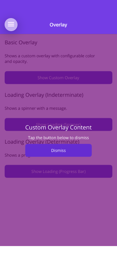
<!-- Overlays in the Panels collection --> <shiny:ShinyContentPage.Panels> <shiny:Overlay IsShown="{Binding IsOverlayVisible}" BlurRadius="10"> <shiny:Overlay.OverlayContentTemplate> <DataTemplate> <VerticalStackLayout HorizontalOptions="Center" VerticalOptions="Center" Spacing="12"> <Label Text="Hello from the overlay!" TextColor="White" FontSize="20" /> <Button Text="Dismiss" Command="{Binding DismissCommand}" /> </VerticalStackLayout> </DataTemplate> </shiny:Overlay.OverlayContentTemplate> </shiny:Overlay> </shiny:ShinyContentPage.Panels>
</shiny:ShinyContentPage>MAUI — Loading Overlay (Spinner)
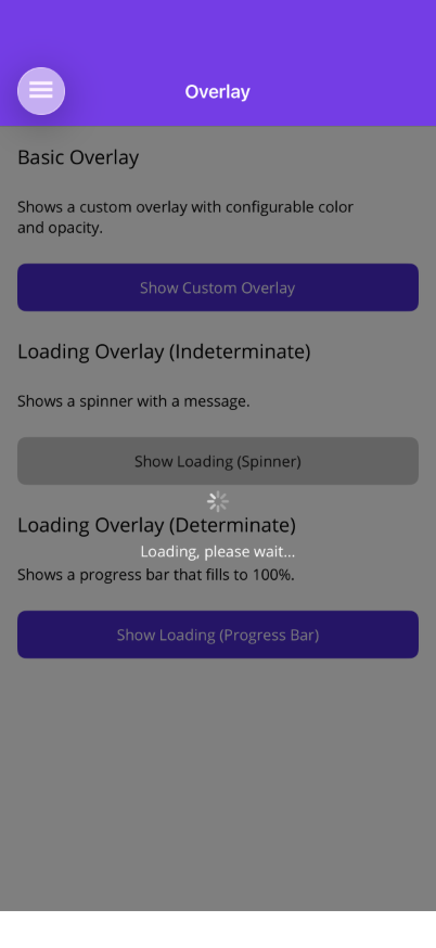
Section titled “MAUI — Loading Overlay (Spinner)”<shiny:ShinyContentPage.Panels> <shiny:LoadingOverlay IsShown="{Binding IsBusy}" Message="Loading, please wait..." /></shiny:ShinyContentPage.Panels>MAUI — Loading Overlay (Progress Bar)
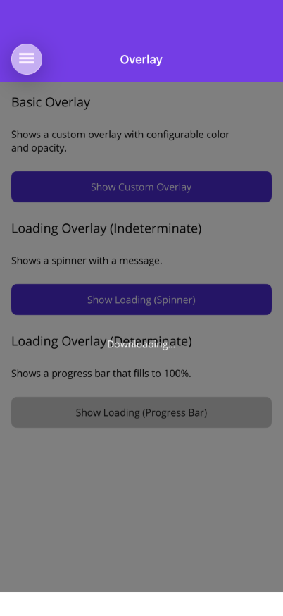
Section titled “MAUI — Loading Overlay (Progress Bar)”<shiny:ShinyContentPage.Panels> <shiny:LoadingOverlay IsShown="{Binding IsBusy}" IsIndeterminate="False" Progress="{Binding DownloadProgress}" Message="Downloading..." /></shiny:ShinyContentPage.Panels>Blazor — Custom Overlay
Section titled “Blazor — Custom Overlay”<Overlay IsShown="@isShown" OverlayColor="rgba(0, 0, 0, 0.6)" BlurRadius="10"> <ChildContent> <button @onclick="() => isShown = true">Show Overlay</button> </ChildContent> <OverlayContent> <div style="color: white; text-align: center;"> <h2>Hello from the overlay!</h2> <button @onclick="() => isShown = false">Dismiss</button> </div> </OverlayContent></Overlay>Blazor — Loading Overlay
Section titled “Blazor — Loading Overlay”<LoadingOverlay IsShown="@isBusy" IsIndeterminate="false" Progress="@progress" BlurRadius="8" Message="Downloading..."> <p>Page content that gets overlaid when loading</p></LoadingOverlay>Overlay Properties
Section titled “Overlay Properties”| Property | Type | Default | Description |
|---|---|---|---|
| IsShown | bool | false | Show/hide the overlay (TwoWay) |
| AnimationDuration | uint | 250 | Fade animation duration in ms |
| BlurRadius | double | 0 | When > 0, applies a frosted glass blur effect behind the backdrop using FrostedGlassView. Uses native platform blur (UIVisualEffectView on iOS, RenderEffect on Android 12+). |
| OverlayContentTemplate | DataTemplate | null | Custom overlay content |
Backdrop color and opacity are controlled at the ShinyContentPage / OverlayHost level:
| Property | Type | Default | Description |
|---|---|---|---|
| BackdropColor | Color | Black | Shared backdrop color |
| BackdropMaxOpacity | double | 0.5 | Maximum backdrop opacity when shown |
Blazor
Section titled “Blazor”| Parameter | Type | Default | Description |
|---|---|---|---|
| IsShown | bool | false | Show/hide overlay |
| IsShownChanged | EventCallback<bool> | — | Two-way binding callback |
| OverlayColor | string | ”rgba(0,0,0,0.5)“ | CSS color for backdrop |
| OverlayOpacity | double | 1.0 | Additional opacity multiplier |
| BlurRadius | double | 0 | When > 0, applies CSS backdrop-filter: blur(Xpx) to the backdrop |
| ChildContent | RenderFragment | — | Normal page content |
| OverlayContent | RenderFragment | — | Content rendered in the overlay |
| CssClass | string? | null | Additional CSS class |
LoadingOverlay Properties
Section titled “LoadingOverlay Properties”Inherits all Overlay properties, plus:
| Property | Type | Default | Description |
|---|---|---|---|
| IsIndeterminate | bool | true | true = spinner, false = progress bar |
| Progress | double | 0 | Progress 0–100 (TwoWay) |
| Message | string? | null | Text below the loading indicator |
| SpinnerColor | Color | White | ActivityIndicator color |
Blazor
Section titled “Blazor”| Parameter | Type | Default | Description |
|---|---|---|---|
| IsIndeterminate | bool | true | Spinner (true) or progress bar (false) |
| Progress | double | 0 | Progress 0–100 |
| Message | string? | null | Text below the loading indicator |
| SpinnerColor | string | ”#FFFFFF” | CSS spinner border color |
| SpinnerSize | double | 48 | Spinner diameter in px |
| ProgressBarColor | string | ”#FFFFFF” | Progress bar fill color |
| ProgressTrackColor | string | ”rgba(255,255,255,0.2)“ | Progress bar track color |
| BlurRadius | double | 0 | When > 0, applies CSS backdrop-filter: blur(Xpx) to the backdrop |
Placement Notes
Section titled “Placement Notes”MAUI: Place Overlay or LoadingOverlay inside ShinyContentPage.Panels or an OverlayHost. They share the backdrop with FloatingPanel — only one backdrop is shown at a time, and it auto-hides when all clients dismiss. Tapping the backdrop dismisses the overlay.
Blazor: The Overlay component uses ChildContent for your normal page content and OverlayContent for what appears in the overlay. Uses fixed CSS positioning when shown. No ShinyContentPage equivalent needed.
Code-Behind Setup (MAUI)
Section titled “Code-Behind Setup (MAUI)”Your page must inherit from ShinyContentPage:
using Shiny.Maui.Controls;
public partial class MyPage : ShinyContentPage{    public MyPage()    {        InitializeComponent();    }}