


Walkthrough
Walkthrough is a guided tour of a page: dim everything, cut a hole around one control at a time, and say
what it does. Onboarding, feature announcements, and walking someone through a workflow they only do once
a quarter.


Screenshots
Section titled “Screenshots”MAUI (iOS)
| Welcome — no cut-out | Popover on a target | Circular spotlight | Live target through the hole |
|---|---|---|---|
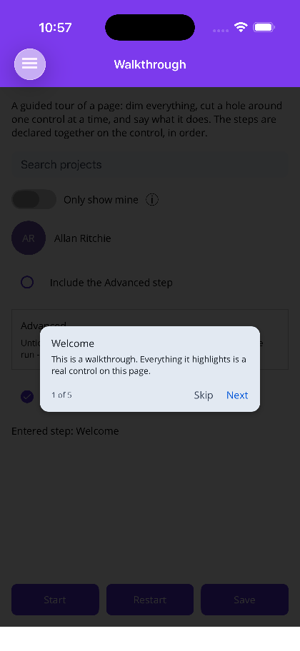 |
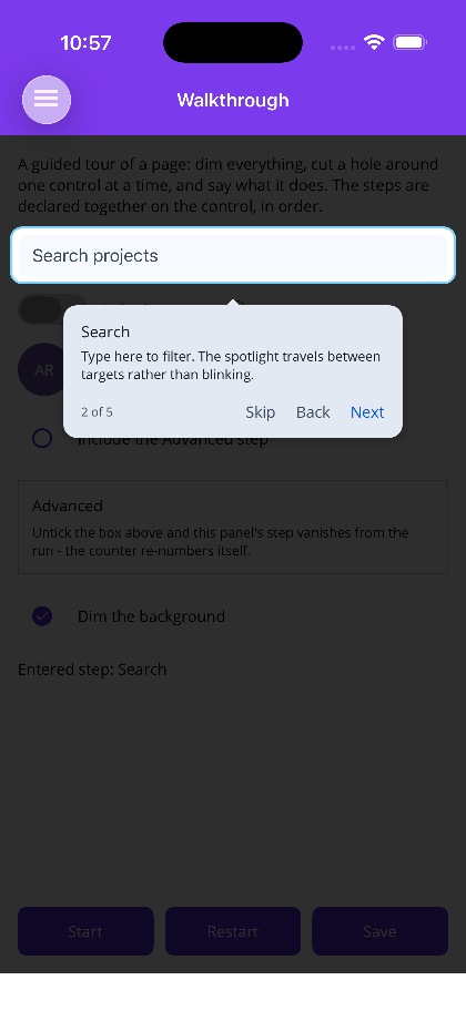 |
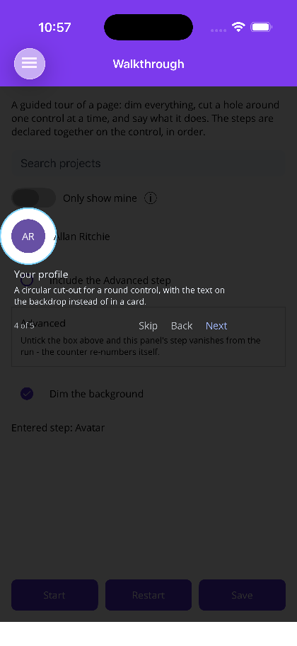 |
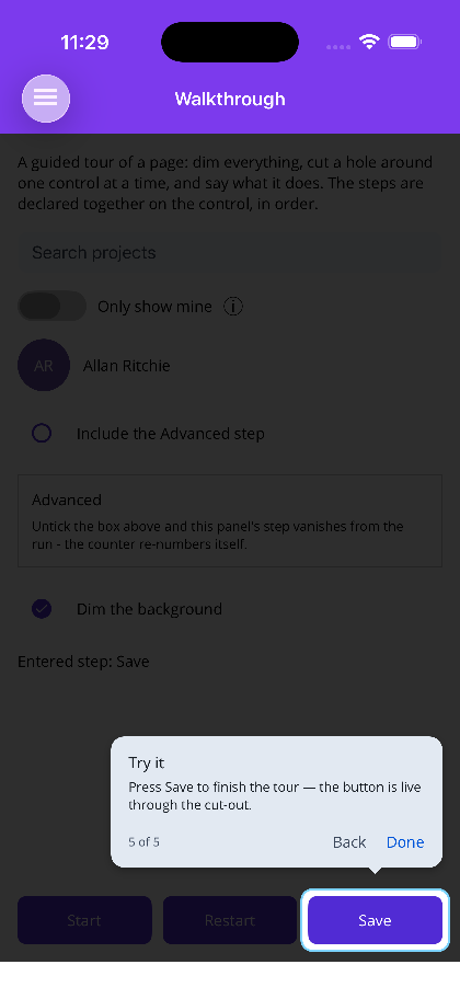 |
Blazor
| Welcome — no cut-out | Popover on a target | Circular spotlight | Live target through the hole |
|---|---|---|---|
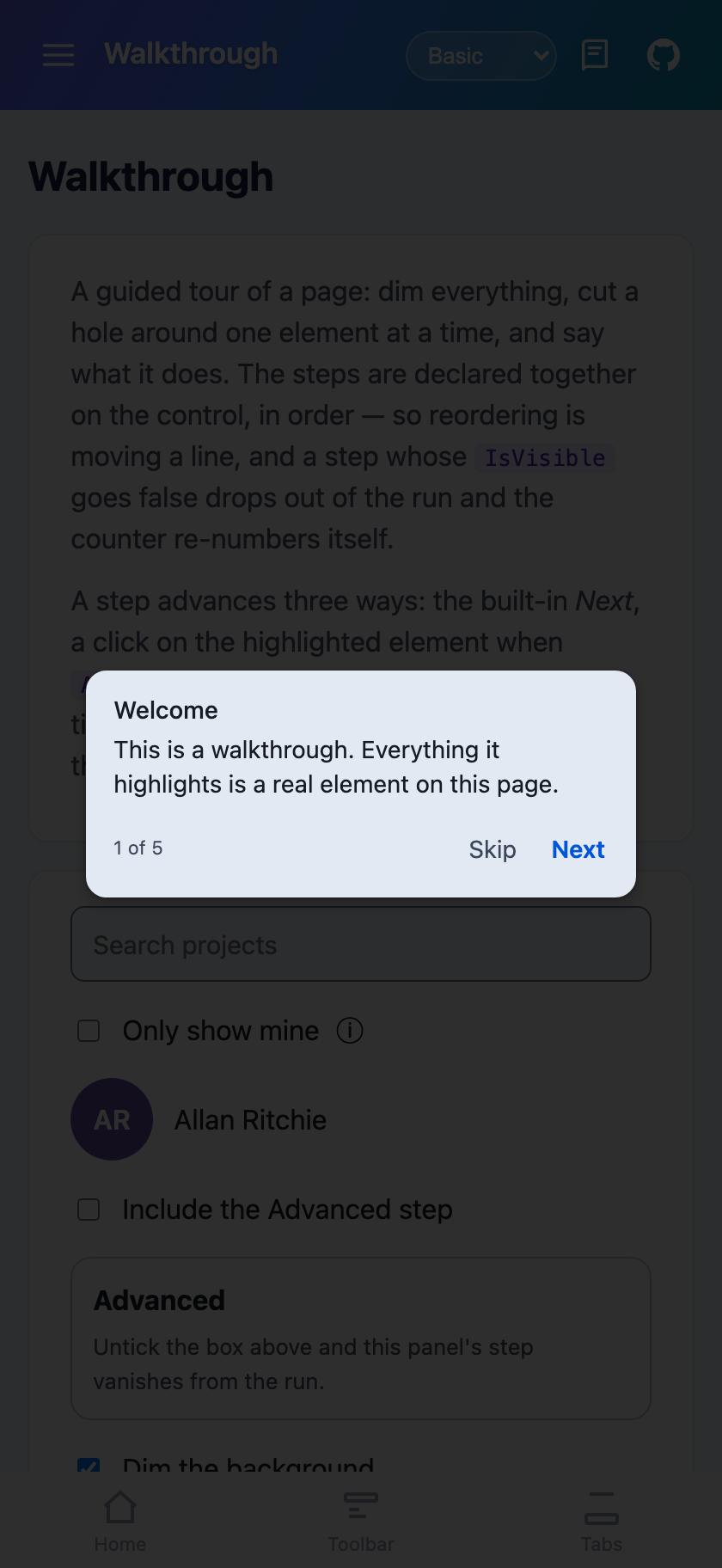 |
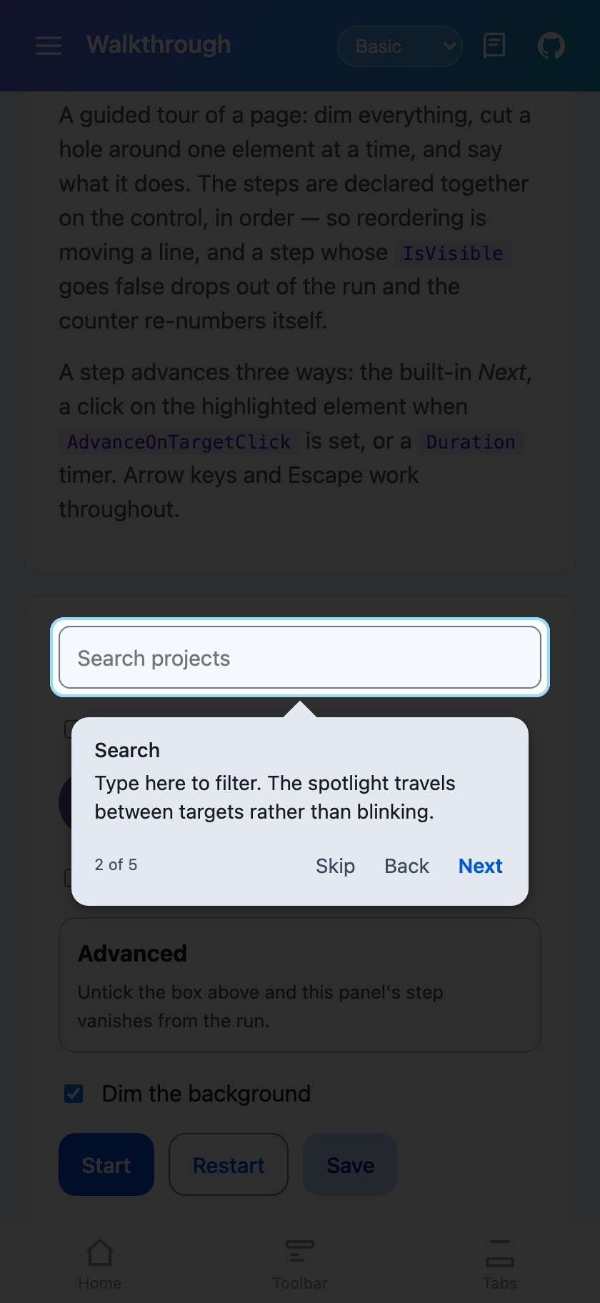 |
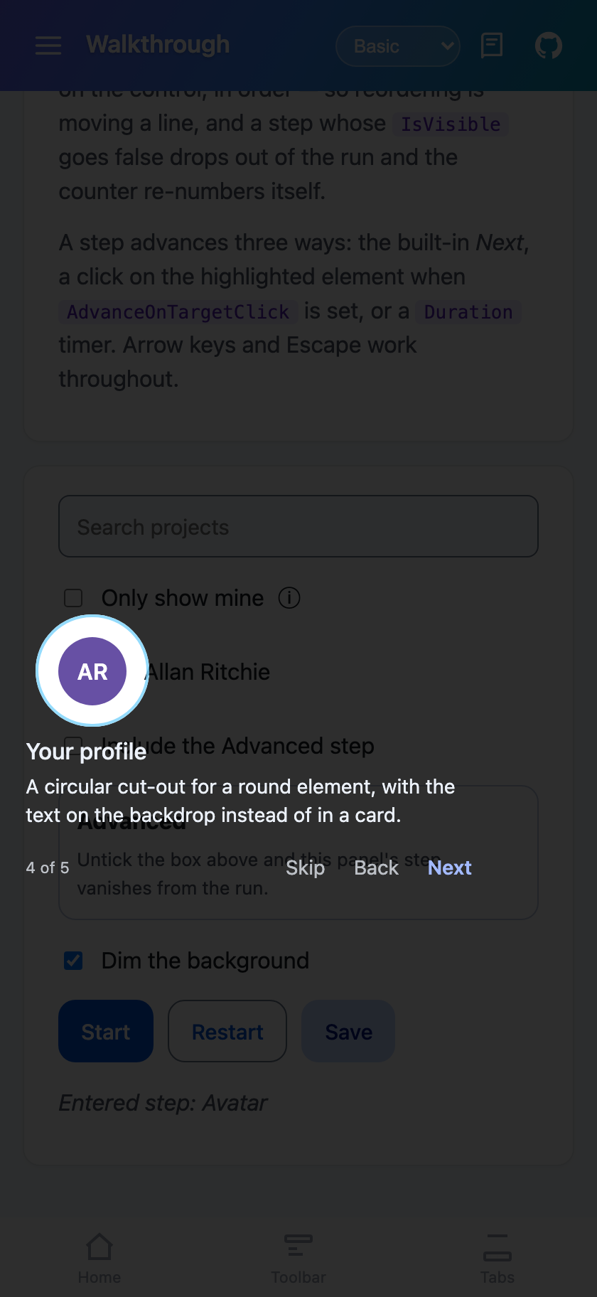 |
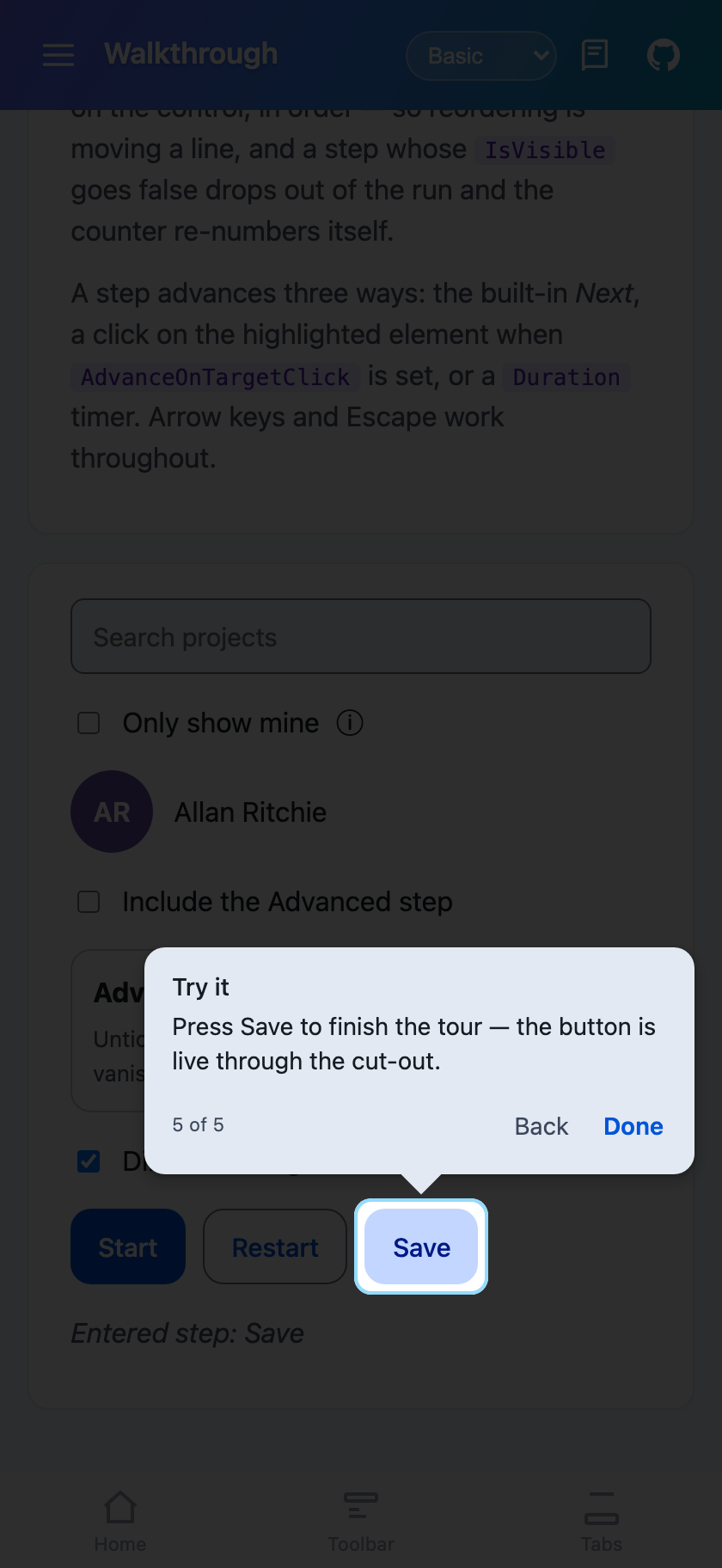 |
Why the steps live on the control
Section titled “Why the steps live on the control”The steps are declared together on the walkthrough, in order. They are not attached to the controls they describe, and that is the design decision the whole control is built around.
Attached properties look tidy on a small screen and fall apart on a real one. Nested layouts, templated cells, a control that is only sometimes there — the sequence ends up scattered across the markup where nothing can see it as a whole. Reordering means hunting. A step whose control is conditionally hidden silently derails the rest. Neither problem is visible until a user hits it.
A collection reorders by moving a line, IsVisible="False" takes a step out of the run cleanly, and the
counter re-numbers itself.
Features
Section titled “Features”- Animated spotlight — the cut-out travels from one target to the next rather than blinking, and shrinks to nothing as the tour ends
- Four displays —
Popover(card, tail, counter, Back/Next/Skip),Tooltip(compact, no buttons),Inline(card without a tail) andSpotlight(no card at all — the text sits on the dim) - Three ways to advance — a command, a tap on the highlighted control itself, or a dwell timer
- Live targets —
AllowTargetInteractionlets taps inside the cut-out reach the real control, so the user can try the thing being explained - Conditional steps — bind
IsVisibleand a step drops out of the run - Runs once —
RememberRunKey, backed by a replaceable store - Per-step motion —
AnimationIn/AnimationOutand their durations - Your own body —
Content/ContentTemplate(MAUI) or child markup (Blazor) replaces the card’s contents while keeping the highlight, placement and animation - Not clipped — the tour paints into a layer above the page’s content, so a target inside a scroll view or a card is highlighted where it actually is
Three ways to advance
Section titled “Three ways to advance”These compose per step:
- The Next command — the built-in nav row, or bind
NextCommand/ callNextAsync()from your own button. - Using the highlighted control —
AdvanceOnTargetTap(MAUI) /AdvanceOnTargetClick(Blazor). This is the “tap Save to continue” step. It impliesAllowTargetInteraction, since the tap has to reach the control to count. - A timer — the step’s
Duration, in milliseconds. Zero (the default) waits for the user.
Plus AdvanceOnBackdropTap / AdvanceOnBackdropClick, off by default because a stray tap would otherwise
end a tour early, and on Blazor the arrow keys and Enter.
xmlns:shiny="http://shiny.net/maui/controls"
<shiny:Walkthrough x:Name="Tour"                   RememberRunKey="home-v1"                   AutoStart="True"                   AutoStartDelay="700"                   UseOverlay="True"                   OverlayOpacity="0.8"                   IsRunning="{Binding IsTouring}"                   CompletedCommand="{Binding TourDone}">
    <!-- No target: a centred welcome card, no cut-out. -->    <shiny:WalkthroughStep Name="Welcome"                           Title="Welcome"                           Text="Here is what is new in this release."                           AnimationIn="Pop" />
    <shiny:WalkthroughStep Name="Search"                           Target="{x:Reference SearchBox}"                           Title="Find anything"                           Text="Search across every project you can see."                           Placement="Bottom" />
    <!-- Compact, no buttons, advances itself after 2.5s. -->    <shiny:WalkthroughStep Target="{x:Reference FilterSwitch}"                           Text="Filters the list to yours."                           Display="Tooltip"                           Duration="2500" />
    <!-- No card; the cut-out does the pointing. -->    <shiny:WalkthroughStep Target="{x:Reference Avatar}"                           Title="Your profile"                           Text="Settings and sign-out live here."                           Display="Spotlight"                           Highlight="Circle" />
    <!-- Only in the run while the account has teammates. -->    <shiny:WalkthroughStep Target="{x:Reference InvitePanel}"                           IsVisible="{Binding CanInvite}"                           Title="Invite the team"                           Display="Inline" />
    <!-- Live control: the tap reaches it through the hole, and using it advances. -->    <shiny:WalkthroughStep Target="{x:Reference SaveButton}"                           Text="Press Save to finish."                           Placement="Top"                           AllowTargetInteraction="True"                           AdvanceOnTargetTap="True" /></shiny:Walkthrough>
Walkthrough renders nothing where it sits — it is invisible and takes no space — so put it anywhere on
the page.
Bind a button straight to the control, with no view-model code at all:
<Button Text="Show me around" Command="{Binding Source={x:Reference Tour}, Path=RestartCommand}" />Targeting
Section titled “Targeting”Prefer Target="{x:Reference SearchBox}". It is checked when the XAML compiles, so a renamed control
breaks the build instead of quietly producing a tour that highlights nothing. TargetName="SearchBox" is
the escape hatch for controls created in code, resolved through the page’s name scope when the step shows.
A step with no resolvable target does not fail: it shows centred, with no cut-out. That is also how you get a plain welcome card.
Blazor
Section titled “Blazor”<Walkthrough @ref="tour" RememberRunKey="home-v1" AutoStart="true" AutoStartDelay="700" UseOverlay="true" OverlayOpacity="0.8" Completed="OnTourDoneAsync"> <Steps> <WalkthroughStep Name="Welcome" Title="Welcome" Text="Here is what is new." />
<WalkthroughStep Target="#search" Title="Find anything" Text="Search across every project you can see." Placement="TooltipPlacement.Bottom" />
<WalkthroughStep Target="#avatar" Title="Your profile" Display="WalkthroughDisplay.Spotlight" Highlight="WalkthroughHighlight.Circle" />
<WalkthroughStep Target="#save" Text="Press Save to finish." AllowTargetInteraction="true" AdvanceOnTargetClick="true" /> </Steps></Walkthrough>
@code { Walkthrough? tour;}Differences from MAUI:
Targetis a CSS selector string, resolved each time the step shows — so it works for content that comes and goes.- Methods are async and live on the component reference:
StartAsync,StopAsync,NextAsync,BackAsync,SkipAsync,GoToAsync,ResetAsync,RestartAsync. There are noICommandproperties. - Callbacks are
EventCallback:Started,StepChanged,Completed,Skipped,Ended. EnableKeyboard(default on) gives arrows/Enter to move and Escape to leave — a tour nobody can leave is a trap — andLockScroll(default on) stops the page scrolling underneath.- Colours are CSS strings.
Register the store that backs RememberRunKey:
builder.Services.AddShinyWalkthrough();Or
builder.Services.AddShinyControls()— one call registers this alongside every other service-backed control. Both areTryAdd, so calling either or both is safe.
It is optional. Without it a tour simply runs every time rather than failing, which is the safe direction for onboarding to break in.
Remembering a run
Section titled “Remembering a run”RememberRunKey is what makes onboarding onboarding: the tour runs once per user and then stays out of the
way. AutoStart checks it before starting.
- MAUI —
IWalkthroughStore, defaulting toPreferences. AssignWalkthrough.Storeduring startup to put the flag with the rest of your user state instead. On the plainnet10.0head (macOS AppKit, GTK4)Preferencesis a platform API that is not there, so the default falls back to memory — once per launch rather than persisted. Supply your own store on those heads. - Blazor —
IWalkthroughStorein DI, defaulting tolocalStorage. Register your own withAddShinyWalkthrough<T>().
Reset() / ResetAsync() clears the flag. Restart() / RestartAsync() clears it and starts — that is
the “show me the tour again” menu item.
Bump the key (home-v1 → home-v2) to show a changed tour to users who have already seen the old one.
The four displays
Section titled “The four displays”| Display | Card | Tail | Buttons | For |
|---|---|---|---|---|
Popover |
yes | yes | yes | The default. Most steps. |
Tooltip |
yes | yes | no | A short label on an obvious control. Pair with Duration. |
Inline |
yes | no | yes | A target too large for a tail to point at meaningfully. |
Spotlight |
no | no | yes | The cut-out is the message. |
Spotlight needs UseOverlay and falls back to Popover without it — bare text over live content is
unreadable, so rendering it would be worse than ignoring the setting.
Live controls
Section titled “Live controls”AllowTargetInteraction lets taps inside the cut-out reach the real control. It is implemented by fencing
the backdrop with four transparent panels around the hole rather than one full-screen catcher: hit
testing has no notion of a hole, so the hole has to be a gap between panels. Everything outside is still
the walkthrough’s.
With UseOverlay="False" there are no panels at all, no dim and no cut-out — the app stays entirely live
and the callouts float over it.
Timing the start
Section titled “Timing the start”AutoStartDelay defaults to 400ms, and non-zero for a reason: the tour measures its targets, and a page
that is still animating in gives it the position a control was at, not where it lands. Raise it for a
page with a longer entrance.
Walkthrough properties
Section titled “Walkthrough properties”| Property | Default | Notes |
|---|---|---|
Steps |
— | The content property, so steps are just children |
IsRunning |
false |
Two-way. Set true to start; written back false when it ends |
AutoStart / AutoStartDelay |
false / 400 |
|
RememberRunKey / RememberOnSkip |
null / true |
|
UseOverlay |
true |
Off leaves the app live; also disables the cut-out |
OverlayColor / OverlayOpacity |
theme scrim / 0.8 |
|
Highlight |
RoundedRectangle |
Rectangle / Circle / Ellipse / None |
HighlightPadding / HighlightCornerRadius |
6 / 10 |
|
RingColor / RingThickness |
null / 0 |
An outline traced round the cut-out |
SpotlightMoveDuration |
320 |
Travel time between targets |
ShowNavigation / ShowStepCounter / ShowSkip / ShowBack |
true |
|
NextText / BackText / SkipText / FinishText |
Next / Back / Skip / Done | |
AdvanceOnBackdropTap |
false |
|
ScrollToTarget |
true |
|
CalloutColor / CalloutTextColor / CalloutCornerRadius / MaxCalloutWidth |
theme / theme / unset / 320 |
|
CalloutOffset / ScreenMargin |
14 / 16 |
Read-only: StepCount, StepNumber, CurrentStep, CurrentStepIndex, HasRun.
Commands to bind to a button (MAUI): StartCommand, StopCommand, NextCommand, BackCommand,
SkipCommand, RestartCommand.
Commands raised outward (MAUI): StartedCommand, StepChangedCommand, CompletedCommand,
SkippedCommand, EndedCommand.
Step properties
Section titled “Step properties”| Property | Default | Notes |
|---|---|---|
Target |
null |
{x:Reference} on MAUI, a CSS selector on Blazor |
TargetName |
null |
MAUI only — x:Name resolved at show time |
Name |
null |
For GoTo and CurrentStep |
Title / Text |
null |
|
Content / ContentTemplate |
null |
MAUI. Blazor uses child markup |
IsVisible |
true |
False drops the step from the run |
Display |
Popover |
|
Placement |
Auto |
Top / Bottom / Left / Right / Center |
Duration |
0 |
Dwell time in ms before auto-advancing |
DurationIn / DurationOut |
260 / 180 |
Animation lengths |
AnimationIn / AnimationOut |
Zoom / Fade |
None / Fade / Slide / Zoom / Pop |
Highlight / HighlightPadding / HighlightCornerRadius |
null |
Null inherits from the walkthrough |
AllowTargetInteraction |
false |
|
AdvanceOnTargetTap / AdvanceOnTargetClick |
false |
Implies the above |
ScrollToTarget |
null |
Null inherits |
EnteredCommand / LeftCommand (MAUI), Entered / Left (Blazor) |
null |