


Docking
A Visual-Studio-style window-docking system for desktop apps. Drop a host into a page, register your panels by stable string IDs, and the layout takes care of dockable tool windows, tabbed groups, draggable splitters, auto-hide rails, and tear-off floating windows that survive across launches.
Two packages ship the same shape:
| Package | Description |
|---|---|
Shiny.Maui.Controls.Desktop |
MAUI desktop (Windows + macOS AppKit + MacCatalyst + Linux GTK). Combined with Tray Icon in the same package since both share the desktop TFM matrix. |
Shiny.Blazor.Controls |
Blazor (browser today; Blazor Server / BlazorWebView once the contracts stabilize). There is no Blazor add-on package: docking ships in the main controls package, in the Shiny.Blazor.Controls.Docking namespace. |
Mobile (iOS / Android) is intentionally out of scope.


MAUI (macOS AppKit)

Blazor
| Default layout | Output panel docked to the bottom |
|---|---|
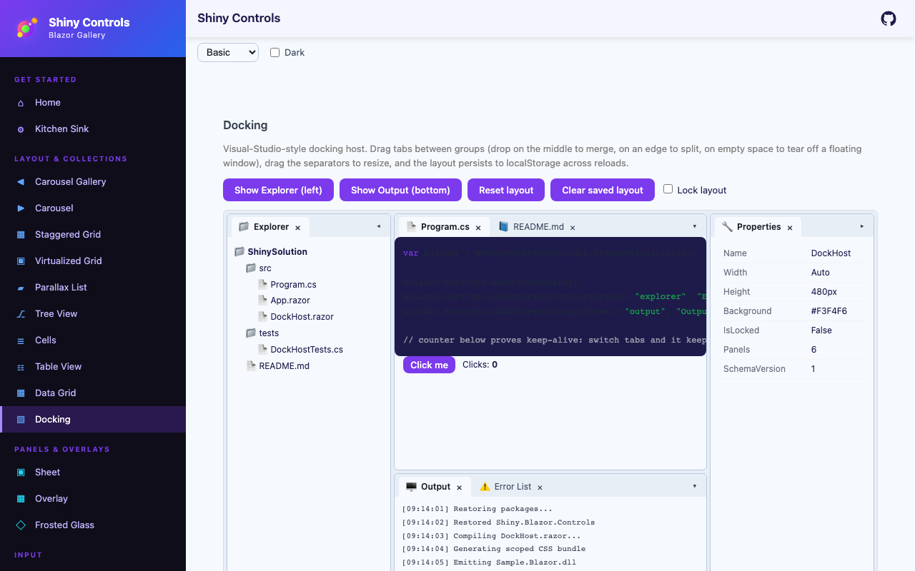 |
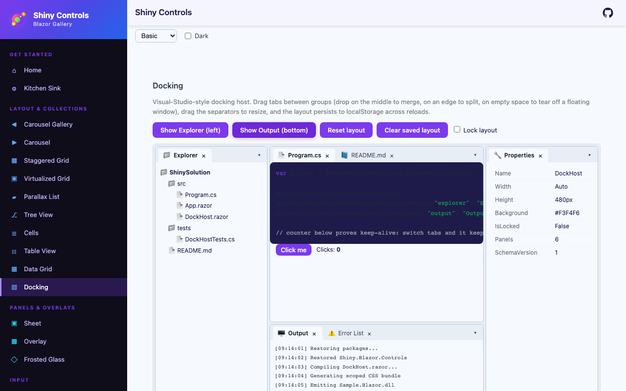 |
- MyApp/
1#if PLATFORM2using MyApp.Services;34namespace MyApp;56public static class MauiProgram7{8 public static MauiApp CreateMauiApp()9 {10 var builder = MauiApp.CreateBuilder();1112 builder 13 .UseMauiApp<App>()14 .UseShiny()15 // desktop only - Android / iOS throw PlatformNotSupportedException when a tray icon is created16 .UseTrayIcon()17 .UseShinyDocking()18 .UseDesktopKeyboardShortcuts()19 .UseDesktopQuickEntry() // borderless window over other apps from a global hotkey20 .UseFileDrop()21 .ConfigureFonts(fonts =>22 {23 fonts.AddFont("OpenSans-Regular.ttf", "OpenSansRegular");24 fonts.AddFont("OpenSans-Semibold.ttf", "OpenSansSemibold");25 });2627 // TODO: once you have localization, add these28 //builder.Services.AddLocalization();29 //builder.Services.AddStronglyTypedLocalizations();30 builder.Services.AddSingleton(TimeProvider.System);31#if DEBUG32 builder.Logging.SetMinimumLevel(LogLevel.Trace);33 builder.Logging.AddDebug();34#endif3536 // source generated by Shiny.Extensions.DependencyInjection - registers every class marked [Singleton], [Scoped] or [Transient]37 builder.Services.AddGeneratedServices();38 // builder.Services.AddGeneratedAITools(); // https://shinylib.net/di/ai-tools/39 var app = builder.Build();4041 return app;42 }43}44#endifSetup (.NET MAUI)
Section titled “Setup (.NET MAUI)”dotnet add package Shiny.Maui.Controls.DesktopIn MauiProgram.cs:
using Shiny;using MyApp.Panels;   // SolutionExplorerPanel, OutputPanel — your dockable views
var builder = MauiApp.CreateBuilder();builder    .UseMauiApp<App>()    .UseShinyDocking()    .AddDockPanel<SolutionExplorerPanel>("solution-explorer", displayName: "Explorer", icon: "📁")    .AddDockPanel<OutputPanel>("output");
AddShinyControls()registers docking too, and takes the panels inline:AddShinyControls(cfg => cfg.AddDockPanel<OutputPanel>("output")). Both areTryAdd, so calling either or both is safe.
Each AddDockPanel<TView>("id") call registers TView as a transient service and an IDockableContentFactory keyed to your stable string ID. Persisted layouts reference panels by that ID, so you can rename the C# class without breaking saved layouts. The optional displayName sets the tab title (defaults to the panel ID) and icon sets an emoji / unicode glyph shown on tabs and collapsed edge bars; a panel that implements IDockableContent overrides both per-instance.
Panels that must not be closed
Section titled “Panels that must not be closed”Some panels a surface simply cannot work without — a file explorer’s folder tree, an editor’s
document area. Closing one of those leaves a layout with nothing on screen that would bring it
back, because nothing reopens a panel unless you have built that yourself. Register those with
canClose: false:
services .AddShinyDocking() .AddDockPanel<FolderTreePanel>("explorer-tree", displayName: "Folders", icon: "📁", canClose: false) .AddDockPanel<FileListPanel>("explorer-files", displayName: "Files", icon: "📄", canClose: false) .AddDockPanel<OutputPanel>("output"); // closable, as most panels should beThe tab stops drawing a close button, and HidePanelAsync refuses the panel as well — so it is a
rule the host keeps rather than a button you happened to hide. Prefer it to suppressing
.shiny-dock-tab__close in CSS, which only removes the affordance and leaves every other close
path open.
Attach the host inside any existing ContentPage — DockHostView is a ContentView, not a ContentPage subclass. You keep full control of your Shell / page architecture:
<ContentPage xmlns="http://schemas.microsoft.com/dotnet/2021/maui" xmlns:docking="clr-namespace:Shiny.Maui.Controls.Desktop.Docking;assembly=Shiny.Maui.Controls.Desktop" x:Class="MyApp.DockingShellPage" Title="IDE"> <docking:DockHostView x:Name="Dock" InitialLayout="{Binding StartupLayout}" LayoutStore="{Binding LayoutStore}" IsLocked="{Binding IsLayoutLocked}" /></ContentPage>DockHostView implements IDockHost directly — call Dock.ShowPanelAsync(...) / Dock.ResetLayoutAsync() and subscribe to Dock.Events from code-behind. Bindable properties: InitialLayout (DockRoot? — the layout built when no persisted layout loads), LayoutStore (IDockLayoutStore? — loaded at startup, auto-saved with debouncing on every layout change), and IsLocked (bool).
A dockable panel is just a regular View:
public sealed class SolutionExplorerPanel : ContentView{ public SolutionExplorerPanel(/* inject anything you need */) { Content = new VerticalStackLayout { Padding = 12, Children = { new Label { Text = "Solution Explorer" } } }; }}Setup (Blazor)
Section titled “Setup (Blazor)”Program.cs:
using Shiny.Blazor.Controls.Docking;
builder.Services .AddShinyDocking() .AddDockPanel<SolutionExplorerPanel>("solution-explorer", displayName: "Explorer", icon: "📁") .AddDockPanel<OutputPanel>("output");_Imports.razor:
@using Shiny.Blazor.Controls.DockingAny razor page:
<DockHost @ref="host" InitialLayout="@layout" LayoutStore="@layoutStore" IsLocked="@locked" />Component parameters: InitialLayout (DockRoot?), IsLocked (bool), LayoutStore (IDockLayoutStore? — loaded at startup, auto-saved with debouncing), and BackgroundColor (CSS color override). The component implements IDockHost — capture it with @ref to call ShowPanelAsync / ResetLayoutAsync / Snapshot and subscribe to Events (e.g. in OnAfterRender).
Each panel is a regular Razor component. Blazor docking supports in-app floating; popping panels out into separate browser windows is not supported (Blazor runtime instances cannot share component instances across windows).
Defining an initial layout
Section titled “Defining an initial layout”readonly DockRoot layout = new(){ MainWindow = new DockWindowState { LeftRail = new DockGroup { Tabs = { new DockTab { PanelTypeId = "solution-explorer" } } }, DocumentArea = new DockSplit { Orientation = DockOrientation.Vertical, Ratio = 0.7, First = new DockGroup { Tabs = { new DockTab { PanelTypeId = "editor" }, new DockTab { PanelTypeId = "readme" } } }, Second = new DockGroup { Tabs = { new DockTab { PanelTypeId = "output" } } } } }};Layout Schema
Section titled “Layout Schema”A POCO tree with a source-generated System.Text.Json context (AOT-safe). Round-trip with DockSerialization.Serialize(root) and DockSerialization.Deserialize(json).
DockRoot├── int SchemaVersion + int MinReadableVersion├── DockWindowState MainWindow└── List<DockWindowState> FloatingWindows         (stacking order is session state, not persisted)
DockWindowState├── DockRect? Bounds                              (screen-coord rectangle — desktop only)├── bool IsMaximized + bool IsFullScreen├── DockNode DocumentArea                         (structurally distinct document well)├── DockNode? LeftRail + TopRail + RightRail + BottomRail├── double? LeftRailSize + TopRailSize + RightRailSize + BottomRailSize├── List<DockArea> CollapsedRails                 (legacy whole-rail collapse — converted to per-panel on load)├── List<DockCollapsedPanel> CollapsedTabs        (per-panel edge-bar collapse: which panel, which edge)├── string? ActivePanelId                         (for focus restoration on load)└── string? RestoreGroupId                        (floating windows only: the group it was torn from — docking back returns it there)
DockNode = DockSplit | DockGroup | DockEmpty       (polymorphic, $kind discriminator)DockSplit  { Orientation, Ratio (0..1), First, Second }DockGroup  { GroupId, List<DockTab> Tabs, int ActiveTabIndex, List<int> FocusHistory (MRU), bool IsCollapsed }DockEmpty  { }
DockTab            { PanelTypeId, PanelInstanceId, bool IsPinned }DockCollapsedPanel { DockArea Area, DockTab Tab }
Schema versioning is built in from day one: bump SchemaVersion, register an IDockLayoutMigrator for each step, and stored layouts migrate forward as your app upgrades. Unknown PanelTypeIds on load land in a missing-panels tray rather than silently dropping — so a removed feature gracefully degrades instead of corrupting the layout.
Contracts
Section titled “Contracts”IDockHost
Section titled “IDockHost”Per-window controller exposed by DockHostView / <DockHost />.
public interface IDockHost{    bool IsLocked { get; set; }                    // layout read-only mode (kiosk / demos)    IDockEvents Events { get; }    IDockCommandScope CommandScope { get; }
    Task LoadAsync(DockRoot root, CancellationToken ct = default);    DockRoot Snapshot();
    Task ShowPanelAsync(string panelTypeId, DockArea preferredArea = DockArea.Left, CancellationToken ct = default);    Task HidePanelAsync(string panelInstanceId, CancellationToken ct = default);    Task ActivatePanelAsync(string panelInstanceId, CancellationToken ct = default);    Task ResetLayoutAsync(CancellationToken ct = default);    Task FloatPanelAsync(string panelInstanceId, CancellationToken ct = default);   // tear a panel off into its own floating window    Task SetRailCollapsedAsync(DockArea area, bool collapsed, CancellationToken ct = default);}
IDockableContentFactory
Section titled “IDockableContentFactory”Registered by AddDockPanel<T>("id") — resolves the stable string ID to a View (MAUI) or RenderFragment (Blazor).
public interface IDockableContentFactory{ string PanelTypeId { get; } string DisplayName => PanelTypeId; // tab title (default interface member) string? Icon => null; // optional emoji / unicode glyph Task<View> CreateAsync(string instanceId, CancellationToken ct = default);}IDockableContent
Section titled “IDockableContent”Optional interface your panel content can implement to participate in disposal, focus, and pointer hand-off semantics.
public interface IDockableContent{    string Title { get; }    object? Icon { get; }    bool CanClose { get; }    bool CanFloat { get; }    void OnActivated();    void OnDeactivated();
    // Embedded editors return true to claim pointer-down events — prevents the dock    // system from starting a tab drag during caret-drag inside a text editor.    bool WantsPointerDown(double x, double y);}
IDockLayoutStore (bring-your-own)
Section titled “IDockLayoutStore (bring-your-own)”Persistence is consumer-supplied — no default implementation ships. Hand your store to the host (LayoutStore bindable property on DockHostView, LayoutStore parameter on <DockHost>): it loads at startup (falling back to InitialLayout when the store returns null) and auto-saves every layout change, debounced by SaveDebounceMs. Two minimal patterns:
// File-backedpublic sealed class FileDockLayoutStore(string path) : IDockLayoutStore{    public int SaveDebounceMs => 500;
    public async Task<DockRoot?> LoadAsync(CancellationToken ct = default)        => File.Exists(path) ? DockSerialization.Deserialize(await File.ReadAllTextAsync(path, ct)) : null;
    public Task SaveAsync(DockRoot root, CancellationToken ct = default)        => File.WriteAllTextAsync(path, DockSerialization.Serialize(root), ct);}
// Shiny.Stores-backed (works on every host)public sealed class ShinyStoreDockLayoutStore(IKeyValueStore store) : IDockLayoutStore{    public int SaveDebounceMs => 500;
    public Task<DockRoot?> LoadAsync(CancellationToken ct = default)        => Task.FromResult(store.Get<string?>("docking.layout") is { } json            ? DockSerialization.Deserialize(json) : null);
    public Task SaveAsync(DockRoot root, CancellationToken ct = default)    {        store.Set("docking.layout", DockSerialization.Serialize(root));        return Task.CompletedTask;    }}
IDockLayoutMigrator
Section titled “IDockLayoutMigrator”Forward-only schema migrations. Register one per version step — chained automatically.
public interface IDockLayoutMigrator{ int FromVersion { get; } int ToVersion { get; } DockRoot Migrate(DockRoot input);}IDockEvents
Section titled “IDockEvents”Observability surface — wire into telemetry, undo stacks, or autosave debouncing.
public interface IDockEvents{ event EventHandler<LayoutChangedEventArgs>? LayoutChanged; event EventHandler<PanelActivatedEventArgs>? PanelActivated; event EventHandler<DockDragEventArgs>? DragStarted; event EventHandler<DockDragEventArgs>? DragCompleted; event EventHandler<DockDragEventArgs>? DragCancelled;}IDockCommandScope
Section titled “IDockCommandScope”Scopes global accelerators (Ctrl+W close tab, Ctrl+Tab MRU, Ctrl+Alt+PgUp/Dn group navigation) to the dock surface so they only fire when keyboard focus is inside it.
public interface IDockCommandScope{ bool IsInScope { get; } string? ActiveGroupId { get; } string? ActivePanelInstanceId { get; }}Interactions
Section titled “Interactions”Everything below ships working end-to-end on both hosts:
- Tab drag, the Visual Studio way — pull a tab out of its strip and it becomes a translucent floating window that follows the pointer (on Blazor it carries a live snapshot of the panel, so you see the window you are about to get). A docking compass appears over the pane under the pointer — the centre guide adds the panel as a tab, the four arms split the pane — and four outer guides sit on the host edges to dock against that side of the whole layout. Only a guide you are hovering is a target, and an accent preview shows exactly where the panel will land. Let go anywhere else and the panel floats right there, at the size you were dragging. Over a tab strip the drop inserts at the caret. On Blazor Esc cancels a drag; MAUI has no cross-platform key hook, so a MAUI drag is cancelled only by the platform.
- Floating windows — real window chrome: a title bar with the panel’s icon and title, Dock and Close buttons (Close is hidden while any panel inside is registered
canClose: false), an accent title bar on the window that holds the active panel, and no redundant tab strip for a single panel. Resize from every edge and corner; click to bring a window to the front. Drag a window by its title bar and the window itself travels translucent with the same guides: drop it on a guide to dock the whole window (an edge drop keeps its internal splits, a centre or tab-strip drop merges its tabs), or anywhere else to move it. Bounds persist inDockRoot.FloatingWindows. - Double-click a tab to float it. Double-click a floating window’s title bar, or press Dock, to send it home — back into the group it was torn from (
RestoreGroupId), or onto the left rail if that group has gone.IDockHost.FloatPanelAsync(instanceId)floats a panel from code. - Splitters — drag to resize;
DockSplit.Ratiopersists and is clamped to 0.08–0.92 so neither side can vanish. - Per-panel collapse — collapse a tab to a slim edge bar (icon + rotated title); click to restore.
SetRailCollapsedAsync(area, collapsed)collapses or restores a whole rail at once. Collapsed state persists viaCollapsedTabs. - Locked mode —
IsLocked = truedisables drag, resize, collapse, and close; switching between existing tabs still works. Ideal for kiosk and demo scenarios. - Events — wire
host.Events.LayoutChanged / PanelActivated / DragStarted / DragCompleted / DragCancelledfor telemetry, autosave hooks, or undo stacks.
Panel lifecycle
Section titled “Panel lifecycle”Every tab in the layout has a unique PanelInstanceId (GUID). The host creates content once per instance via the factory and keeps the same view/component instance alive as it moves between groups, rails, and floating windows.
Disposal contract
Section titled “Disposal contract”When a panel is closed, the host disposes the content if it implements IDisposable. Tearing off to a floating window or moving between groups in the same window does not dispose — the same view instance is moved. This is intentional and documented because retrofitting “recreated” → “preserved” would break every panel implementation, and consumers will rely on whichever behavior ships first.
Theming
Section titled “Theming”MAUI: ResourceDictionary keys (DockTabBackgroundBrush, DockGroupSeparatorBrush, …) — names locked before styling lands so consumer code stays stable.
Blazor: CSS custom properties (--shiny-dock-host-bg, --shiny-dock-placeholder-fg, …) — override on a parent or on <DockHost> itself. The accent used by the focused tab bar, focused-group border, active floating title bar, docking guides and drop preview is the theme’s --shiny-color-primary; set --shiny-dock-accent to give docking its own. Other hooks: --shiny-dock-group-bg, --shiny-dock-border, --shiny-dock-tabs-bg, --shiny-dock-focus-border, --shiny-dock-float-header-bg / -fg, --shiny-dock-float-active-header-bg / -fg, --shiny-dock-float-shadow, --shiny-dock-splitter-hover.
Animation duration is a theme token, not a constant — reduced-motion / accessibility consumers can flatten to zero without recompiling.
Architectural Notes
Section titled “Architectural Notes”- macOS tear-off uses native AppKit (
net10.0-macos)NSPanelatNSWindowLevel.Floating. MacCatalyst stays in-app-only in v1 (Catalyst can’t do borderless click-through windows for the drag ghost). - Cross-window drag uses mouse-down implicit capture, not global mouse hooks. This sidesteps the macOS Accessibility entitlement entirely, so the library works under sandboxed / Mac App Store distribution.
- Floating window z-order is session state. Clicking a window raises it without rewriting the layout, so focusing a window never triggers a save.
- Document area vs tool area is a schema-level partition rather than a per-panel flag, so document-well focus rules and tab behavior don’t leak into every consumer.
Related
Section titled “Related”- Tray Icon — ships in the same
Shiny.Maui.Controls.Desktoppackage - FloatingPanel — a mobile-shaped bottom/top sheet for MAUI; distinct from desktop docking auto-hide rails