


Floor Plan
FloorPlanView draws a floor plan — rooms, walls, doors, cubicles, outlets, furniture and custom SVG
stencils — on a pan-and-zoom canvas, and lets you edit it. It has two modes, and in practice they are
two quite different controls:
-
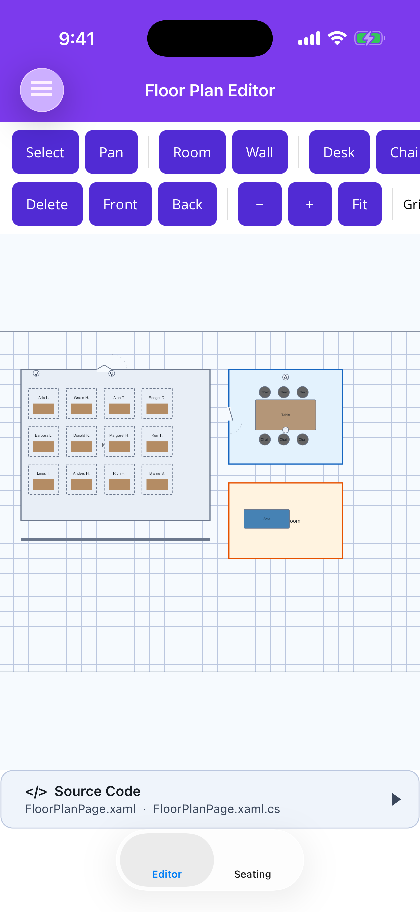
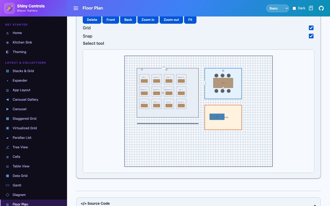
Edit — the active tool has the pointer. Draw rooms and walls, drop furniture, drag things around, grab a handle to resize, rubber-band a selection.
-
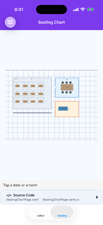
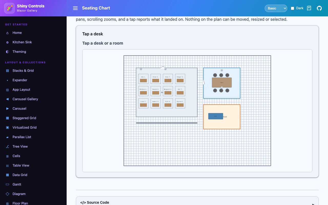
View — the whole surface pans, nothing can be moved, and a tap tells you what it landed on. That is the seating chart, and it needs no toolbar at all.
-
-
-



- MyApp/
1#if PLATFORM2using Shiny.Maui.Controls.FloorPlan;3using MyApp.Services;45namespace MyApp;67public static class MauiProgram8{9 public static MauiApp CreateMauiApp()10 {11 var builder = MauiApp.CreateBuilder();1213 builder 14 .UseMauiApp<App>()15 .UseShiny()16 // registers SkiaSharp - without it FloorPlanView paints nothing17 .UseShinyFloorPlan()18 .ConfigureFonts(fonts =>19 {20 fonts.AddFont("OpenSans-Regular.ttf", "OpenSansRegular");21 fonts.AddFont("OpenSans-Semibold.ttf", "OpenSansSemibold");22 });2324 // TODO: once you have localization, add these25 //builder.Services.AddLocalization();26 //builder.Services.AddStronglyTypedLocalizations();27 builder.Services.AddSingleton(TimeProvider.System);28#if DEBUG29 builder.Logging.SetMinimumLevel(LogLevel.Trace);30 builder.Logging.AddDebug();31#endif3233 // source generated by Shiny.Extensions.DependencyInjection - registers every class marked [Singleton], [Scoped] or [Transient]34 builder.Services.AddGeneratedServices();35 // builder.Services.AddGeneratedAITools(); // https://shinylib.net/di/ai-tools/36 var app = builder.Build();3738 return app;39 }40}41#endifMAUI
| Edit mode | View mode — the seating chart |
|---|---|
 |
 |
Blazor
| Edit mode | View mode — the seating chart |
|---|---|
 |
 |
| Seating chart page |
|---|
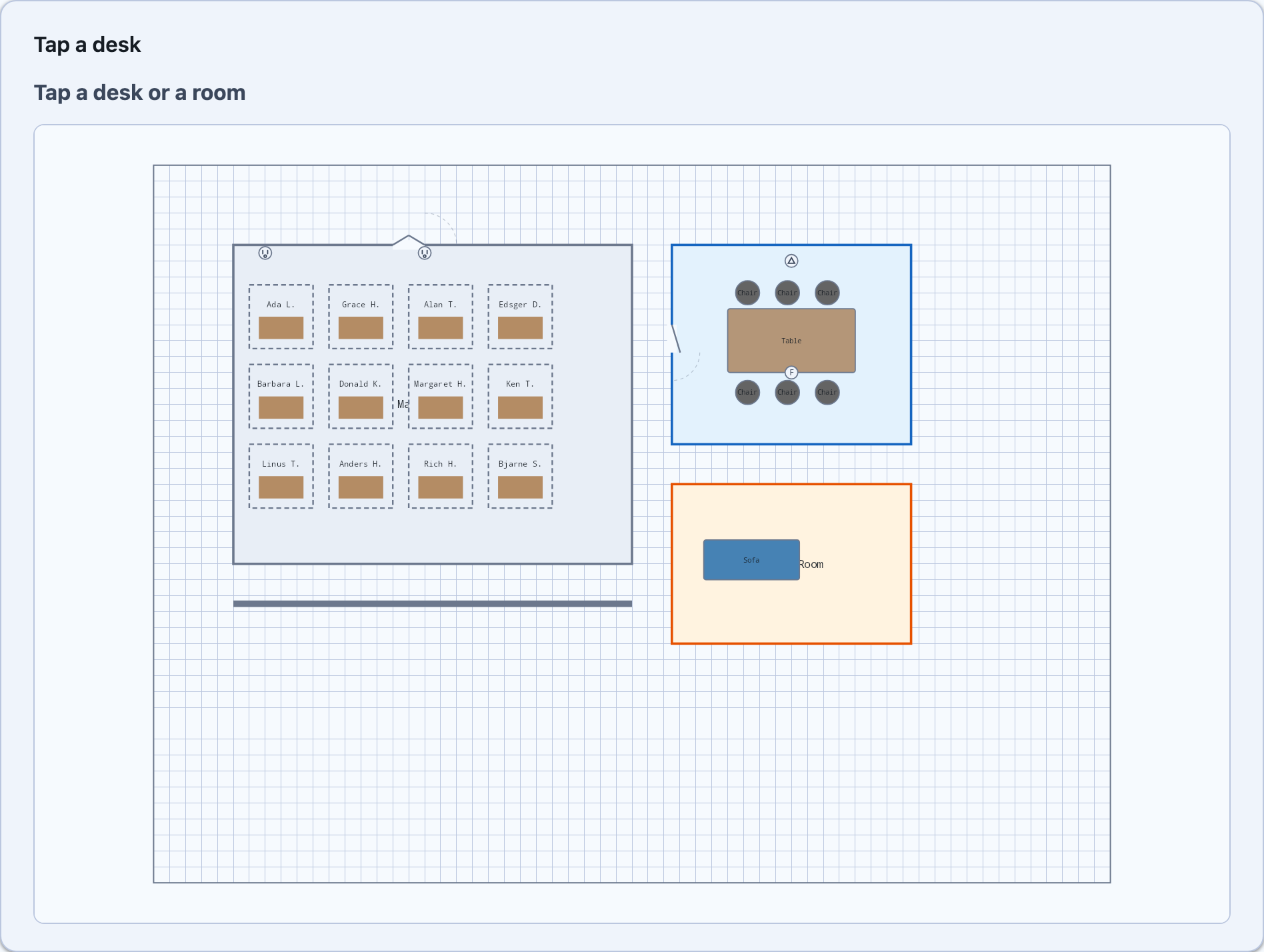 |
One engine, two hosts
Section titled “One engine, two hosts”The plan is painted rather than laid out. Renderers, hit-testing, a camera, snapping and the tools
are all arithmetic over a document, and none of it wants to know whether the surface underneath is an
SKCanvasView in a MAUI page or one in a Blazor component. So it does not know.
Shiny.Controls.FloorPlan.Shared owns the document model, the renderers, the hit-tester, the
camera and every tool. Both controls are a surface and an event pump around one FloorPlanEngine.
That is also why this is an add-on package rather than part of the core ones. The engine is SkiaSharp
all the way down, and putting SkiaSharp in Shiny.Maui.Controls / Shiny.Blazor.Controls would hand
the native binaries to every consumer of those — including every Blazor WebAssembly consumer, who
would then need the WebAssembly native build toolchain to publish anything at all.
Getting started
Section titled “Getting started”.NET MAUI
Section titled “.NET MAUI”dotnet add package Shiny.Maui.Controls.FloorPlanbuilder.UseShinyFloorPlan();That registers SkiaSharp, which is all the control needs — and it is not optional. MAUI will not hand
an SKCanvasView a platform view without it, so a plan in an app that forgot the call is a blank
rectangle with nothing in the log to say why.
<ContentPage xmlns:fp="http://shiny.net/maui/floorplan"> <fp:FloorPlanView x:Name="Plan" Document="{Binding Plan}" ActiveTool="{Binding ActiveTool}" ShowGrid="{Binding ShowGrid}" SnapToGrid="True" SelectedElement="{Binding Selected, Mode=TwoWay}" /></ContentPage>Blazor
Section titled “Blazor”dotnet add package Shiny.Blazor.Controls.FloorPlanNo registration call — but the component does need a sized container. A drawn surface has no intrinsic height, and without one the canvas collapses and the control looks like it failed to load.
<div style="height: 60vh"> <FloorPlanView Document="plan" ActiveTool="tool" ShowGrid="true" @bind-SelectedElement="selected" /></div>On Blazor WebAssembly the package fails your build (SHINY0001) when the WebAssembly native
build toolchain is missing, rather than letting you publish an app that throws
DllNotFoundException: libSkiaSharp on its first frame.
The document
Section titled “The document”using Shiny.Controls.FloorPlan;
var plan = new FloorPlanDocument { Width = 1200, Height = 900, GridSize = 20 };
plan.Elements.Add(new RoomElement{ Name = "Main Office", Label = "Main Office", Transform = { X = 100, Y = 100 }, Width = 500, Height = 400});
plan.Elements.Add(new CubicleElement{ Name = "Desk 1", Occupant = "Ada L.", Transform = { X = 120, Y = 150 }});Sizes are in plan units. The engine never assumes what one is — pixels, centimetres, inches — and the camera is the only thing that turns them into screen coordinates.
| Element | |
|---|---|
RoomElement |
A rectangular room with an optional Label drawn in the middle |
WallElement |
A Start/End segment of a given Thickness |
DoorElement |
An opening with a swing arc; Single, Double or Sliding |
CubicleElement |
A partitioned bay with a desk in it and an optional Occupant |
OutletElement |
A power or data outlet — Standard, Floor or Data |
FurnitureElement |
Desk, chair, table, bookshelf, sofa or file cabinet |
CustomElement |
An instance of one of the document’s own ShapeDefinition stencils |
Everything carries Name (what a tap reports), Transform, Style, ZIndex, IsVisible,
IsLocked and a Metadata dictionary the engine never looks at — hang a desk booking id or a room’s
capacity off it and it round-trips with the rest of the document.
Building and Floor cover the multi-storey case: a stack of plans saved as one file, so a floor
switcher has something to switch between.
Colours belong to the document, and default to the theme
Section titled “Colours belong to the document, and default to the theme”ElementStyle.FillColor and StrokeColor are nullable and default to null, meaning “whatever the
current theme says”. That is what lets one saved plan read correctly in a light app and a dark one —
a document that hard-codes #CCCCCC for every room can only ever be viewed on white.
Set a colour explicitly and it is honoured exactly, in both schemes, which is what you want for a plan that genuinely colour-codes its rooms:
new RoomElement { Label = "Open plan" } // follows the themenew RoomElement { Label = "Boardroom", Style = { FillColor = "#E8F5E9" } } // green in both schemesLocking
Section titled “Locking”IsLocked is enforced in the editor state rather than in each tool, so a locked element cannot be
selected, dragged, resized or deleted — including by a rubber band dragged across it, which is the
accident locking mostly exists to prevent.
Saving and loading
Section titled “Saving and loading”var json = FloorPlanSerializer.SerializeDocument(plan);var back = FloorPlanSerializer.DeserializeDocument(json);Source-generated, so it survives trimming and Native AOT. The type discriminators on
FloorPlanElement ("room", "wall", …) are part of the saved format: renaming one breaks every
document already written, so add new element types with new discriminators rather than reusing old
ones.
One tool is active at a time and the engine hands it every pointer event.
| Tool | |
|---|---|
SelectTool |
The default. Pick, drag, resize from eight handles, rubber-band. Shift adds to the selection |
PanTool |
Drags the camera |
DrawRoomTool |
Drag out a rectangular room |
DrawWallTool |
One click per end. Chained (the default) starts the next wall where the last one ended; right-click ends the run |
PlaceElementTool |
Drops an element wherever you click, with a ghost of the real thing under the pointer first |
The middle button pans from any tool, the way every drawing application behaves.
<fp:FloorPlanView.ActiveTool> <fp:DrawRoomTool /></fp:FloorPlanView.ActiveTool>this.ActiveTool = new PlaceElementTool(FurnitureKind.Chair);PlaceElementTool configures two ways. Kind and its companions (FurnitureKind, OutletType,
DoorType, ShapeDefinitionId) cover the built-in elements and are settable from XAML or a Blazor
parameter; Factory takes over completely when set, which is how you place an element type of your
own or one carrying pre-filled metadata. Repeat = false falls back to SelectTool after one drop.
Writing your own
Section titled “Writing your own”Implement IFloorPlanTool. Render draws a preview in plan coordinates (the camera transform is
already applied) and context.DrawElement paints a real element for you — which is why the placement
ghost is the actual thing you are about to create rather than a generic marker. Only
OnPointerReleased should change the document.
Snapping
Section titled “Snapping”SnapToGrid snaps to the document’s own GridSize; set GridSize to 0 to turn both the grid and
snapping off.
Dragging snaps on release, not on every move. Snapping mid-drag makes the element jump ahead of the pointer, and a nudge smaller than one grid cell does nothing at all.
Theming
Section titled “Theming”The plan is painted, so the theme arrives as a value rather than as inherited colour. Leave Theme
unset and it follows the app: MAUI reads Application.Current.Resources, Blazor reads the
--shiny-color-* custom properties off the element, and both end at FloorPlanSurface so the two
hosts cannot drift into theming this differently. A light/dark flip repaints on its own.
Only the neutrals follow the app. The selection blue means this is what you have hold of and the furniture colours mean this is wood, that is upholstery; restating either in an app’s accent is not theming, it is a different control. Same rule the Office surfaces follow.
For a fixed palette, hand it a FloorPlanTheme:
plan.Theme = FloorPlanTheme.Dark with { Selection = PlanColor.Rgb(0xFF, 0x6B, 0x00) };Viewport
Section titled “Viewport”ZoomToFit(), ZoomIn(), ZoomOut() and ScrollTo(element) are methods on the control rather than
bindable properties: they all need the surface size, and a view model has no business knowing it.
On MAUI, ZoomToFit() is safe to call before the view has ever painted — which is the usual case,
since the natural place to call it is the page’s constructor. The surface has no size until the first
frame, so the request is held and applied there. On Blazor the same thing happens automatically:
FitOnLoad (on by default) fits the plan on the first painted frame.
Selection
Section titled “Selection”SelectedElement is two-way. Reading it tells a view model what the user picked; writing it selects
that element in the plan, so a list beside the plan drives it both ways. It is null when nothing — or
more than one thing — is selected; SelectionChanged / OnSelectionChanged hands over the whole set.
Custom renderers
Section titled “Custom renderers”plan.Engine.RegisterRenderer(new MyRoomRenderer());Renderers are keyed on ElementType exactly — one registered for a base type will not pick up its
subclasses. GetOutlinePath is what a pointer is tested against, so return the silhouette you
actually drew: a renderer that draws a circle but returns its bounding box makes the corners
clickable, and the control feels wrong for a reason nobody can put their finger on.
Platform support
Section titled “Platform support”| MAUI | iOS, Android, Mac Catalyst, Windows |
| Blazor | WebAssembly, Server, Hybrid |