


AppLayout
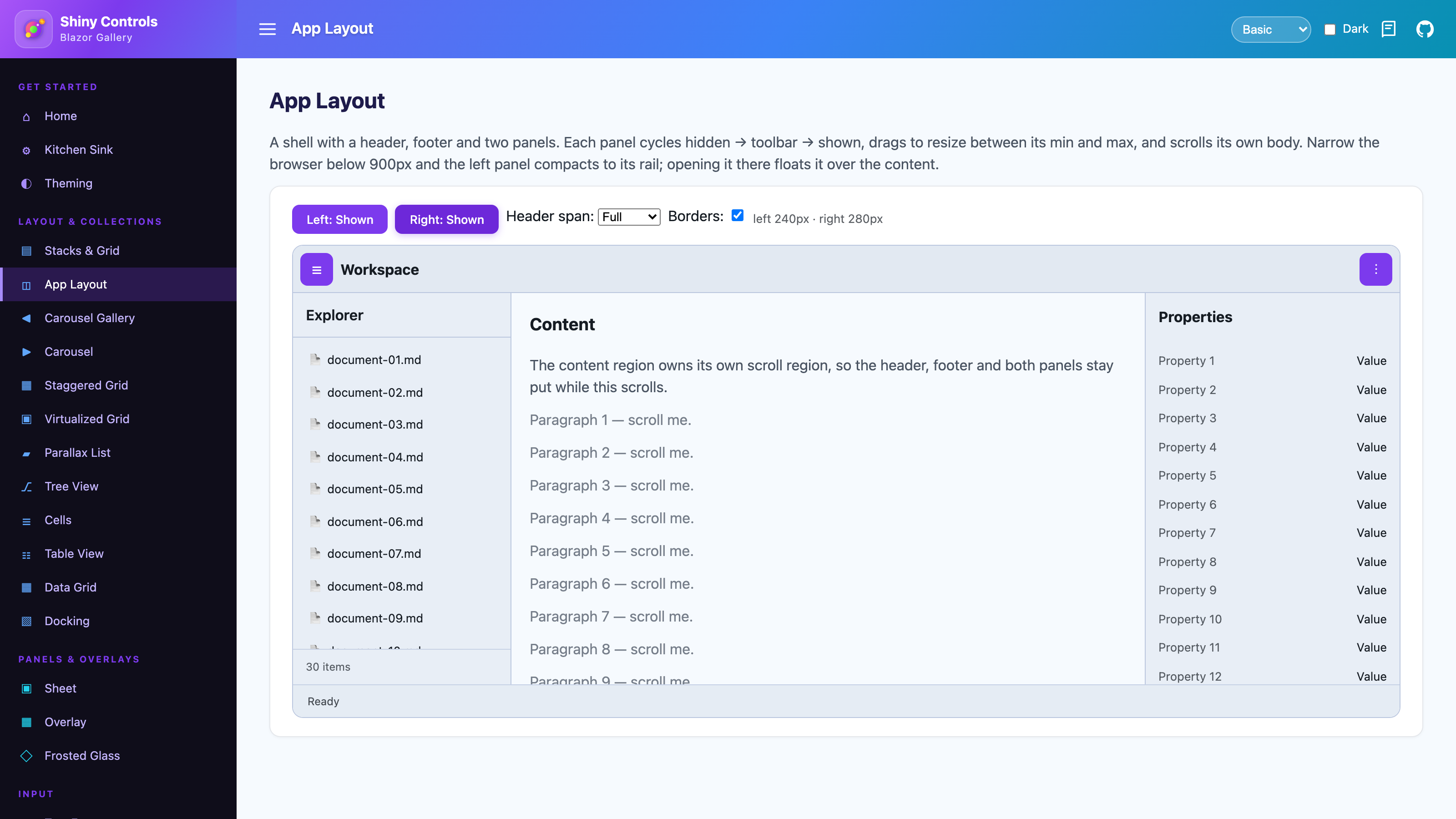
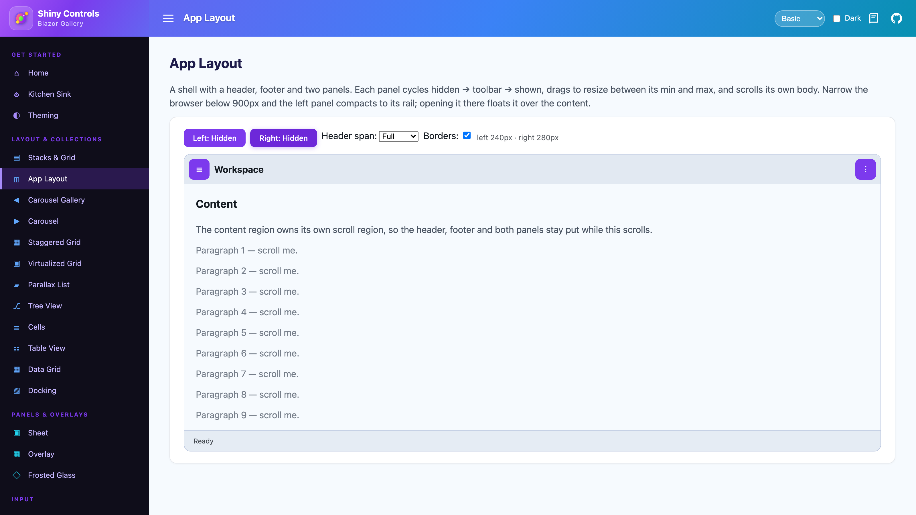
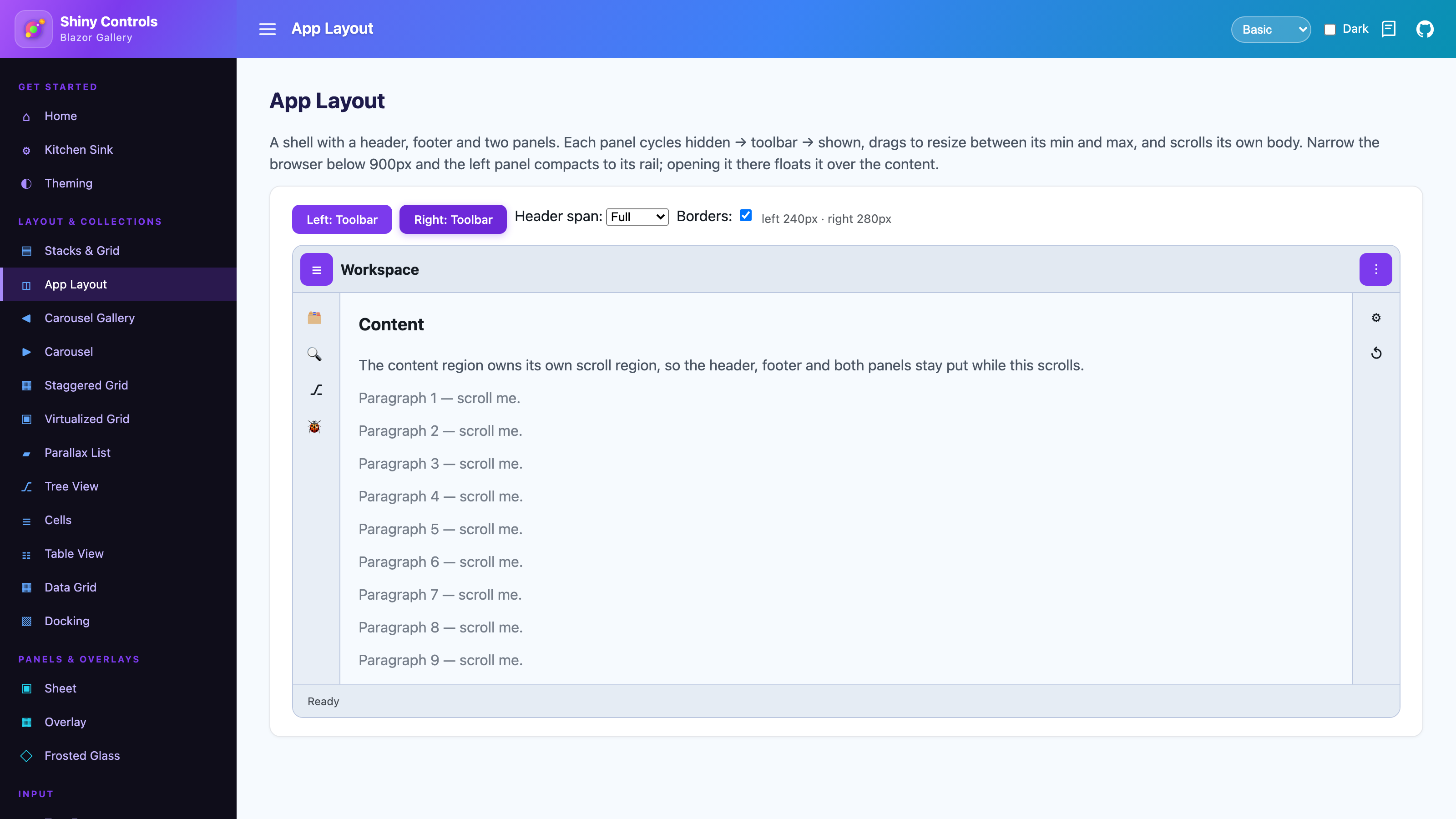
An application shell: a header, a footer, a left and a right panel, and the content between them. Panels collapse to nothing, to a narrow toolbar rail, or to their full width; they drag to resize between a minimum and maximum; and every region keeps its own scroll region.
Blazor only. For a Visual-Studio-style surface where the user rearranges tabbed, tear-off tool windows, see Docking instead — AppLayout is for a fixed shell whose panels you define.

Screenshots
Section titled “Screenshots”| Both panels shown | Both hidden | Both collapsed to the rail |
|---|---|---|
 |
 |
 |
Features
Section titled “Features”- Three panel states –
Hidden,Toolbar(a narrow rail rendering whatever you put inToolbarContent) andShown, two-way bindable or driven from code. - Drag to resize – a handle on each panel’s inner edge, clamped to
MinSizeandMaxSize, with the final width reported back through@bind-Size. - Independent scroll regions – the panel body, the toolbar rail and the content each scroll on their own while the header, footer and a panel’s pinned header/footer stay put.
- Configurable borders – a default width and colour on the shell that every region inherits and can override, or turn off per region.
- Responsive – under a breakpoint measured on the shell (not the window), an expanded panel compacts to a rail and re-expands as a drawer floating over the content.
- Persistence – opt in with
PersistKeyand a panel’s state and width survive a reload. - Order-independent markup – regions are placed by CSS grid areas, so you can write them in whatever order reads best.
Step 1 — Add the marketplace:
claude plugin marketplace add shinyorg/skillsStep 2 — Install the plugin:
claude plugin install shiny@shinyOne plugin installs all 37 Shiny skills. Your agent loads only the skill relevant to what you're building, so there's no cost to having them all available.
Step 1 — Add the marketplace:
copilot plugin marketplace add https://github.com/shinyorg/skillsStep 2 — Install the plugin:
copilot plugin install shiny@shinyOne plugin installs all 37 Shiny skills. Your agent loads only the skill relevant to what you're building, so there's no cost to having them all available.
Getting started
Section titled “Getting started”Nothing to register — no service, no JS reference. The shell imports its own module.
@using Shiny.Blazor.Controls
<AppLayout Height="100dvh">    <AppLayoutHeader Height="56" Padding="0 16">        <button @onclick="() => nav.ToggleAsync()">☰</button>        <strong>My App</strong>    </AppLayoutHeader>
    <AppLayoutPanel @ref="nav"                    Side="PanelSide.Left"                    @bind-State="navState"                    @bind-Size="navWidth"                    MinSize="180"                    MaxSize="420"                    CollapseBelow="900"                    PersistKey="nav">        <HeaderContent><h4>Explorer</h4></HeaderContent>        <ToolbarContent>            <VStack Spacing="4" Align="StackAlign.Center" Padding="8 0">                <button title="Files">🗂</button>                <button title="Search">🔍</button>            </VStack>        </ToolbarContent>        <ChildContent>            @* this is the scrolling body *@            <NavMenu />        </ChildContent>        <FooterContent>…</FooterContent>    </AppLayoutPanel>
    <AppLayoutContent Padding="20">        @Body    </AppLayoutContent>
    <AppLayoutFooter Height="36" Padding="0 16">Ready</AppLayoutFooter></AppLayout>
@code { AppLayoutPanel nav = default!; PanelState navState = PanelState.Shown; double navWidth = 260;}AppLayout
Section titled “AppLayout”| Parameter | Type | Default | Description |
|---|---|---|---|
Height |
string |
"100%" |
CSS height of the shell |
HeaderSpan |
LayoutSpan |
Full |
Full runs the header edge to edge; Content insets it between the panels, which then run the full height |
FooterSpan |
LayoutSpan |
Full |
The same for the footer |
BorderWidth |
double |
1 |
Default divider width for every region |
BorderColor |
string? |
theme outline | Default divider colour for every region |
Background |
string? |
null |
CSS background shorthand |
HostWidth |
double |
read-only | Last measured width of the shell |
AppLayoutHeader & AppLayoutFooter
Section titled “AppLayoutHeader & AppLayoutFooter”Height (pixels; null sizes to the content), Border, BorderWidth, BorderColor, Background and Padding. The header draws its divider on the bottom, the footer on the top. Neither scrolls.
AppLayoutContent
Section titled “AppLayoutContent”Scrollable (default true), Background and Padding. There are no border parameters — the header, footer and panels each draw the divider on their own edge.
AppLayoutPanel
Section titled “AppLayoutPanel”| Parameter | Type | Default | Description |
|---|---|---|---|
Side |
PanelSide |
Left |
Which edge the panel docks to |
State |
PanelState |
Shown |
Hidden, Toolbar or Shown. Two-way via @bind-State |
Size |
double |
260 |
Expanded width in pixels. Two-way via @bind-Size, updated after a drag |
MinSize / MaxSize |
double |
140 / 640 |
Drag clamps |
Resizable |
bool |
true |
Show the drag handle on the inner edge |
ToolbarSize |
double |
56 |
Rail width in Toolbar state |
CollapseBelow |
double |
0 |
Shell width under which the panel compacts. Zero disables it |
CollapsedState |
PanelState |
Toolbar |
What an expanded panel collapses to |
PersistKey |
string? |
null |
Saves state and width to localStorage |
Scrollable |
bool |
true |
Give the body its own scroll region |
Border, BorderWidth, BorderColor |
Divider on the edge facing the content | ||
Background |
string? |
null |
CSS background shorthand |
Padding |
string? |
null |
Applied to the body, so a pinned header or footer stays flush |
Content slots
Section titled “Content slots”| Slot | Renders |
|---|---|
HeaderContent |
Pinned above the body |
ChildContent |
The scrolling body |
FooterContent |
Pinned below the body |
ToolbarContent |
Replaces the body in Toolbar state — put anything you like in the rail |
Members
Section titled “Members”| Member | Description |
|---|---|
SetStateAsync(PanelState) |
Move to a state, raising StateChanged |
ToggleAsync() |
Toggle between Shown and CollapsedState |
CurrentState |
The live state, which may differ from State after a collapse |
CurrentSize |
The live width, which may differ from Size after a drag |
IsOverlay |
True while the panel is floating as a compact drawer |
Responsive behaviour
Section titled “Responsive behaviour”CollapseBelow is measured against the shell, not the browser window — an AppLayout nested inside a card compacts when the card gets narrow.
Below the breakpoint an expanded panel drops to CollapsedState. Expanding it while compact floats it over the content as a drawer with a scrim; clicking the scrim dismisses it. Widening back past the breakpoint restores whatever state the panel had before it compacted.
Compacting never writes to PersistKey — it is a response to the viewport, not a preference the user expressed.
Borders
Section titled “Borders”BorderWidth and BorderColor on the shell become the default for every region, resolved through CSS variables so theme tokens still apply. Each region overrides them individually, or removes its divider with Border="false".
<AppLayout BorderWidth="2" BorderColor="var(--shiny-color-primary)"> <AppLayoutHeader Border="false">…</AppLayoutHeader> <AppLayoutPanel Side="PanelSide.Left" BorderColor="#e5e7eb">…</AppLayoutPanel></AppLayout>A Hidden panel drops its divider along with its width, so collapsing one never leaves a sliver of border sitting flush against the next region’s border.
Aligning header buttons with a rail
Section titled “Aligning header buttons with a rail”A button placed in the header with nothing but the header’s padding to position it will not line up with the icons in a Toolbar rail underneath it. Give it a slot exactly as wide as the panel’s ToolbarSize and centre it in there:
@* one constant drives the rail width and the header slot, so they cannot drift apart *@<AppLayoutHeader Height="52" Padding="0" style="display:flex;align-items:center;">    <div style="flex:0 0 auto;width:52px;display:flex;justify-content:center;">        <button style="width:36px;height:36px;padding:0;" @onclick="ToggleNavAsync">☰</button>    </div>    <strong>Workspace</strong></AppLayoutHeader>
<AppLayoutPanel Side="PanelSide.Left" ToolbarSize="52" @ref="nav">…</AppLayoutPanel>
Using ShinyToolbar and ShinyTabBar as regions
Section titled “Using ShinyToolbar and ShinyTabBar as regions”Both bars position themselves by default, which fights the shell’s grid — the regions already pin them, so turn it off:
ShinyToolbardefaults toSticky="true". PassSticky="false"inside anAppLayoutHeaderor a panel’sHeaderContent.ShinyTabBardefaults toFixed="true". PassFixed="false"inside anAppLayoutFooter, or it leaves the flow, the footer row collapses to nothing and the bar floats over the content.
<AppLayoutHeader Height="64" Border="false" Padding="0">    <ShinyToolbar Sticky="false"                  HasShadow="false"                  BackgroundColor="var(--shiny-color-surface)"                  TextColor="var(--shiny-color-on-surface)"                  BorderThickness="1"                  BorderColor="var(--shiny-color-outline-variant)"                  Height="64" /></AppLayoutHeader>
<AppLayoutFooter Border="false" Padding="0">    <ShinyTabBar Fixed="false" Items="@tabs" /></AppLayoutFooter>
Colour the bars from theme tokens rather than literals, or they stay on a light palette when the app switches to dark.
Accessibility
Section titled “Accessibility”A Hidden panel keeps its element so the width can animate, but is marked inert and aria-hidden — nothing inside it is focusable or announced. The drag handle carries role="separator" with aria-orientation="vertical". The width transition is dropped under prefers-reduced-motion.