


FloatingPanel
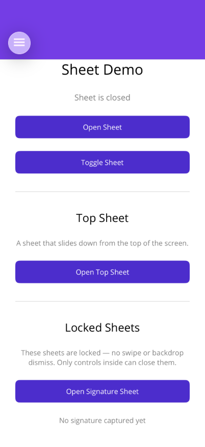
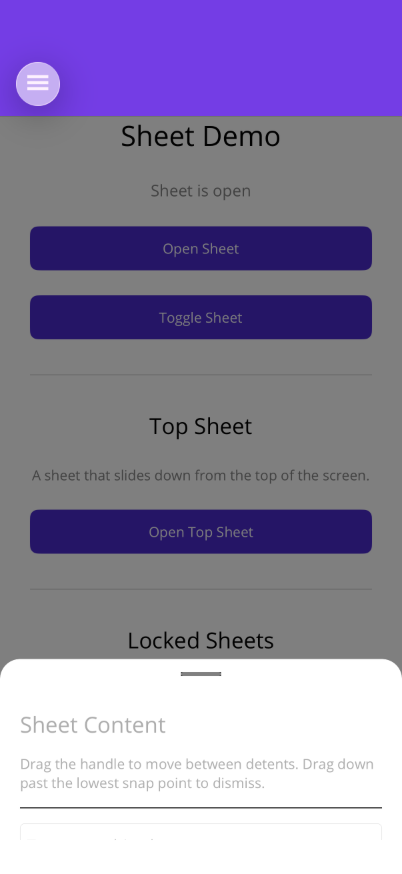
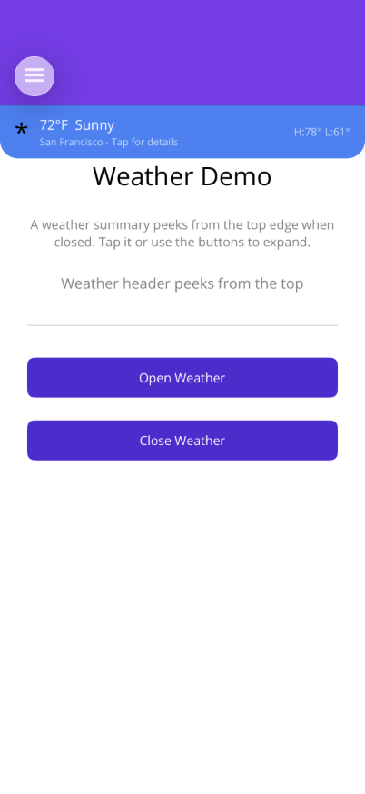
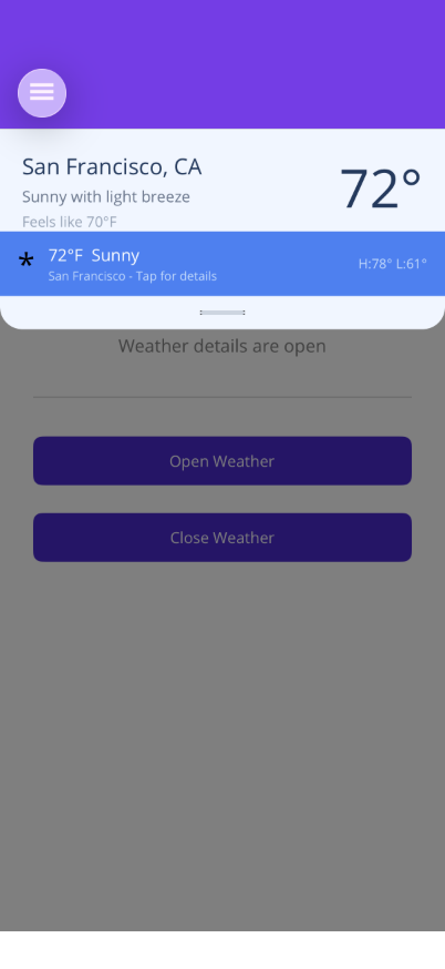
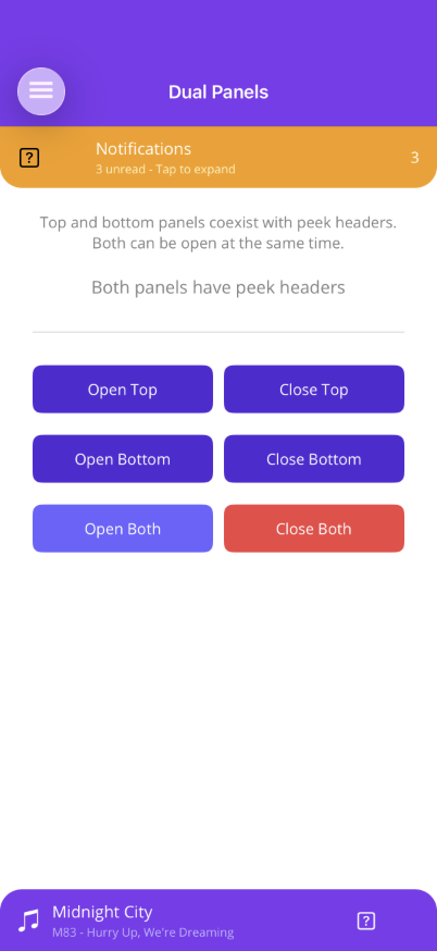
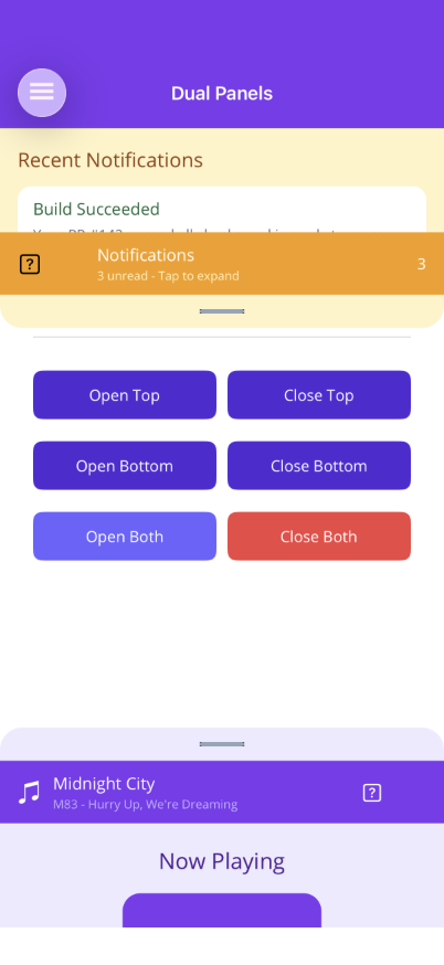
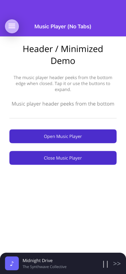
A floating panel overlay that slides in from the bottom or top of the screen with configurable snap positions (detents), optional header peek when closed, backdrop dimming, pan gestures, feedback, and automatic keyboard handling. Requires an OverlayHost container (or the convenience ShinyContentPage base class).

| Open | Header Peek | Now Playing | Browse | Library | Top Panel | Dual Panels |
|---|---|---|---|---|---|---|
 |
 |
 |
 |
 |
 |
 |
Basic Usage
Section titled “Basic Usage”FloatingPanel must live inside an OverlayHost (a transparent Grid that manages backdrops). The easiest approach is to use ShinyContentPage as your page base class:
<shiny:ShinyContentPage xmlns:shiny="http://shiny.net/maui/controls"                        x:Class="MyApp.MyPage">    <shiny:ShinyContentPage.PageContent>        <ScrollView>            <VerticalStackLayout Padding="20" Spacing="10">                <Button Text="Open Panel" Command="{Binding OpenCommand}" />            </VerticalStackLayout>        </ScrollView>    </shiny:ShinyContentContent>
    <shiny:ShinyContentPage.Panels>        <shiny:FloatingPanel IsOpen="{Binding IsPanelOpen, Mode=TwoWay}">            <VerticalStackLayout Padding="20" Spacing="10">                <Label Text="Panel Content" FontSize="18" FontAttributes="Bold" />                <Label Text="Drag the handle or tap the backdrop to close." />            </VerticalStackLayout>        </shiny:FloatingPanel>    </shiny:ShinyContentPage.Panels></shiny:ShinyContentPage>
Or use OverlayHost directly inside any page:
<ContentPage>    <Grid>        <!-- Main page content -->        <ScrollView>            <VerticalStackLayout>                <Button Text="Open Panel" Command="{Binding OpenCommand}" />            </VerticalStackLayout>        </ScrollView>
        <!-- Overlay layer -->        <shiny:OverlayHost>            <shiny:FloatingPanel IsOpen="{Binding IsOpen, Mode=TwoWay}">                <Label Text="Panel content" />            </shiny:FloatingPanel>        </shiny:OverlayHost>    </Grid></ContentPage>
Features
Section titled “Features”| Feature | Description |
|---|---|
| Pan gesture | Drag up/down between detents via the handle; swipe past the lowest to close |
| Keyboard handling | Auto-expands to highest detent when an Entry/Editor is focused, restores on dismiss |
| ScrollView integration | Scroll enabled only at the highest detent; disabled at lower detents so pan gestures work |
| Backdrop | Semi-transparent overlay managed by OverlayHost; supports multiple simultaneous panels |
| Locked mode | IsLocked="True" hides the drag handle and disables pan gestures. The panel can only be opened/closed via binding. Ideal for signature capture, selectors, or confirmation dialogs |
| Fit content | FitContent="True" measures content and auto-computes a single detent to fit, ignoring the Detents collection |
| Top, bottom, or bottom with tabs | Position="Top" slides from the top, Position="BottomTabs" clips above a Shell TabBar |
| Header peek | Provide HeaderTemplate and set ShowHeaderWhenClosed="True" to show a tap/drag target when the panel is closed |
| Feedback | Tactile click on open, close, and detent snap (disable with UseFeedback="False") |
| Corner radius | Configurable via PanelCornerRadius (auto-flips for top vs bottom positioning) |
OverlayHost
Section titled “OverlayHost”OverlayHost is a transparent Grid that manages backdrop dimming for overlay clients (FloatingPanel, Overlay, LoadingOverlay). It tracks active clients and only hides the backdrop when all are dismissed. Tapping the backdrop dismisses all active clients (FloatingPanels that allow it, and Overlays).
| Property | Type | Default | Description |
|---|---|---|---|
BackdropColor |
Color |
Black |
Color of the dimming overlay |
BackdropMaxOpacity |
double |
0.5 |
Maximum backdrop opacity when clients are active |
ShinyContentPage
Section titled “ShinyContentPage”ShinyContentPage is a convenience ContentPage subclass with a built-in OverlayHost. Use PageContent for your main content and Panels for floating panels and overlays:
| Property | Type | Description |
|---|---|---|
PageContent |
View? |
Your main page content (replaces Content) |
Panels |
IList<IView> |
Collection of FloatingPanel, Overlay, or LoadingOverlay instances |
BackdropColor |
Color |
Forwarded to the internal OverlayHost |
BackdropMaxOpacity |
double |
Forwarded to the internal OverlayHost |
AI Skill
Section titled “AI Skill”Step 1 — Add the marketplace:
claude plugin marketplace add shinyorg/skillsStep 2 — Install the plugin:
claude plugin install shiny@shinyOne plugin installs all 48 Shiny skills. Your agent loads only the skill relevant to what you're building, so there's no cost to having them all available.
Step 1 — Add the marketplace:
copilot plugin marketplace add https://github.com/shinyorg/skillsStep 2 — Install the plugin:
copilot plugin install shiny@shinyOne plugin installs all 48 Shiny skills. Your agent loads only the skill relevant to what you're building, so there's no cost to having them all available.