


ShinyButton
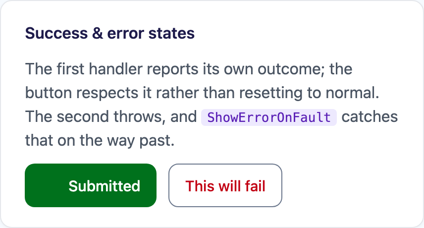
A button that knows what it is doing: a leading and a trailing icon slot, a real working state, and success/error states, all wired to the theme and — on MAUI — to its Command.


MAUI (iOS)
| Appearance × Type | Motion icons in the slots | All three busy modes at once |
|---|---|---|
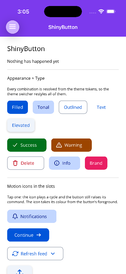 |
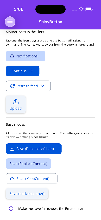 |
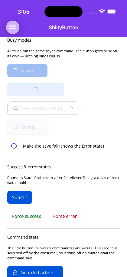 |
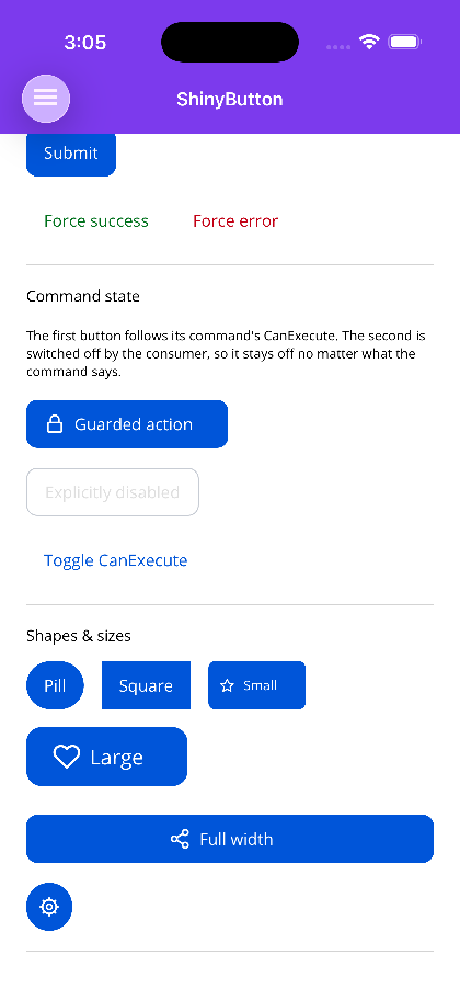
| Success state, command state | Shapes & sizes |
|---|---|
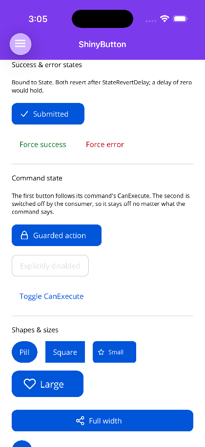 |
 |
Blazor
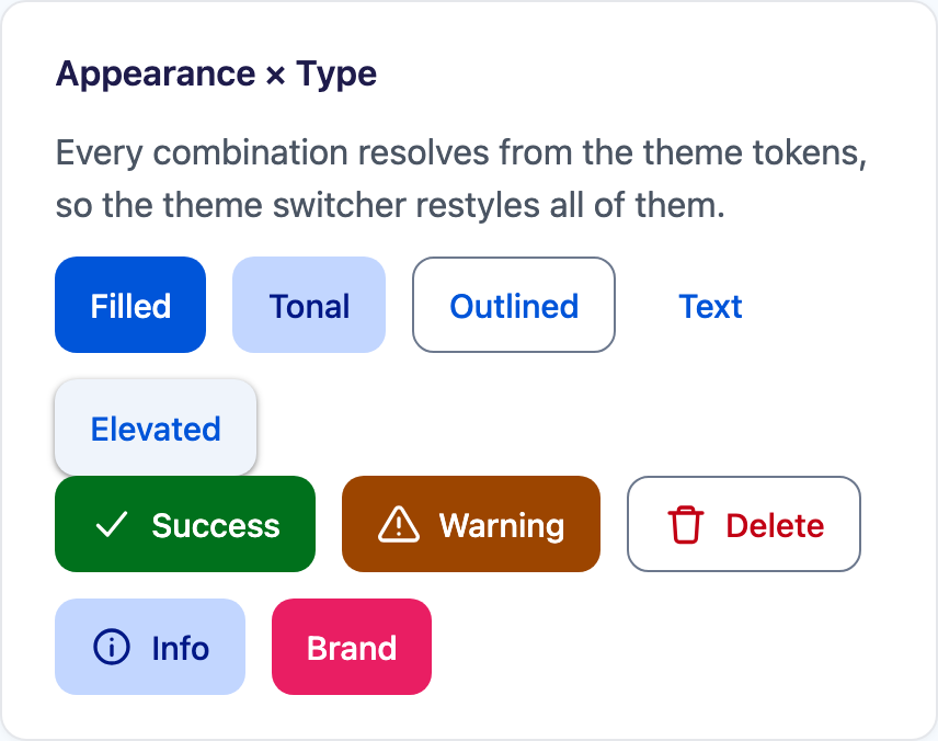
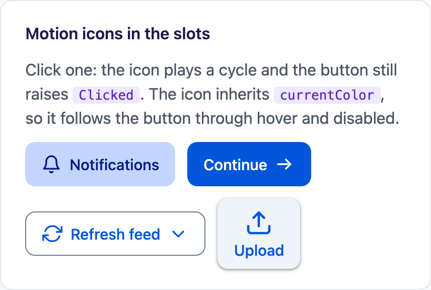
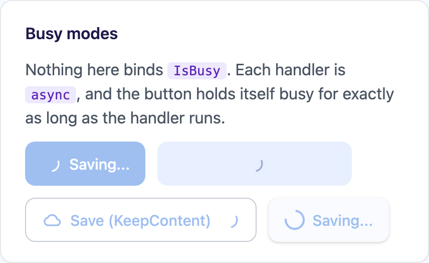
| Appearance × Type | Motion icons | Busy modes | Success |
|---|---|---|---|
 |
 |
 |
 |
| Shapes & sizes |
|---|
 |
Microsoft.Maui.Controls.Button renders text and one image. There is no way to put a spinner inside it, so the most ordinary interaction in an app — press a button, wait for the network, see whether it worked — gets hand-assembled on every page out of a Grid, an ActivityIndicator, a swapped label and an IsBusy property on the view model that exists only to drive the UI.
ShinyButton is that assembly, done once:
<!-- SaveCommand is an AsyncRelayCommand. Nothing here binds IsBusy - there is no IsBusy. --><shiny:ShinyButton Text="Save" BusyText="Saving..." LeftMotionIcon="download" Command="{Binding SaveCommand}" />Basic Usage
Section titled “Basic Usage”<ContentPage xmlns:shiny="http://shiny.net/maui/controls"> <VerticalStackLayout Padding="24" Spacing="12">
<!-- Appearance is emphasis, Type is meaning; they are independent --> <shiny:ShinyButton Text="Save" Appearance="Filled" Type="Primary" /> <shiny:ShinyButton Text="Delete" Appearance="Outlined" Type="Critical" LeftMotionIcon="trash" /> <shiny:ShinyButton Text="Cancel" Appearance="Text" />
<!-- An explicit colour always wins over the tokens --> <shiny:ShinyButton Text="Brand" ButtonBackgroundColor="#E91E63" TextColor="White" />
<!-- Icon slots take an image, a motion icon name, or any View --> <shiny:ShinyButton Text="Notifications" LeftMotionIcon="bell" Appearance="Tonal" /> <shiny:ShinyButton Text="Continue" RightMotionIcon="arrow-right" /> <shiny:ShinyButton Text="Attach" LeftIcon="clip.png" />
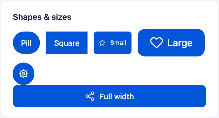
<!-- Icon-only. Give it a description - there is no label to read out. --> <shiny:ShinyButton LeftMotionIcon="settings" CornerRadius="22" ContentPadding="11" SemanticProperties.Description="Settings" />
</VerticalStackLayout></ContentPage>ButtonState is Normal, Busy, Success or Error. Each non-normal state can stand in its own text and its own icon, and Success/Error return to Normal on their own after StateRevertDelay (1.5s by default; TimeSpan.Zero holds).
<shiny:ShinyButton Text="Submit" State="{Binding SubmitState}" BusyText="Submitting..." SuccessText="Submitted" ErrorText="Failed" SuccessMotionIcon="check" ErrorMotionIcon="warning" StateRevertDelay="0:0:2" Command="{Binding SubmitCommand}" />IsBusy is a shorthand projection for a view model that only has a flag:
<shiny:ShinyButton Text="Refresh" IsBusy="{Binding IsRefreshing}" />Setting IsBusy false only unwinds Busy — it will not cut a Success or Error short. That matters more than it sounds: a view model clearing its busy flag in a finally block is exactly the moment the outcome is on screen, and the naive projection would wipe the tick before anyone saw it.
See States & Commands for the full state machine and the MAUI command integration.
Appearance × Type
Section titled “Appearance × Type”Appearance is how much of the button is painted; Type is what it means. Keeping them orthogonal is what lets a destructive action be loud (Filled + Critical) or quiet (Text + Critical) without an enum member for every pairing.
| Appearance | Background | Foreground | Stroke |
|---|---|---|---|
Filled (default) |
{Type} |
On{Type} |
none |
Tonal |
{Type}Container |
On{Type}Container |
none |
Outlined |
transparent | {Type} |
Outline, 1px |
Text |
transparent | {Type} |
none |
Elevated |
SurfaceContainerLow |
{Type} |
none, plus shadow |
Type is Primary (default), Secondary, Success, Warning, Critical or Info.
Everything resolves through SetDynamicResource against the theme tokens, so ShinyThemeManager.SetTheme restyles a live button. Any explicit colour property (ButtonBackgroundColor, TextColor, BorderColor, IconColor) short-circuits its token — which means an explicit colour survives every theme swap. Leave them unset unless you mean to pin the colour.
Icon slots
Section titled “Icon slots”Each side takes three forms, in ascending order of precedence:
| Property | Takes |
|---|---|
LeftIcon / RightIcon |
An ImageSource |
LeftMotionIcon / RightMotionIcon |
The name of a motion icon |
LeftIconView / RightIconView |
Any View — a BadgeView, an avatar, a control of your own |
Motion icons are the path worth taking. The button colours them from its own resolved foreground and plays one cycle on tap, so they follow the button through disabled, hover and theme changes with nothing to wire up:
<shiny:ShinyButton Text="Refresh feed" LeftMotionIcon="refresh" RightMotionIcon="chevron-down" Appearance="Outlined" />A MAUI Image cannot be tinted, so IconColor reaches a FontImageSource glyph and a motion icon but leaves a PNG whatever colour it was drawn.
The button owns that playback on both hosts: the slot icons sit on MotionTrigger.Manual and the button plays them from its own tap, so a tap anywhere on the button animates them rather than only one that lands on the glyph. Set MotionIconPlayOnClick="false" to leave them still.
ContentLayout is Sides (default), Top or Bottom — named for where the icons sit relative to the text, for tile-style buttons.
<shiny:ShinyButton Text="Upload" LeftMotionIcon="upload" ContentLayout="Top" IconSize="28" />Busy modes
Section titled “Busy modes”BusyMode decides what the working state does to the content.
| Mode | Behaviour |
|---|---|
ReplaceLeftIcon (default) |
The indicator takes the left icon’s place and the text stays put. Both are IconSize square, so the button cannot change width and a row of buttons cannot reflow. |
ReplaceContent |
The content fades to opacity zero — keeping its layout space, so the button holds exactly the width it had — and a centred indicator takes over. |
KeepContent |
The indicator appears after the right icon and nothing else moves. |
The indicator is, in order: BusyIconView if you set one, a motion icon if BusyMotionIcon is set (default loader), or a platform ActivityIndicator if you clear BusyMotionIcon.
ReplaceContent uses opacity rather than visibility deliberately. Hiding the content would collapse the button to the width of the spinner and shove the rest of the row sideways mid-operation; keeping it laid out but invisible pins the width with no measuring on your part.
Properties
Section titled “Properties”Text — Text, TextColor?, FontSize (15), FontFamily?, FontAttributes, CharacterSpacing, LineBreakMode (NoWrap).
Surface — Appearance (Filled), Type (Primary), ButtonBackgroundColor?, BorderColor?, BorderThickness (-1, meaning the appearance decides), CornerRadius (10), ContentPadding (16,10), HasShadow (bool?, null = the appearance decides), DisabledOpacity (0.38), PressedOpacity (0.6).
Icons — LeftIcon?, RightIcon?, LeftMotionIcon?, RightMotionIcon?, LeftIconView?, RightIconView?, IconSize (20), IconColor?, IconSpacing (8), ContentLayout (Sides), MotionIconPlayOnClick (true), MotionIconStrokeWidth (2).
State — State (TwoWay), IsBusy (TwoWay), BusyMode (ReplaceLeftIcon), BusyText?, SuccessText?, ErrorText?, BusyMotionIcon ("loader"), BusyIconView?, SuccessMotionIcon ("check"), ErrorMotionIcon ("warning"), SuccessIcon?, ErrorIcon?, StateRevertDelay (1.5s), DisableWhileBusy (true), AutoBusy (true), ShowErrorOnFault (true).
Command — Command?, CommandParameter?, UseFeedback (true).
Events: Clicked, and StateChanged carrying From and To.
Accessibility
Section titled “Accessibility”The button keeps one stable AutomationId across state changes and moves only SemanticProperties.Description, because MAUI’s AutomationId throws if it is assigned twice — a button that relabels itself cannot use it to carry the current text. Motion icons inside the button are removed from the accessibility tree so a screen reader does not announce the label twice.
Set a SemanticProperties.Description on any icon-only button. On Blazor, the rendered element is a real <button type="button">, so keyboard activation, focus ring and disabled come for free; use aria-label there.
Step 1 — Add the marketplace:
claude plugin marketplace add shinyorg/skillsStep 2 — Install the plugin:
claude plugin install shiny@shinyOne plugin installs all 37 Shiny skills. Your agent loads only the skill relevant to what you're building, so there's no cost to having them all available.
Step 1 — Add the marketplace:
copilot plugin marketplace add https://github.com/shinyorg/skillsStep 2 — Install the plugin:
copilot plugin install shiny@shinyOne plugin installs all 37 Shiny skills. Your agent loads only the skill relevant to what you're building, so there's no cost to having them all available.