


DataGrid | Detail (Breakdown) Rows
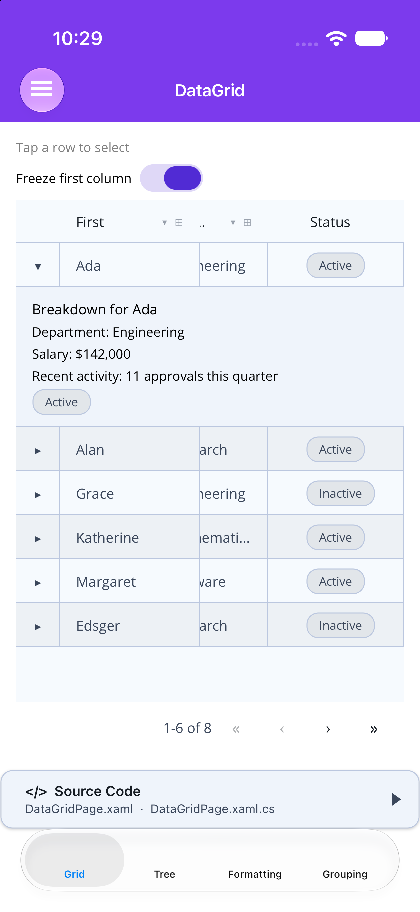
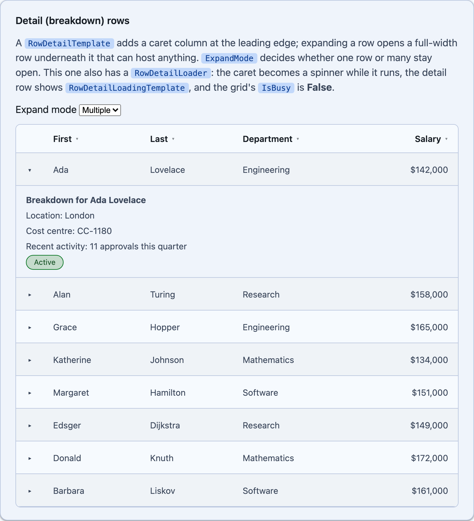
Set a RowDetailTemplate and the grid grows a caret column at the leading edge. Expanding a row opens a full-width row beneath it, bound to that row’s item, and it can host anything — a summary, a chart, a nested grid, a form.
@* Blazor - the template's context is the row's item *@<DataGrid TItem="Person" Items="people" ExpandMode="DataGridExpandMode.Multiple"> <Columns> <PropertyColumn Property="x => x.FirstName" Title="First" /> <PropertyColumn Property="x => x.Salary" Format="C0" /> </Columns> <RowDetailTemplate> <strong>Breakdown for @context.FirstName @context.LastName</strong> <div>Location: @context.Location</div> <div>Cost centre: @context.CostCentre</div> </RowDetailTemplate></DataGrid><!-- MAUI - the template's BindingContext is the row's item --><shiny:DataGrid ItemsSource="{Binding People}"> <shiny:DataGrid.RowDetailTemplate> <DataTemplate x:DataType="local:Person"> <VerticalStackLayout Spacing="4"> <Label Text="{Binding FirstName, StringFormat='Breakdown for {0}'}" FontAttributes="Bold" /> <Label Text="{Binding Salary, StringFormat='Salary: {0:C0}'}" /> <shiny:PillView Text="{Binding StatusText}" HorizontalOptions="Start" /> </VerticalStackLayout> </DataTemplate> </shiny:DataGrid.RowDetailTemplate> <shiny:DataGridColumn Title="First" PropertyName="FirstName" /> <shiny:DataGridColumn Title="Salary" PropertyName="Salary" StringFormat="{}{0:C0}" /></shiny:DataGrid>ExpandMode—Multiple(default) orSingle, which closes whatever was open before.IsRowExpandable— a per-item veto. Returnfalseand the row shows no caret and cannot be opened; use it for rows with nothing to break down.ExpandOnRowTap(MAUI) /ExpandOnRowClick(Blazor) — off by default, so a tap stays free for selection and editing. The caret is the affordance.- Drive it from code with
ExpandRow/CollapseRow/ToggleRow/ExpandAll/CollapseAll/IsRowExpanded(Blazor’s are the…Asyncforms), and react with theRowExpanded/RowCollapsedevents. Blazor also exposes a bindableExpandedItems.
Expansion is keyed on the data item, not the row, so it survives the rebuild that sorting, filtering or paging causes — reorder the grid and the same rows are still open. The detail content stays pinned to the leading edge while the columns scroll sideways (MAUI translates the pane the way it does for group headers; Blazor uses position: sticky), so a breakdown never slides out of view.
Next Steps
Section titled “Next Steps”| Topic | Description |
|---|---|
| Async Detail & IsBusy | fetch a breakdown on demand |
| TreeDataGrid | the same grid in hierarchy mode |