


Accordion
Accordion stacks Expanders and decides how many of them may be open at once.
Screenshots
Section titled “Screenshots”MAUI (iOS)
| Single-open accordion |
|---|
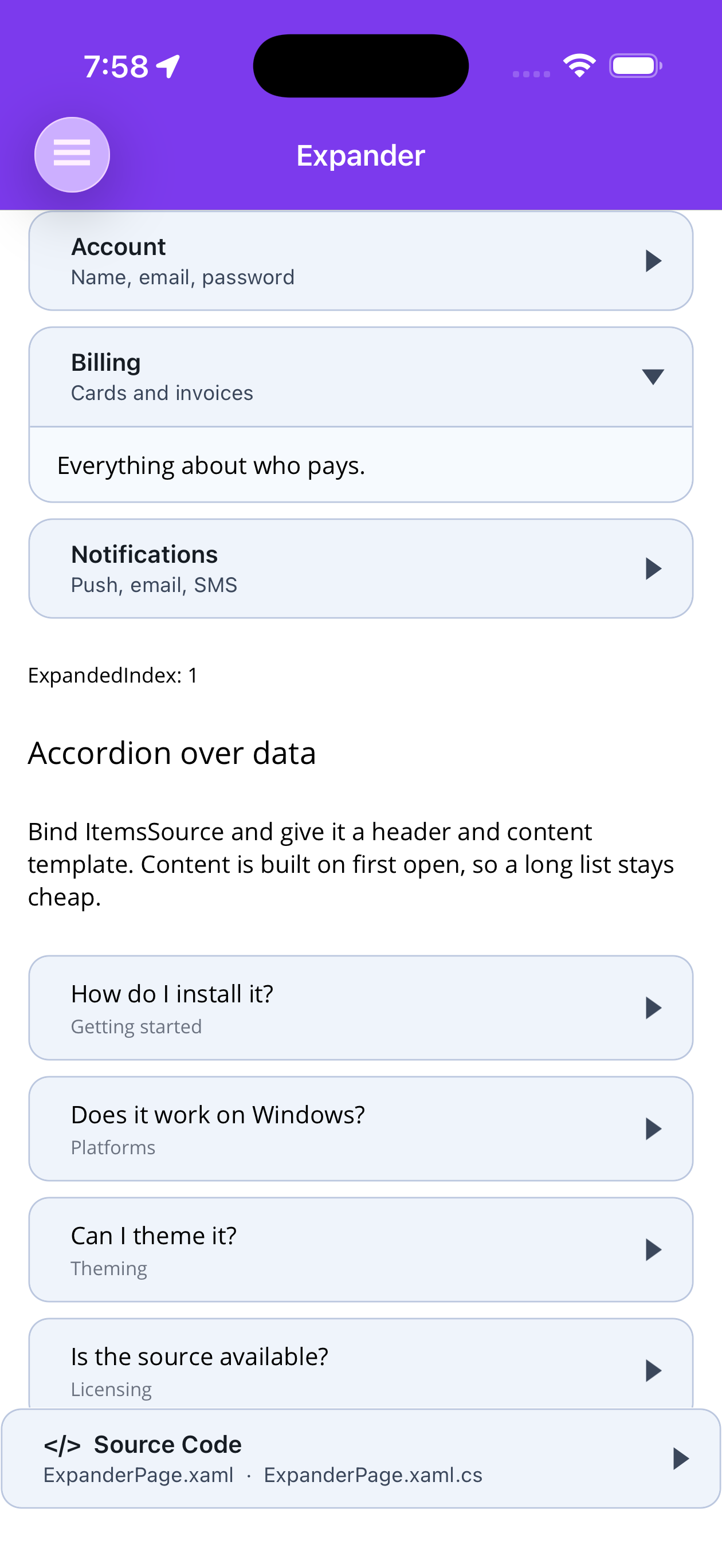 |
Blazor
| Single-open accordion |
|---|
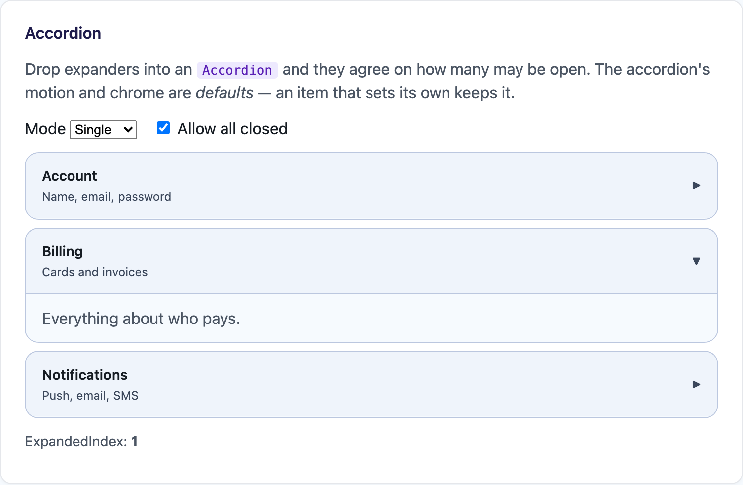 |
Quick Start
Section titled “Quick Start”<shiny:Accordion SelectionMode="Single" CornerRadius="14"> <shiny:Expander HeaderText="Account" HeaderDetail="Name, email, password"> <Label Text="Everything about who you are." /> </shiny:Expander> <shiny:Expander HeaderText="Billing" HeaderDetail="Cards and invoices"> <Label Text="Everything about who pays." /> </shiny:Expander> <shiny:Expander HeaderText="Notifications" HeaderDetail="Push, email, SMS"> <Label Text="Everything about when we bother you." /> </shiny:Expander></shiny:Accordion>Accordion derives from VerticalStackLayout, so Spacing, Padding and the rest are the ones you
already know. It defaults to a spacing of 8.
How many may be open
Section titled “How many may be open”| Property | Effect |
|---|---|
SelectionMode="Single" |
Opening one closes the rest. The default. |
SelectionMode="Multiple" |
Any number can be open together. |
AllowCollapseAll="False" |
The accordion refuses to end up with nothing open. |
AllowCollapseAll="False" does two things: a list that starts fully closed opens its first item, and
whichever item is the last one open has its CanCollapse set to false, so tapping its header does
nothing. As soon as something else opens, the affordance comes back.
Driving it from code
Section titled “Driving it from code”| Member | What it does |
|---|---|
ExpandedIndex |
Two-way. The open item, or -1. In Multiple mode it reports the first open one. |
ExpandedIndexes |
Every open item’s index. |
Items |
The expanders, in visual order. |
ExpandItem(index) |
Opens one. Returns false when out of range. |
ExpandAll() |
Opens everything. Ignored in Single mode. |
CollapseAll() |
Closes everything — unless AllowCollapseAll is false, which leaves the first one open. |
Events
Section titled “Events”ItemExpanded, ItemCollapsed and ItemExpandedChanged carry the expander, its ItemsSource element
(when it was generated), its index and the new state. ItemExpandedCommand is invoked with the data — or
the expander itself for an item written in markup.
<shiny:Accordion ItemExpandedCommand="{Binding ItemExpandedCommand}" />Generating items from data
Section titled “Generating items from data”Bind ItemsSource with a HeaderTemplate and a ContentTemplate. Generated items are appended after
anything declared in markup, so the two can be mixed freely.
<shiny:Accordion ItemsSource="{Binding Faqs}" SelectionMode="Single" LoadContentOnDemand="True"> <shiny:Accordion.HeaderTemplate> <DataTemplate x:DataType="local:FaqItem"> <VerticalStackLayout Spacing="2"> <Label Text="{Binding Question}" FontAttributes="Bold" /> <Label Text="{Binding Category}" FontSize="11" /> </VerticalStackLayout> </DataTemplate> </shiny:Accordion.HeaderTemplate> <shiny:Accordion.ContentTemplate> <DataTemplate x:DataType="local:FaqItem"> <Label Text="{Binding Answer}" /> </DataTemplate> </shiny:Accordion.ContentTemplate></shiny:Accordion>Use ItemTemplate instead when an item needs to set expander properties of its own — a template that
returns a whole Expander is used as-is, with the element as its binding context. Anything else it
returns is treated as the item’s content.
LoadContentOnDemand="True" on the accordion reaches every item, so a long list builds only the bodies
that are actually opened.
Styling the whole list at once
Section titled “Styling the whole list at once”The accordion’s motion and chrome properties are defaults, not overrides. They reach every item that did not set the same property itself, so one odd expander in the list stays odd — and changing the accordion’s value later still reaches the items it seeded.
Animation, SlideFrom, AnimationDuration, AnimationEasing, ExpandDirection, IndicatorMode,
IndicatorPosition, BorderColor, BorderThickness, CornerRadius, HeaderBackgroundColor,
ContentBackgroundColor, LoadContentOnDemand.
<shiny:Accordion Animation="Height,Fade" AnimationDuration="300" CornerRadius="14"> <shiny:Expander HeaderText="Follows the accordion" /> <!-- 600ms here; still picks up the accordion's radius and animation flags --> <shiny:Expander HeaderText="Insists on its own pace" AnimationDuration="600" /></shiny:Accordion>For anything the shortcuts do not cover, ItemStyle takes a TargetType="shiny:Expander" style and
applies it to every item:
<shiny:Accordion> <shiny:Accordion.ItemStyle> <Style TargetType="shiny:Expander"> <Setter Property="HeaderPadding" Value="20,14" /> <Setter Property="ShowSeparator" Value="False" /> </Style> </shiny:Accordion.ItemStyle></shiny:Accordion>